Like most US households, I received my 2020 census form in the mail this past week and I decided to see how accessible the process really is since it’s a US government website subject to Section 508 compliance.

The first thing to note is that someone with low vision or who is blind might have trouble with this whole process because the paper form that arrived in the mail does not have particularly large print nor does it include even cursory instructions in Braille. For deaf or hard of hearing people, there is a TDD number but only if you speak English. I think it’s safe to say that many people with disabilities will have to rely on someone else’s help to complete the process.
Let’s take a look at the website that the paper form directs you to visit: my2020census.gov.
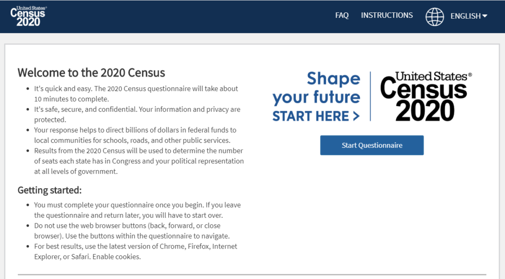
I found a few oddities with the home page while using a screen reader:
- The very first text a screen reader user encounters is a technology warning: If you are using a screen reader, it is recommended that you use the latest version of Internet Explorer and the JAWs [J-A-W-S] screen reader. I’m testing with Chrome and NVDA and this website should work with all major browser/screen reader combinations.
- The first focusable element is a “skip to main content” link which works fine for a keyboard user but announces blank when using a screen reader because focus is moved to a
<div>element with arole=buttonbut no label.
<div role="button" tabindex="0">
<img src="/static/images/start-here.png" class="img-responsive" alt="Start Here Shape your future">
<button type="button" title="Start Questionnaire" name="Start Questionnaire">Start Questionnaire</button>
<div id="recaptcha-container"></div>- And as we can see from the screen shot below, the reading order does not match the focus order. The “skip to main content” link sends focus to after all the important instructional information.

- Lastly, neither the home page nor the questionnaire pages have
<h1>headings or unique page titles to adequately convey place in site.
Start the questionnaire
At the top of the questionnaire pages is a status bar similar to what you might see during a checkout process for online shopping.

There are two problems here:
- There isn’t any screen-reader accessible help text explaining that it’s a status bar, like a heading, nor any text to indicate which step the user is currently on so it’s useless for someone using a screen reader.
- This is the login in screen but the “Address Verification” step is highlighted in the status bar.
The login form itself has very good screen reader label text for the three form fields.

- Enter the first 4 digits of your Census ID
- Enter the next 4 digits of your Census ID
- Enter the last 4 digits of your Census ID
But it’s kind of ironic because someone who can’t see the paper letter with their census ID won’t be able to type it in anyway unless someone reads it off to them.
Address verification section
Once you get past the login screen, the status bar at the top properly indicates to a screen reader user where they are the process: progress bar You are on section 1, the address verification section. But, they are unlikely to benefit from this because every time you click the “Next” button, focus is moved to the question text, not the top of the page.
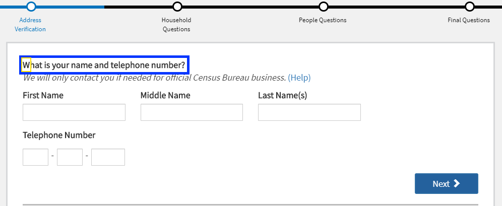
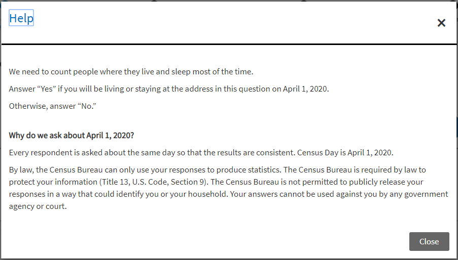
Each question has a “Help” link next to it that opens a modal dialog window which is properly coded by:
- Moving focus to the modal window heading
<h1> - Keeping focus in the modal window
- Providing close buttons to exit the modal window
If you click the “Next” button without completing the required fields, you get an alert and the required fields are outlined in a thick, red border.
<div role="alert">Your name is required to continue the 2020 Census questionnaire. If you prefer not to provide your name, please provide a nickname or unique description.</div>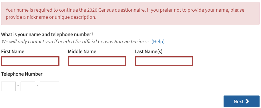
The three “Telephone Number” fields are required but leaving them blank triggers a separate alert message after filling out the name fields. All required fields should be clearly indicated both visually and to a screen reader user.
Household questions
When the “Household” section loaded, the screen reader was silent so there’s something going on with managing focus on this section. It’s hard to troubleshoot because the application is not designed to let you go back to previous questions or sections.
Instead of a “Help” link for the first question, there was this link text: For more information on who to include, click here. What the screen reader announced, though, was: Help link popcount question. A look at the code shows there are both a title attribute and an aria-label attribute on the link with this nonsensical name.
<a href="#" title="Help link popcount question" aria-label="Help link popcount question">For more information on who to include, click here.</a>People questions
Just as with the “Household questions” section, when the questionnaire moved to the “People questions” section, the screen reader was silent and I could see focus remained on the “Next” button that was removed from the DOM.
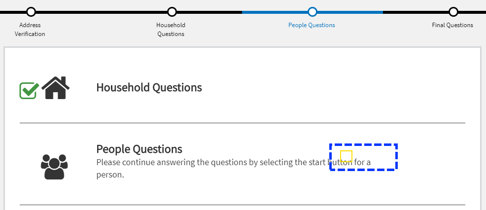
These are not marked up as headings.
This section asks information about each of the persons entered in the “Household questions” section, including birthday.
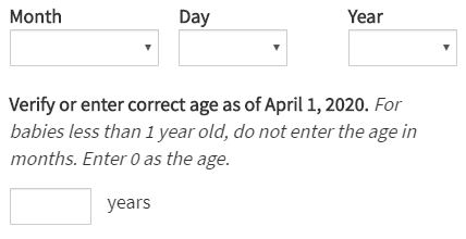
After selecting the month, day and year, the next input displays a calculated age but the help text after the label does not get read by a screen reader in forms mode because it is not programmatically associated with it using aria-describedby or located inside the <label>.
<label for="P_AGE_INT">Verify or enter correct age as of April 1, 2020.</label>
<span>For babies less than 1 year old, do not enter the age in months. Enter 0 as the age.</span>
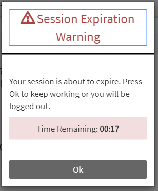
The site does a nice job with its session expiration warning both visually and by sending an alert to screen reader users.
Submit questionnaire
This screen also has a focus management issue. The screen reader doesn’t announce anything when the final screen loads and you can see in the screen shot below how focus remains on the “Next” button that was removed from the DOM.
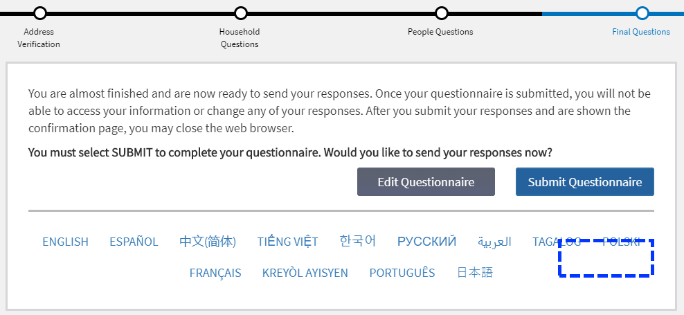
And the same thing happens after clicking the “Submit Questionnaire” button and you’re shown the confirmation page. This site needs more testing with a screen reader and better focus management.