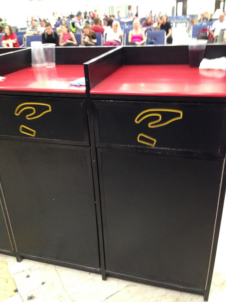
I was recently in an airport in Mexico when I saw this set of trash cans with no text, just an icon of a hand dropping what looks like a cup.

I think this is a good example of UX in the real world, especially for a multi-cultural area like an airport where people might not know the word for “trash” in the local language.
(Not to mention, some places use the name of container like “bin” instead of identifying what goes into it.)
Icons have notorious usability issues because universal icons are rare. But I think in this context, an icon used on the physical object is clearer than using text.
I think the silliest thing to label trash cans with is “Thank You” because it doesn’t give you an indication of what the container is for, yet this is rampant here in the US. I wonder how that got started?
