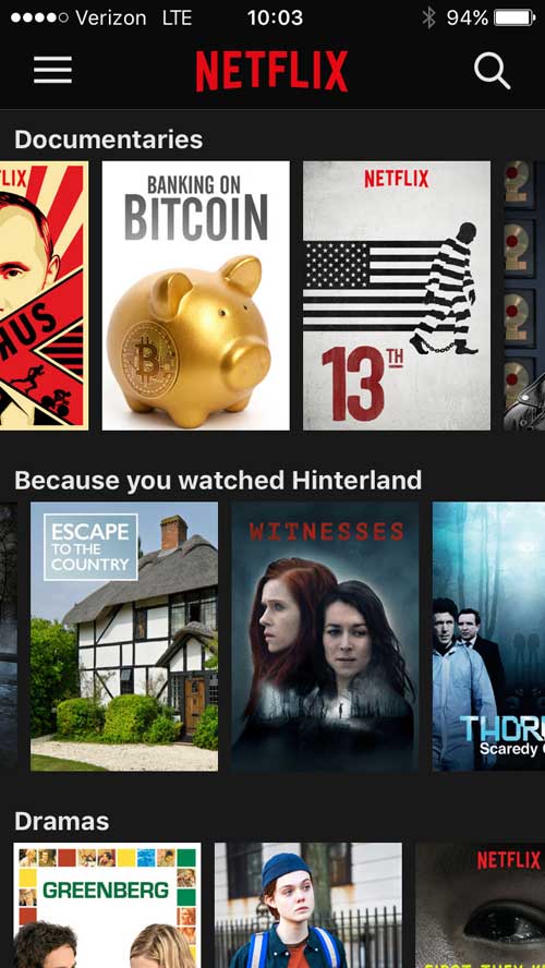
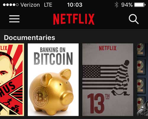
I use the Netflix iOS a lot. I’ve watch a lot of stuff and need to find new videos to watch. This app doesn’t facilitate that user task very well.
Design Suggestions
- Make it obvious which videos you’ve watched already. Lower the opacity for watched items.


Provide a way to mark videos you don’t want to watch so they stop showing up as suggestions. I’ve added a “Skip” icon as an example. Icons are always hard. My first attempt was a “not interested” button but it was too prominent. I think employing the same design as other icons and putting it in line with the “close” icon gives it subtlety and context.
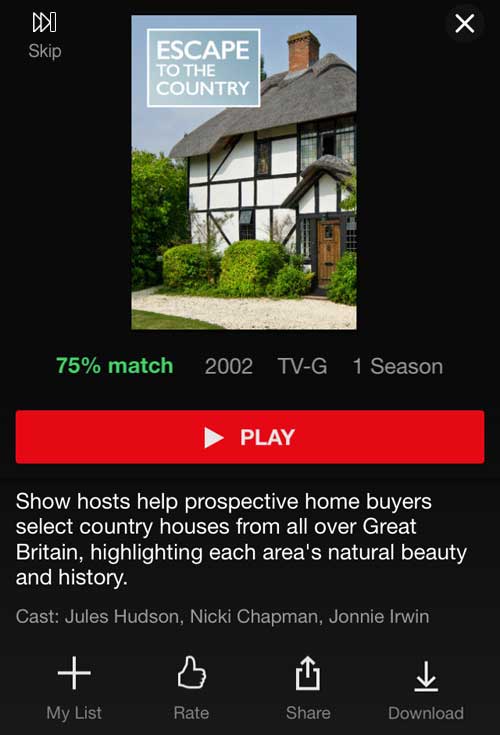
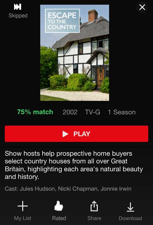
Once you’ve rated a video, the thumbs up icon turns white and the text “Rate” turned to “Rated”. I’ve followed that pattern with the “Skip” button, filling in the control and changing it to “Skipped”. Tapping this would allow this title to become a suggestion again.
Then test it!