Driving in Mexico

A few weeks ago, I took a trip to Mexico’s Yucatan peninsula. We flew into Cancun and were driving south to Tulum. I enjoyed driving there after I learned some key rules of the road.

Stop signs aren’t

Mexican roads have what look like stop signs, the same red octagon as in the United States, with the word “Alto.”
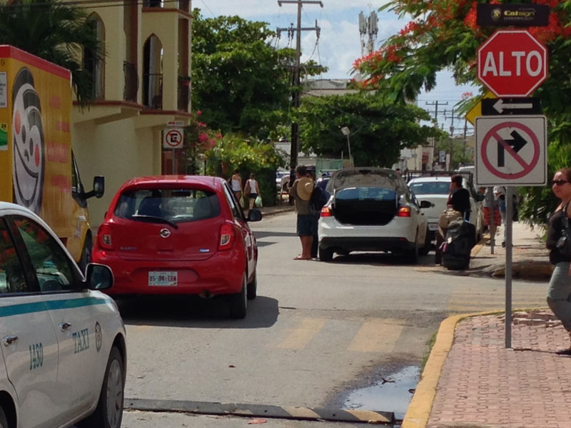
a city street with cars and a stop sign with the word "Alto"
City street intersection with “Alto” sign

Drivers here do not stop at these signs. We almost got rear-ended leaving the airport for stopping. While they look the same as our stop signs, the “Alto” translates more to “halt” which people seem to treat like a yield. Keep going if there are no obvious obstructions.

Topes!

Topes are speed bumps and they are all over the place. I was truly impressed how well they control traffic in three ways:

  1. As a highway enters the town and speed limit drops from 100 km/h to 40 km/h, there is a severe set of speed bumps that force traffic to slow down.
  2. Once in town, there are speed humps just large enough to allow traffic to travel at the speed limit without having to slow down much to go over them.
  3. They are spaced out before intersections and crosswalks, helping maintain cross traffic flow like left turns.
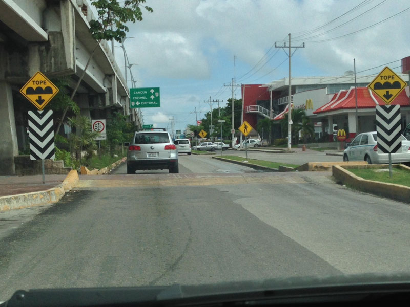
street with a speed hump across it and two signs reading "Tope"
Street with a speed hump and “Tope” signs

Go with the flow

Mexican drivers seemed much more calm, aware, and patient than many drivers in the States. The roads were chaotic with people crossing, motorbikes on the shoulders, bicycles, and dogs. Yet I didn’t see any accidents or hear angry horn honking. People just made driving work. If you’re in the left lane and someone wants to pass, get over.

One other interesting feature is at light controlled intersections, there is no bi-directional traffic. Each of the four directions get the green light in turn which means you always have a protected left.

Cold Offices

Every woman in my office is cold. We have varying strategies to deal with this. I wear a long sleeved cardigan every day and a blanket as backup; some women wear fleece; one even has a sleeping bag under her desk.

Why is this? According to Alan Hedge, an ergonomics professor at Cornell University, “The temperature gets set usually by a man because often that man will be the CEO or the facility manager or the mechanical engineer responsible for maintaining the system.” And men run hotter. (For more check out the full interview “New Study Says Chilly Offices Hurt Women Workers’ Productivity, Health“.)

In our office, space heaters helped us a lot, but the building management banned them. Given the enormous energy expense of cooling a building, I propose raising the temperature several degrees and if men are cold, they can bring in fans, which are permitted and safer than space heaters.

Identifying Trash Cans

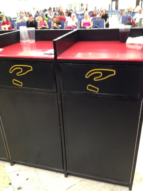
I was recently in an airport in Mexico when I saw this set of trash cans with no text, just an icon of a hand dropping what looks like a cup.

two brown trash cans with a hand icon dropping a cup
Trash can with icon instead of test

I think this is a good example of UX in the real world, especially for a multi-cultural area like an airport where people might not know the word for “trash” in the local language.

(Not to mention, some places use the name of container like “bin” instead of identifying what goes into it.)

Icons have notorious usability issues because universal icons are rare. But I think in this context, an icon used on the physical object is clearer than using text.

I think the silliest thing to label trash cans with is “Thank You” because it doesn’t give you an indication of what the container is for, yet this is rampant here in the US. I wonder how that got started?

trash can that says "Thank You" on its door
Photo Credit: Lauren Brown