Adding a Bookmark in Safari – Part 2

In Part 1, I explored how you add bookmarks in the Safari browser for desktop versus other browsers. Part 2 looks at adding a bookmark on the iPhone using Safari mobile.

The desktop version of Safari uses a “plus” icon for adding bookmarks, an icon not found in the mobile interface.

screen shot of the Safari browser in iPhone
Safari mobile browser

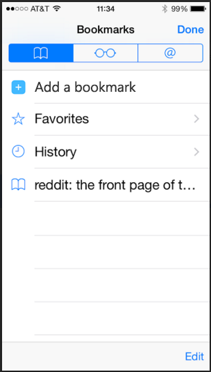
This left me wondering which icon to use. My instinct was to tap the “book” icon. This icon shows the list of current bookmarks only, and does not include an option to add the current page as a bookmark.

screen shot of the bookmarks screen in Safari mobile
Safari mobile bookmarks screen

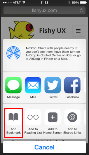
Turns out you have to tap what I’ll call the “export” icon to get to the option to save a page as a bookmark. This option uses the same “book” icon as the menu bar, which I find confusing.

screen shot of the Safari mobile screen that allows you to add a bookmark
Safari mobile add bookmark

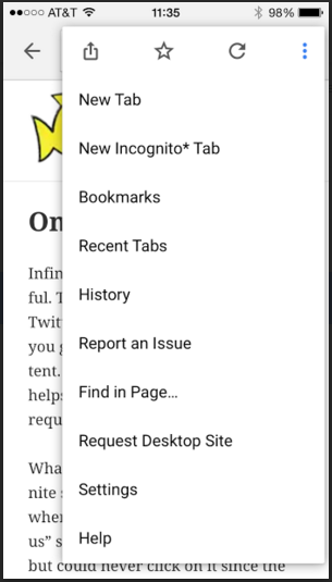
Compare this to Chrome which uses the typical “star” icon for adding a favorite, located in the browser menu, and provides a “Bookmarks” link to view existing ones all in one place.

Screen shot of the Chrome mobile browser menu
Chrome mobile browser menu

Design Recommendations

The iOS UI patterns on iPhone seem to limit the number of icons on the bottom menu bar to five, which makes adding a “plus” icon just for bookmarks unlikely. Instead, I’d include an option to add a bookmark from the “Bookmarks” screen for those of us whose instinct is to click the “book” icon.

Updated screen shot of the bookmarks page with the option to add a bookmark
Safari mobile mock up for adding a bookmark

Blood Bank Questionnaire UI – Part 2

In Part 1, I explored issues and possible improvements to the blood bank’s questionnaire interface for each question. In this part, I’ll look at the end screen of the process.

screen shot of the questionnaire's end screen that asks the user to review the answers to all questions
Questionnaire end screen UI

The glaring issue with this screen is that it requires the user to remember each question based on a short, obviously programmer-named description like “BLD TRANSFUSION”. I question the need to review a dump of all the questions and answers. The progressive nature of the questionnaire and the ability to jump back and forth between questions provides the user adequate opportunity to review and change answers.

Design Possibilities

  1. Determine how necessary this end screen really is. How often do people use it? How often do users go back and change answers at the end? If it’s very low, get rid of it.
  2. Rather than show all questions, maybe show only those questions users skipped and give them another chance to answer.

    end screen mock up that asks users if they would like to answer any questions skipped during the questionnaire
  3. Change the format of the questionnaire to show multiple questions at a time, and progress through only a few screens where questions are grouped together by type. For example, travel, sexual activity, and disease exposure.

    questionnaire screen with 4 questions in a Current Health section

Blood Bank Questionnaire UI – Part 1

I’m a regular blood donor so I must have used this self-administered questionnaire UI dozens of times over the years. It’s old, clunky, and suffers from providing the bear minimum in functionality with little thought to usability.

Screen shot of the self questionnaire interface

Top issues

  1. Using check boxes for the answer responses when only one choice is allowed (yes, no, or skip). My best guess about why they used check boxes instead of radio buttons is to allow a user to remove any response to the question.
  2. Placing the “Continue” button at the bottom of the page, far away from the answer check boxes. This results in having to move the mouse up and down, over and over, for every question.
  3. No indication of how many questions there are or which question you’re on.
  4. No integration of the educational materials within the interface. If you want to know which European countries are on the travel list, you have to consult a paper print out.
  5. It’s ugly and does not provide a very friendly experience.

Design Recommendations

Here’s a mock up I did that attempts to address the top issues.

Screen shot of a new mock up of the questionnaire UI
My mock up of the questionnaire UI
  1. Use radio buttons for the answer responses (yes and no) and move the “skip” option to a link that does not give the “skip” option the same visual weight as “yes” or “no.”
  2. Change the “Continue” button to “Next” and place it next to the radio buttons to minimize the effort of answering the question and moving on to the next one.
  3. Add a status bar for a quick visual of how far along you are in the questions, and indicate which question you’re on, e.g. 15 of 28.
  4. Add links to the educational materials within the interface.
  5. Update the look and feel. Use the blood bank’s logo and color palette instead of the software maker’s.

And here is what the interface looks like once the user selects an answer.

Screen shot of the updated UI with the "no" radio button checked
UI updated with a checked response

The user no longer has the option to clear a response. Maybe clicking “skip question” would clear the radio button? But since a user must answer all questions eventually, either in the software or verbally to a tech, I don’t see the ability to clear a response in the UI as very important.