Waze, what is that bar on the left for?

I’ve been using Waze for a few months now, and every now and then, a bar shows up on the left side. I’d glance down and see that it showed “something” was estimated to happen (or last?) for a few minutes, but I could not figure out what. We have a hands-free law here, so I could not legally take my phone off its holder and look at it more closely.

photo inside a car of an iPhone in a phone holder, displaying the Waze app map
Waze app in my car

The screen is probably 18″ from my eyes and I wear polarized sunglasses which makes the app even harder to interpret when glancing down for fractions of a second.

It took using Waze as a passenger to see that the bar’s label also had the word “Jam” (traffic jam?) in a light blue font. However, other times I’ve been driving and the bar has no label, so I’m still not sure what it’s for!

screenshot of the Waze map with a status bar on the left side that has no label to indicate its purpose
Waze left bar with no label

Design Recommendation

This is an easy one. Change the font color to white and bold it so that the word “Jam” is just as visible as the time estimate. And always include a label to indicate why the bar is there.
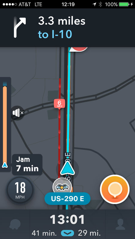
Waze map showing an orange status bar with "Jam 7 minutes"
Screen capture of the Waze map screen

Geocaching.com App Advanced Search

Geocaching is one of my hobbies and I usually cache with just my iPhone using the official Geocaching.com app. Most of the time, I’m searching by location (find nearest caches) or by a cache’s specific ID. But occasionally, I want to narrow the results using the app’s Advanced Search feature.

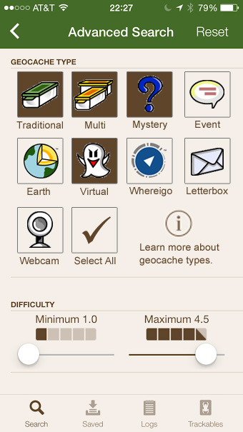
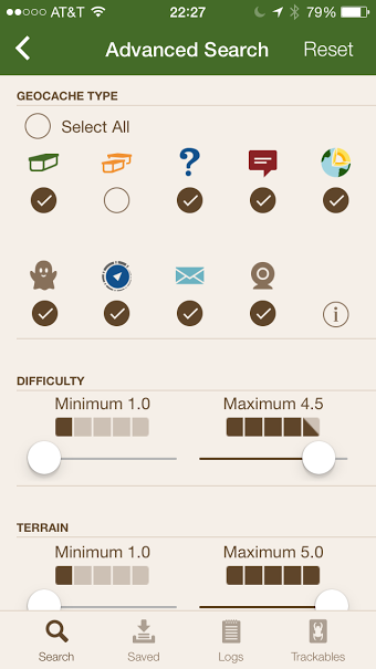
One of the advanced options is to narrow by cache type.

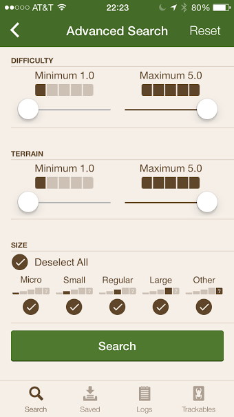
screen for the geocaching app advanced search show cache type and difficulty filters
Geocaching app advanced search screen

Issues with geocache type filter

  1. Use of radio buttons when the user can select multiple options. These should be check boxes.
  2. The hit area for each type is very small. I often have to hit the circle multiple times to get my selection to register.
  3. The select all/deselect all option is in a weird spot.
  4. It can be problematic to rely solely on icons because not everyone, especially newer cachers, know about all the types of caches. There is a little “information” icon but it has information about many additional cache types beyond the nine available in the app search. Other filters include labels.

    geocaching difficult and size filters with labels on the icons
    Filter options with labels

Design Recommendations

  1. Change the circles to squares and make the entire icon the hit area for selecting a cache type.
  2. Move the select all option to the end.
  3. Add icon labels.
mock up of cache type selection with boxes and icon labels in place of radio buttons
Cache type selection mock up

Adding a Bookmark in Safari – Part 2

In Part 1, I explored how you add bookmarks in the Safari browser for desktop versus other browsers. Part 2 looks at adding a bookmark on the iPhone using Safari mobile.

The desktop version of Safari uses a “plus” icon for adding bookmarks, an icon not found in the mobile interface.

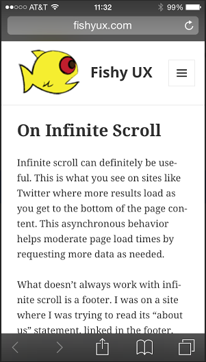
screen shot of the Safari browser in iPhone
Safari mobile browser

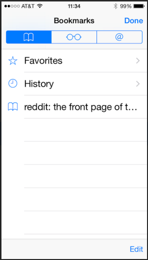
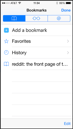
This left me wondering which icon to use. My instinct was to tap the “book” icon. This icon shows the list of current bookmarks only, and does not include an option to add the current page as a bookmark.

screen shot of the bookmarks screen in Safari mobile
Safari mobile bookmarks screen

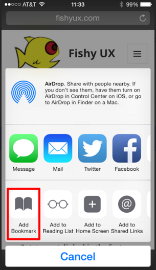
Turns out you have to tap what I’ll call the “export” icon to get to the option to save a page as a bookmark. This option uses the same “book” icon as the menu bar, which I find confusing.

screen shot of the Safari mobile screen that allows you to add a bookmark
Safari mobile add bookmark

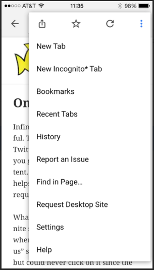
Compare this to Chrome which uses the typical “star” icon for adding a favorite, located in the browser menu, and provides a “Bookmarks” link to view existing ones all in one place.

Screen shot of the Chrome mobile browser menu
Chrome mobile browser menu

Design Recommendations

The iOS UI patterns on iPhone seem to limit the number of icons on the bottom menu bar to five, which makes adding a “plus” icon just for bookmarks unlikely. Instead, I’d include an option to add a bookmark from the “Bookmarks” screen for those of us whose instinct is to click the “book” icon.

Updated screen shot of the bookmarks page with the option to add a bookmark
Safari mobile mock up for adding a bookmark