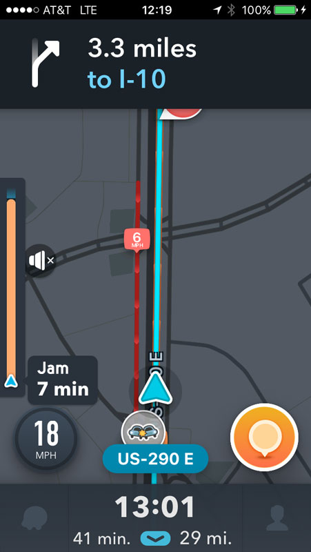
Making Connections with Siren

I first heard about Siren, “A dating site that gives women more control,” earlier this year on NPR. It opened up this week to more communities, and I decided to try it out.

In lieu of a standard profile, Siren has people answer ‘Questions of the Day’. Women can chose to hide their profiles while men cannot and they have to approve any connection requests before receiving messages.

I find myself at a crossroads because of a serious UX flaw: What happens when I click the “Accept?” button for a connection request?

screen shot of the Siren app connections screen with two request
Siren app ‘Connections’ screen
  • Why does the button have a question mark?
  • If I click the button, will it automatically accept the request? Because I don’t see a ‘reject’ or ‘ignore’ option.
  • If I click the button, does it then give me an option to reject?

The main purpose of the app is to connect people, yet I find myself ready to walk away at precisely that point because I don’t want to get connected to someone by mistake, nor do I want to have a perpetual list of requests I’m not interested in.

On a user’s profile, I have the options to ‘Block User’ or ‘Report User’, neither of which is what I want to do.

For curiosity’s sake, I’ll click the damn “Accept?” button…

And there’s my answer. Clicking the button accepted the connection request, with no option to reject, and I see no option to disconnect. Bad, bad, bad.

Design Recommendations

    • Remove the question mark from the “Accept” button, remove ambiguity about what clicking the button does.
    • Provide an “Ignore” button too.
Connections screen with an ignore option added
Connections screen with an ‘Ignore’ button added
  • I found that on a user’s profile you can click some text that reads ‘Connected’ to remove the connection. I really dislike when UIs try to make text and buttons do double duty. It’s never clear, especially when the text isn’t shaped like a link or button. Just provide a ‘Remove’ button.

    Before and after screens for 'remove connection' options
    Add a ‘Remove Connection’ button

Managing Favorites on Hulu’s Mobile Apps

The Hulu interface differs in confusing ways between its desktop website, iPhone app, and Android app for managing your favorite shows.

Desktop Website

On Hulu’s website, it’s easy to “favorite” a show. You go to the show’s overview page and click the link with a plus icon and “favorite” label. Once a show is a favorite, the plus changes to a check mark.

What’s more difficult is removing a show from your favorites since the interface expects a user to understand that clicking the same “favorite” label will now remove it.

screenshot of Hulu's desktop website
Hulu’s desktop website

It’s not immediately obvious what adding a show to your favorites does either. You have to find the “Favorites” page by hovering over your account name, then clicking the “favorite” link in the menu.

Screenshot of Hulu's Favorites page
Hulu’s Favorites page

On the “Favorites” page, you can select what gets added to your queue automatically for any shows you’ve added as a favorite. I really like this feature. However, now that I use the mobile app exclusively to watch shows, I’ve had a very hard time figuring out how to manage my favorites.

iPhone App

On the iPhone, there is a tiny icon on the show’s detail page with no label and no feedback about what tapping it does. I already have Saturday Night Live added to my favorites, so I was really confused why it shows a plus icon instead of a check mark on my mobile.

Screenshot of the Hulu app on iPhone
Hulu app on iPhone

Tapping the plus icon takes you to a screen where you can add additional episodes, even entire past seasons, to your queue.

Screenshot if iPhone add episodes
iPhone add episodes to queue

I was left feeling very uncertain whether this show was still one of my favorites and if new episodes would get added to my queue.

An additional problem is that I had trouble finding my favorites list. There is a “Shows You Watch” icon on the navigation bar but this includes you anything you’ve watched, not just favorites.

After much digging around, I finally found the “Favorites” screen buried under the “Browse” menu icon > gear icon for “Edit Account” > “Favorites” link. Here I could verify which shows will have new episodes to my queue.

screenshot of Hulu Favorites options on iPhone
iPhone Favorites screen

Android App

By comparison, the Android app makes it very apparent whether a show is a favorite by providing a big “Add to Favorites/Remove from Favorites” button on a show’s detail screen.

screenshot of the Hulu app on Android
Hulu app on Android

What’s less clear is how to manage which episodes or clips from your favorite shows get added to your queue. The “Favorites” screen provides shortcuts to your shows only and does not have the same settings as the website and iPhone app.

screenshot of Favorite shows on Android
Android Favorites screen

Design Recommendation for Hulu

  • On the iPhone app, use the add/remove button concept too. Move the plus icon for adding episodes manually to your queue next to the list of episodes.
iphone remove from favorites button
iPhone design recommendation
  • On the Android app, provide a clear way to manage the way favorites update your queue.
  • On the website, again use two labels: “Add to Favorites” then change to to “Remove from Favorites” after a user adds it. Don’t expect a check mark icon to perform double duty. Here it expects users to understand that the check mark means a show is a favorite and that clicking it will remove it from favorites. That makes my brain hurt!