Updated: 9 May 2022 for AccessU
This blog article supplements the talk Making Streaming Video Inclusive, created with my colleagues Carolina Crespo and Charu Pandhi of TPGi and delivered at CSUN 2022 and AccessU 2022. The idea for this talk came from an extensive client audit we participated in: Testing a streaming video application across multiple platforms and devices. With what we have learned, we aim to contribute to best practices for creating inclusive streaming video experiences.
The state of steaming video
As of February 2022, 77% of global viewing time for video is spent watching on demand content: source.
| Type of video | Time spent watching |
|---|---|
| Live TV | 23% |
| On demand video | 77% |
In 2021, 78% of US consumers had a video on demand subscription. That’s a 50% increase in the number of subscribers over the last six years: source.
| Year | US Consumers |
|---|---|
| 2016 | 52% |
| 2017 | 64% |
| 2018 | 69% |
| 2019 | 74% |
| 2020 | 78% |
| 2021 | 78% |
Demand for streaming video services is not only growing, it’s here to stay as more and more providers enter the market each day. But how accessible is this flood of new apps?
Case study: discovery+
Our team had the opportunity to test the discovery+ streaming video app across multiple devices to explore the differences in implementation and the support for assistive technology built into the platforms.
We used the Web Content Accessibility Guidelines (WCAG) version 2.1 AA success criteria as guideposts for our review since separate guidelines for mobile accessibility are not yet available. Based on what we encountered during accessibility testing, we comprised a list of the top 10 accessibility concerns focused on the application UI—issues that impede disabled people from completing common user journeys:
- Sign in
- Explore what is available
- Select a show to watch
- Add and remove shows to/from My List
- Start watching
Top 10 app UI accessibility concerns
- Controls need to have an accessible name and an appropriate role.
- Provide a visible focus indicator on interactive controls.
- Ensure app works with multiple input modes: screen reader, remote, voice input, external keyboard.
- Notifications should be announced to all users.
- Control focus under actions.
- Grouped controls needs a name.
- Announce the number of items in a group.
- Provide sufficient color contrast between the text and the background (image).
- App should support zooming and resizing text.
- Do not restrict the device to only one orientation.
Accessible content
While our research focused on the functional accessibility of the app, an app is only as accessible as the content it provides. You can have the most intuitive, well-designed interface for finding streaming video content but fail to provide appropriate alternative content for disabled users. Let’s look at three content-related considerations.
Captions
Captions are required on streaming content in the US by the 21st Century Communications and Video Accessibility Act of 2010 and other laws. Streaming companies like Netflix went through litigation for not providing captions. All video content we encountered on the discovery+ app had closed captions and controls for turning them on or off.
While captions are now standard and expected by consumers, they are not all the same. Captions must be of high quality and accurate to be useful and provide an accessible experience. Autocaptions that are not reviewed and edited are rarely good enough on their own.
We should also consider other user needs for accessible captions and ways we can enable users to control their captioning experience. Consider providing caption settings where users can control the color, font, size and position of captions and subtitles.
Audio description
Audio description is a separate audio track for video content that describes what is occurring on screen including text overlays and important actions. Like captions, users need accessible controls for enabling the audio description track.
None of the videos we encountered on the discovery+ app had audio descriptions, which is not uncommon but does exclude users who are blind or low vision. Companies are now engaged in legal action over audio description including a settlement between the American Council of the Blind (ACB) and Hulu; and structured negotiations between ACB and Netflix as well as ACB and WarnerMedia (HBO Max).
ACB runs the Audio Description Project that has a searchable database of audio described titles by streaming service.
Voice input
Voice input is a means of controlling the application with voice commands. Only two of the devices we tested support voice input and neither was capable of fully controlling the discovery+ app. This is due to a mix of what the platform supports and what the application supports. To the extent available, we recommend implementing voice support in streaming video applications. Voice input aids in navigating the application as well as making on-screen data entry easier, such as a natural language query to search for content.
Accessibility testing
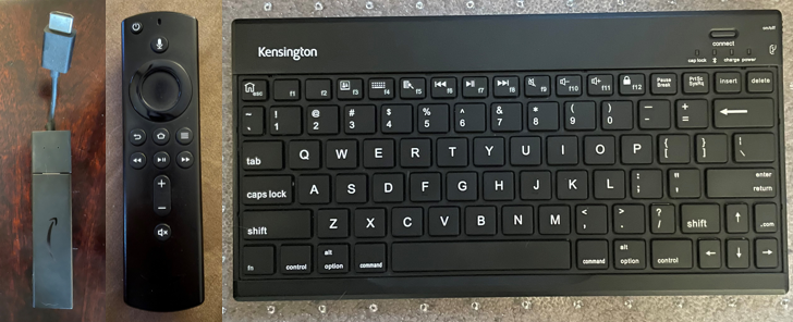
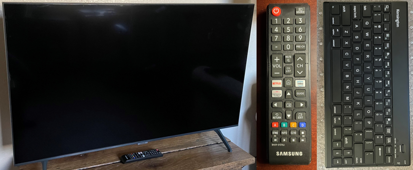
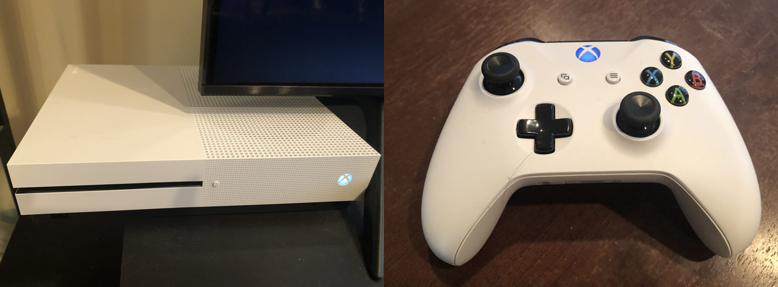
We included five devices and platforms in this review:
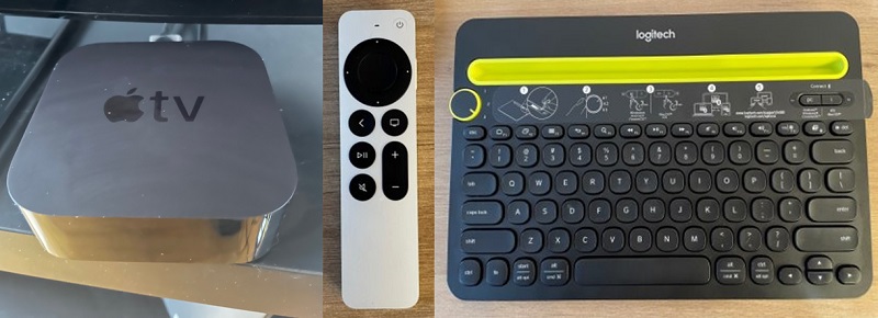
Apple TV
Screen reader: VoiceOver on iOS
Apple TV findings
- Profile buttons do not have accessible names or roles that distinguish them.
- Notifications when a show is added or removed to or from a list are not announced.
- Carousels lack names.
| Rule | Status |
|---|---|
| 1. Controls have accessible names/roles | Fail |
| 2. Focus indicator on interactive controls | Pass |
| 3. Support multiple input modes | Pass |
| 4. Announce notifications | Fail |
| 5. Focus management | Pass |
| 6. Control groups have names | Fail |
| 7. Groups announce number of items | Pass |
| 8. Text color contrast | Fail |
| 9. Support zooming/resizing text | Pass |
| 10. Allow both screen orientations | N/A |
Android phone
Screen reader: TalkBack on Android OS
Android findings
- “Add to My List” and “Remove from My List” controls are missing the button role and accessible names.
- Episode selector does not announce the number of items in the control, the button role or selected state.
- Most player controls do not have proper accessible names and roles.
| Rule | Status |
|---|---|
| 1. Controls have accessible names/roles | Fail |
| 2. Focus indicator on interactive controls | Pass |
| 3. Support multiple input modes | Pass |
| 4. Announce notifications | Pass |
| 5. Focus management | Pass |
| 6. Control groups have names | Fail |
| 7. Groups announce number of items | Fail |
| 8. Text color contrast | Fail |
| 9. Support zooming/resizing text | Pass |
| 10. Allow both screen orientations | Fail |
Fire TV
Screen reader: VoiceView on Fire OS
Fire TV findings
- Profile buttons do not have accessible names that distinguish them.
- Tabbed navigation and carousels do not announce the number of items in the group. Episodes announce n of -1.
- Shows do not announce their titles which are displayed as images.
| Rule | Status |
|---|---|
| 1. Controls have accessible names/roles | Fail |
| 2. Focus indicator on interactive controls | Pass |
| 3. Support multiple input modes | Pass |
| 4. Announce notifications | Pass |
| 5. Focus management | Pass |
| 6. Control groups have names | Pass |
| 7. Groups announce number of items | Fail |
| 8. Text color contrast | Fail |
| 9. Support zooming/resizing text | Pass |
| 10. Allow both screen orientations | N/A |
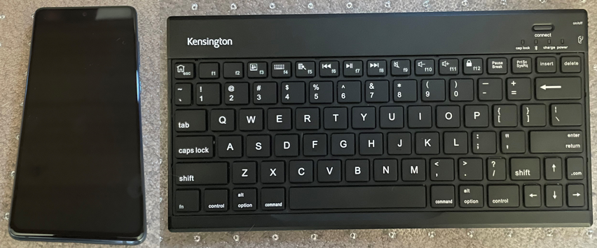
Samsung TV
Screen reader: Voice Guide on Tizen
Samsung TV findings
- Sign In form does not provide audible feedback for input typed with a Bluetooth keyboard.
- Low color contrast between text and background images.
- Episodes don’t announce the episode number.
| Rule | Status |
|---|---|
| 1. Controls have accessible names/roles | Pass |
| 2. Focus indicator on interactive controls | Pass |
| 3. Support multiple input modes | Pass |
| 4. Announce notifications | Pass |
| 5. Focus management | Pass |
| 6. Control groups have names | Pass |
| 7. Groups announce number of items | Pass |
| 8. Text color contrast | Fail |
| 9. Support zooming/resizing text | Fail |
| 10. Allow both screen orientations | N/A |
Xbox
Screen reader: Narrator on Xbox software system
Xbox findings
- Content is grouped, group label is announced, Tabbed navigation announces the number of items in the group, for example 3 of 10.
- Visual notifications are not announced.
- Regular text does not have sufficient contrast with its background.
| Rule | Status |
|---|---|
| 1. Controls have accessible names/roles | Pass |
| 2. Focus indicator on interactive controls | Pass |
| 3. Support multiple input modes | Pass |
| 4. Announce notifications | Fail |
| 5. Focus management | Pass |
| 6. Control groups have names | Pass |
| 7. Groups announce number of items | Pass |
| 8. Text color contrast | Fail |
| 9. Support zooming/resizing text | Pass |
| 10. Allow both screen orientations | N/A |
Overall findings
Every platform tested had issues, with Samsung TV and Xbox having the most accessibility support and Apple TV and Android having the least.
| Rule | Apple TV | Android | Fire TV | Samsung | Xbox |
|---|---|---|---|---|---|
| 1. Controls have accessible names/roles | Fail | Fail | Fail | Pass | Pass |
| 2. Focus indicator on interactive controls | Pass | Pass | Pass | Pass | Pass |
| 3. Support multiple input modes | Pass | Pass | Pass | Pass | Pass |
| 4. Announce notifications | Fail | Pass | Pass | Pass | Fail |
| 5. Focus management | Pass | Pass | Pass | Pass | Pass |
| 6. Control groups have names | Fail | Fail | Pass | Pass | Pass |
| 7. Groups announce number of items | Pass | Fail | Fail | Pass | Pass |
| 8. Text color contrast | Fail | Fail | Fail | Fail | Fail |
| 9. Support zooming/resizing text | Pass | Pass | Pass | Fail | Pass |
| 10. Allow both screen orientations | N/A | Fail | N/A | N/A | N/A |
Conclusion
This article represents data for a single app only and we encourage the community to research other applications across additional platforms and devices to add to the body of knowledge. Our goal was to surface specific accessibility issues that have a critical impact on a user’s ability to navigate the journey from signing in to watching a show. We hope this creates visibility and awareness of the effects from not testing for, and fixing, accessibility issues in streaming video applications and helps inform the pool of best practices for inclusive streaming experiences.