Podcasts App Changes in iOS11

I’ve written about my frustrations with the iOS Podcasts app on the iPhone before. With iOS11, Apple decided to change how the interface works in a major way (again). I had adapted to the iOS9 UI, easily adding items to the “Up Next” queue and figuring out that I could reorder and delete episodes.

Queue Management

What I want from a podcast app is to be able to create a queue of episodes that I can manage by adding/removing/reordering with ease.

screenshot of the podcasts app player screen
Play episode screen

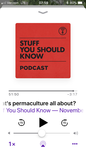
As with the previous version of the app, you tap the menu icon in the lower right to bring up play options.

Episode menu screen
Screenshot of menu options for an episode

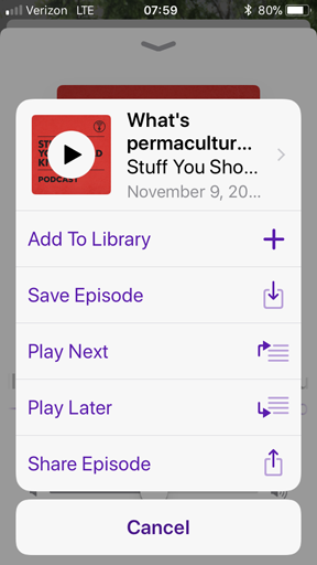
The options under this menu have changed. No more history and no way to see the contents of the queue. You can choose to play the current episode next with the “Play Next” option or add it into the black hole queue with “Play Later”.

screenshot of the added to queue notification for a podcast episode
Added to queue notification

I say black hole because I cannot find the queue.

It’s hard to use this app if I can’t manage which episodes are playing. I’ve already had times where I added an episode twice or wanted to play a different episode before another one I just added to the queue. I’m stumped and upset.

Library

Some readers may have noticed there is a new option in that menu called “Add to Library”. I was really hoping the library was the queue. Instead it appears to replace the “My Podcasts” icon from the previous app version. Best I can tell, this is a list of the latest episodes the podcast thinks you would be interested in.

screenshot of the Library where you can sort through episodes
Library screen

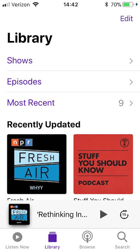
It is useful for navigating podcast feeds and episodes with the option to download to your device.

Listen Now

This was my last hope. I really thought this would be a list I could curate, but again, disappointment.

screenshot of the Listen Now screen which lists the latest podcast episodes
Listen Now screen

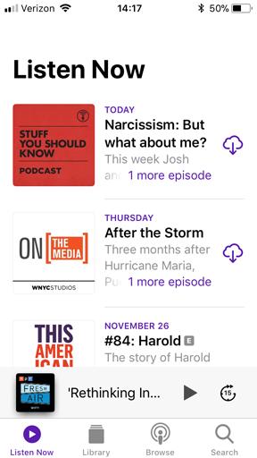
What we see is another list of latest episodes which I think excludes ones you’ve listened to already. So where is the queue? I guess it’s time to search for the answer. The first hit had a great response:

The fact that we have to Google how iOS screen design works shows how iOS screen design doesn’t work any more. I hate iOS 11.

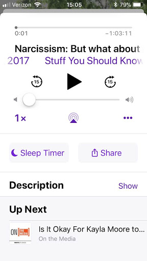
The answer for how to view the queue–swipe up on the screen where the current episode is playing–isn’t working for me. I guess I’ll keep trying but seriously, I don’t understand why Apple obfuscates functionality with obscure gestures.

Update: So if you have episodes in the queue, you can scroll to the bottom of the currently playing episode screen to see what’s “Up Next”. However, if you have nothing in the queue, the section simply isn’t there.

screenshot of the Up Next queue at the bottom of the player screen
Up Next list

My design suggestions would be to make the queue more obvious and to call it a queue. I’d love to see a “Queue” icon at the bottom of the app. Calling it “Up Next” is confusing.

Three years later, iTunes still sucks

Last month, writer Amy X. Wang wrote a spot-on article outlining many of the issues that still plague iTunes even 13 years after it first launched.

I have avoided using iTunes at all, and only when necessary to sync or do a backup to my computer instead of iCloud. It’s been at least three years since I had it installed but I needed to do a backup and manual sync for some files after porting over to a new mobile provider.

Reluctantly, I installed iTunes 12 on my work computer. And sure enough, it still sucks due to extreme slowness and confusing IA. Per instructions from IT, I couldn’t do a restore from the backup though. It took aimless clicking around to locate my apps.

screenshot of the iTunes 12 interface showing the apps area
Screenshot: iTunes 12 apps

I had to figure out the link to the Apps area is hidden in the upper leftmenu. Then after much frustration, I saw that I needed to click a buried link labeled “Purchased” to access apps I’ve installed before. (I have never understood labeling all apps as ‘purchased’ when I’ve paid for all of five apps.)

After landing on my page of apps, which apparently shows any app I ever installed and not just the ones I currently use, I again found myself stuck. Hovering over the app icons and right-clicking didn’t provide any options or tool tips.

screenshot of the iTunes purchased apps with icons for each app
Screenshot: iTunes purchased apps

There’s a little cloud icon with a down arrow over each app icon, so I clicked one and nothing apparent happened. I tried again; I tried others; no obvious feedback. Then after clicking one, I saw a flash at the top of the screen.

screenshot showing the app downloading message at the top
Screenshot: iTunes app download message

I finally got this screen shot with some quick print screen work. While studying the image, I noticed another icon in the upper right, a circle with a down arrow. Clicking on that, I could see a list of apps I had queued for download. Only, nothing was happening. Also, why do the apps have to download to my computer for me to sync them?

I went over to the phone sync screen and saw a few of the apps I had apparently downloaded, and attempted to install them. I didn’t noticed for some time, though, that after choosing to install an app, I had to click another button hidden in the lower right.

screenshot of the iTunes phone sync apps where you install or remove apps
Screenshot: iTunes phone apps

Eventually I gave up. I went into the App Store on my new phone, found the “Purchased” apps area, and was able to quickly download the apps I wanted to use. The only thing I have to use iTunes for is creating custom ringtones. I’ve never purchased music or any other content from the iTunes store (preferring Amazon Music) and will continue to resist the Apple ecosystem.

screenshot of the iPhone App Store with icons and options to download previously installed apps
Screenshot: iPhone App Store purchased apps

Adding a Bookmark in Safari – Part 1

I was on a call with my manager trying to login to an application that requires Safari or Firefox. He was using a Mac with Safari so I decided to use Safari as well, but on Windows.

Apple uses what I consider non-standard design patterns for some features. I say non-standard because if the other three major browsers are using similar patterns but Safari uses something different, well, it’s annoying.

I was trying to bookmark this application. Nothing in the Safari UI jumped out at me. I didn’t see anything that said ‘bookmark’ or ‘favorite’. I didn’t see a star icon. I was stumped.

screen shot of the Safari menu bar on Windows
Safari menu bar

I did notice the ‘plus’ icon to the left of the address bar but I was not willing to click it. Neither its location nor icon led me to believe it had anything to do with bookmarking a page.

I eventually clicked the ‘book’ icon, which opens a pane called “Collections” and allows one to manage existing bookmarks but does not include a way to bookmark the current page. UGH!

As it turns out, the ‘plus’ icon is the way to bookmark the current page. Such a simple task should not cause this level of uncertainty or confusion.

screen shot of Safari menu bar with plus icon highlighted
Safari menu bar ‘bookmark’ button

Design Recommendation for Safari on Windows

Safari on Windows should use the ‘star’ icon for adding a bookmark and that icon should be to the right instead of on the left, the pattern familiar to Windows users.

For comparison, here is how the other three major browsers do it.

screen shot of Chrome menu bar with star icon highlighted
Chrome menu bar

screen shot of Firefox menu bar with star icon highlighted
Firefox menu bar

screen shot of IE menu bar with star icon highlighted
Internet Explorer menu bar

Next time, I’ll examine the bookmarking UI patterns on mobile.