I’ve written about my frustrations with the iOS Podcasts app on the iPhone before. With iOS11, Apple decided to change how the interface works in a major way (again). I had adapted to the iOS9 UI, easily adding items to the “Up Next” queue and figuring out that I could reorder and delete episodes.
Queue Management
What I want from a podcast app is to be able to create a queue of episodes that I can manage by adding/removing/reordering with ease.
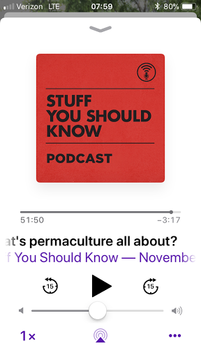
As with the previous version of the app, you tap the menu icon in the lower right to bring up play options.
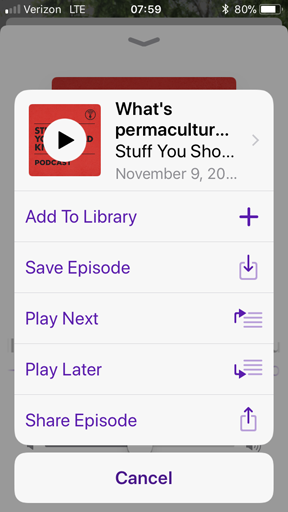
The options under this menu have changed. No more history and no way to see the contents of the queue. You can choose to play the current episode next with the “Play Next” option or add it into the black hole queue with “Play Later”.
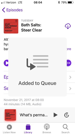
I say black hole because I cannot find the queue.
It’s hard to use this app if I can’t manage which episodes are playing. I’ve already had times where I added an episode twice or wanted to play a different episode before another one I just added to the queue. I’m stumped and upset.
Library
Some readers may have noticed there is a new option in that menu called “Add to Library”. I was really hoping the library was the queue. Instead it appears to replace the “My Podcasts” icon from the previous app version. Best I can tell, this is a list of the latest episodes the podcast thinks you would be interested in.
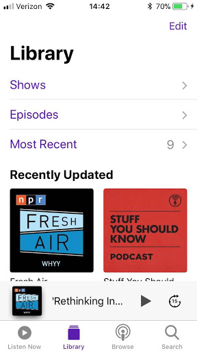
It is useful for navigating podcast feeds and episodes with the option to download to your device.
Listen Now
This was my last hope. I really thought this would be a list I could curate, but again, disappointment.
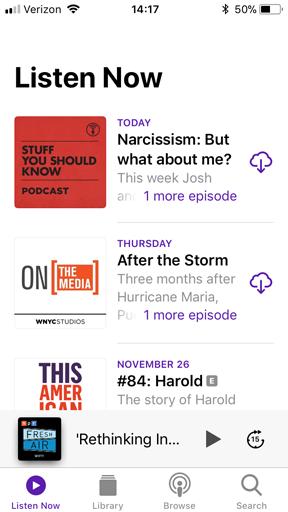
What we see is another list of latest episodes which I think excludes ones you’ve listened to already. So where is the queue? I guess it’s time to search for the answer. The first hit had a great response:
The fact that we have to Google how iOS screen design works shows how iOS screen design doesn’t work any more. I hate iOS 11.
The answer for how to view the queue–swipe up on the screen where the current episode is playing–isn’t working for me. I guess I’ll keep trying but seriously, I don’t understand why Apple obfuscates functionality with obscure gestures.
Update: So if you have episodes in the queue, you can scroll to the bottom of the currently playing episode screen to see what’s “Up Next”. However, if you have nothing in the queue, the section simply isn’t there.
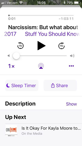
My design suggestions would be to make the queue more obvious and to call it a queue. I’d love to see a “Queue” icon at the bottom of the app. Calling it “Up Next” is confusing.