Another accessibility disaster. It’s great that people are finding creative ways to use JavaScript but it is not okay to ignore progressive enhancement techniques.
Your users should never see this instead of content:
Our site requires javascript, please enable javascript and refresh the browser window.
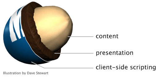
JS frameworks do a disservice to the Web after all the innovation and hard work that has gone into creating a separation model for content, presentation and client-side scripting.
The Texas Gas Service website gives us lots of examples. Let’s see how well we can use the site without a mouse, a.k.a tabbing through.
(Step 0: What is with this trend to play videos as background images? I thought we learned this lesson years ago. Having movement your users can’t disable is annoying and bad practice. Stop it.)

- Links I can’t click; let me count the ways
From the “I want to…” select menu to the hamburger menu to the footer, dozens of “links” are not marked up as<a href>and cannot be tabbed to, nor would they be read as links by a screen reader.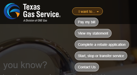
These aren’t links This is lazy and wrong. If something is a link, make it a link. Fake links achieved with JS only are a large accessibility barrier.
<div click.delegate="goTo('home', true)" class="btn pill-btn white-fill-btn au-target" show.bind="!session.loggedIn" au-target-id="111">Pay my bill</div> - Tabbing order fail
The tabindex attribute can be a really useful tool. It can also completely screw up a user’s ability to access important information, like the “username” field. When I could not tab to the “username” field, I looked at the code and saw the field was set totabindex=-1. I had to look this one up. Here’s a 2014 explanation from The Paciello Group:When
tabindexis set to a negative integer like-1, it becomes programmatically focusable but it isn’t included in the tab order. In other words, it can’t be reached by someone using the tab key to navigate through content, but it can be focused on with scripting.From my perspective as a customer who visits this page, being able to log in is the number one user story but it isn’t possible using a keyboard.
- Form validation errors
The only time the “username” field seems to get focus is if that field is empty when clicking the “Login” button. Plenty of client-side field validation solutions work without removing a field from the tabbing order.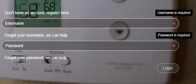
Login form validation errors with login button disabled If a user tries to login with bad data, a small modal window with a an unhelpful developer-style error message of “Login failed” appears at the top right of the page. There is no associated help text about the causes of the error, or which fields have errors, and focus is removed from the form making it that much harder to update the data.
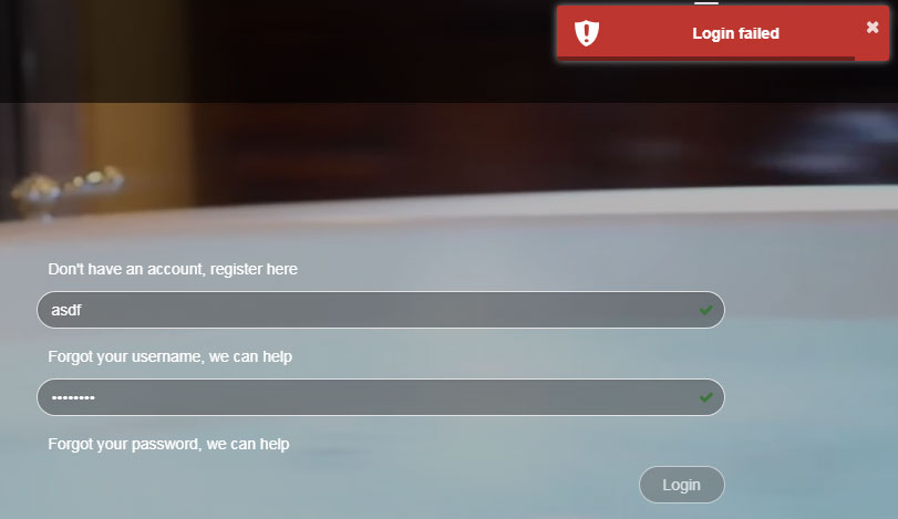
Login failed error modal window Adding to the confusion is the little green check in both fields indicating what would usually mean the field data is valid. But for this form, a green check merely indicates that a field isn’t blank. There isn’t any robust client-side validation occurring at all.
Pet peeve: What is the point of removing the browser scrollbar from the page? It provides a simple and useful way to indicate where I am on the page. This is something I really miss on mobile devices.