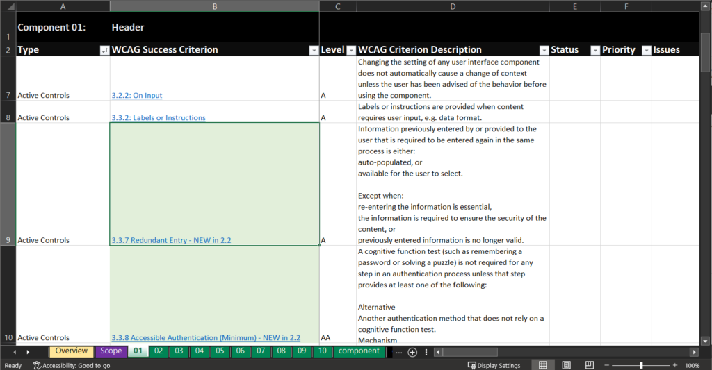
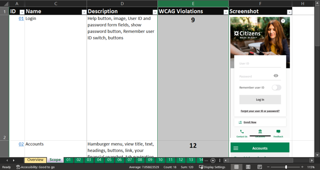
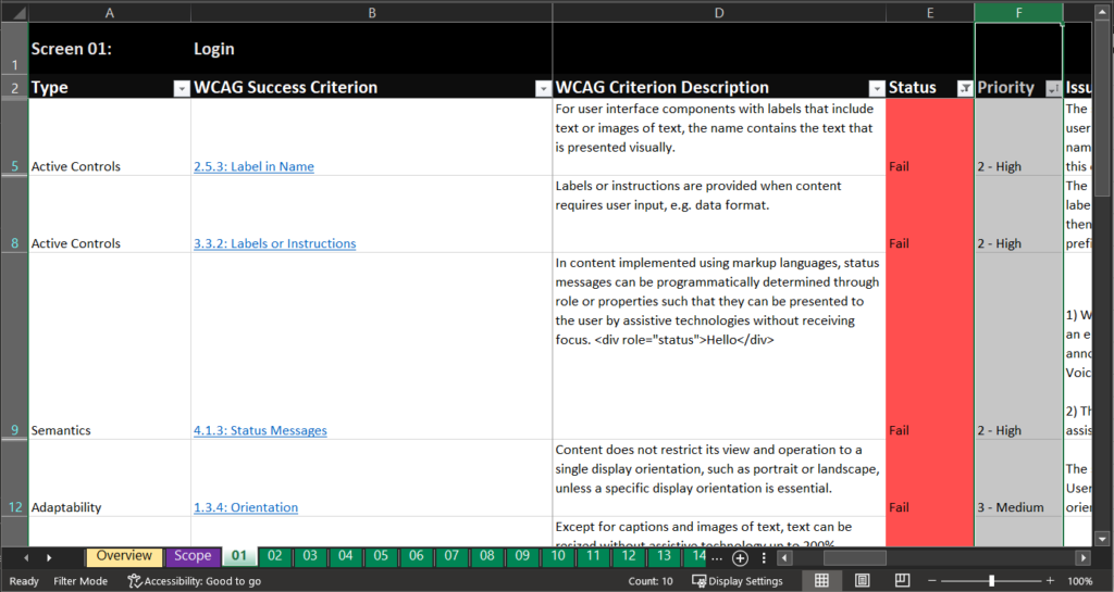
At my work, we struggle with constant turnover of full-stack developers working on the frontend who haven’t been trained in accessibility best practices. We’re limited in what we can teach them due to our team’s capacity so we came up with six quick checks for developers to complete in a web browser before submitting a PR.
Two smoke tests will uncover critical and high accessibility issues that will prevent some customers from using the webpage. Accessibility issues discovered during smoke testing should be resolved before release; otherwise we end up deploying real access barriers into production.
Spending a few minutes to test for accessibility will lead to savings in effort, efficiency and ultimately, money: On average, each accessibility defects costs about $2600 to fix (source: Karl Groves). Smoke testing decreases the amount of accessibility technical debt that many teams end up having to fix as fast followers.
Test 1: Use a keyboard
Keyboard accessibility is one of the most important aspects of web accessibility. Some people only use a keyboard to interact with webpages due to mobility limitations. Some people rely on screen readers which are used by navigating with a keyboard. When people can navigate a webpage using a keyboard only, it’s very likely the webpage will work for people using a multitude of assistive technologies to navigate, like refreshable Braille displays, sip and puff devices and switches. It’s important to ensure that every interactive element in the UI works as expected using only keyboard inputs.
Perform the 4 keyboard navigation checks
- Ensure all actions can be performed with a keyboard: All interactive elements can gain keyboard focus.
- Ensure there are no keyboard traps: If you can
tabto an element, you must be able totabaway from it. - Ensure the focus order is logical: Focus should move left to right, top to bottom following the natural reading order.
- Ensure keyboard focus is visible: All interactive elements have a visible indication of keyboard focus.
Keyboard focus examples
See the Pen HTML elements that receive keyboard focus by Rachele (@racheleditullio) on CodePen.
Test 2: Check for text and UI scaling
Good web applications respond to users’ browser preferences, including page zoom. When a webpage isn’t adaptable, users are blocked from accessing the content in a way that works for them. Adaptive content helps users viewing webpages on smaller mobile device screens and users who have scaled the browser or OS settings to view text and content at larger sizes.
Perform the 2 text and UI scaling checks
- Resize text: Zoom the browser window to 200% in a 1024×768 viewport or use the browser’s device emulator with a 1024×768 viewport at 200% zoom.
- Reflow: Zoom the browser window to 400% in a 1280×1024 viewport or use browser’s device emulator with a 320×256 viewport at 100% zoom.
MacOS browser zoom keyboard shortcuts:
- Press
command +to increase zoom level. - Press
command -to decrease zoom level. - Press
command 0to reset zoom level to 100%.
Windows browser zoom keyboard shortcuts:
- Press
ctrl +to increase zoom level. - Press
ctrl -to decrease zoom level. - Press
ctrl 0to reset zoom level to 100%.
At each zoom level, check the webpage for the following:
- Is there a meaningful change in the text displayed onscreen? All text should scale up or down linearly.
- Does any content overlap or run off the screen? No content should overlap, and text should either wrap or (in some limited cases) be truncated. In cases where text wraps, containers should be scrollable if there is a height constraint; text and webpages should not scroll horizontally. Text should not run off the screen altogether.
- Does the screen still make sense? There should still be some visual hierarchy in the relationships between headings, paragraphs of text, graphics, controls and other elements on the screen.
References
Tools for performing the tests
- Set your viewport size manually: WhatIsMyViewport.com
- Browser viewport resizing extension for Chromium browsers like Window Resizer
- The Chromium browser’s device emulator in Dev Tools (
F12)
Smoke testing success criteria
| Smoke test | WCAG Success Criteria |
|---|---|
| Ensure all actions can be performed with a keyboard. | 2.1.1 Keyboard |
| Ensure there are no keyboard traps. | 2.1.2 No Keyboard Trap |
| Ensure the focus order is logical. | 2.4.3 Focus Order |
| Ensure keyboard focus is visible. | 2.4.7 Focus Visible |
| Ensure text resizes 200% in a 1024×768 viewport. | 1.4.4 Resize Text |
| Ensure content reflows in a 320×256 viewport. | 1.4.10 Reflow |