Last updated: 27 January 2023
This article is in response to Adrian Roselli’s article Comparing Manual and Free Automated WCAG Reviews. Go read it first for background.
Automated accessibility testing tools cannot test all of the Web Content Accessibility Guidelines (WCAG) success criteria. Adrian tested four free tools and compared them to his manual testing results. My intent is to add to the body of knowledge by providing results from the Level Access AMP accessibility testing tool. Level Access also provides a free browser extension that runs the same tests called Access Assistant.
I wanted to compare Level Access’s tools to Adrian’s manual testing findings because these tools are what we use at my work and I share his concerns that too many stakeholders lean on automated testing when it uncovers only a portion of potential problems.
Process
I tested the same page, web.dev, and performed a review with the following tools against WCAG 2.1 Level A and Level AA:
- AMP v9.40.2 in Chrome
- Access Assistant v8.10.0.11 browser extension for Chrome
I performed the tests on 19 January 2023 with a live version of the site. It does not seem to have changed since Adrian’s testing on 14 January 2023 of these four automated tools:
- axe DevTools v4.47.0 browser extension (using axe-core v4.6.2) for Chrome and Firefox.
- ARC Toolkit v5.4.2 browser extension for Chrome.
- WAVE Evaluation Tool v3.2.2.0 browser extension for Chrome and Firefox.
- Equal Access Accessibility Checker (EAAC) v3.1.42.9999 browser extension for Chrome and Firefox.
All references to manual testing results are Adrian’s data. I did not find anything additional in my manual testing.
Highlights
| Tool | Total | A | AA |
|---|---|---|---|
| Manual | 18 | 11 | 7 |
| AMP | 5 | 5 | 0 |
| axe | 2 | 2 | 0 |
| ARC | 3 | 3 | 0 |
| WAVE | 0 | 0 | 0 |
| EAAC | 3 | 3 | 0 |
We compare this to the total number of unique failures as some issues have multiple instances but are counted only once and some success criteria have multiple issues.
| Tool | Total | A | AA |
|---|---|---|---|
| Manual | 37 | 24 | 11 |
| AMP | 4 | 4 | 0 |
| axe | 2 | 2 | 0 |
| ARC | 3 | 3 | 0 |
| WAVE | 0 | 0 | 0 |
| EAAC | 5 | 5 | 0 |
Some tools provide alerts for issues to check manually, including AMP.
| Tool | Alerts |
|---|---|
| Manual | 0 |
| AMP | 10 |
| axe | 0 |
| ARC | 7 |
| WAVE | 6 |
| EAAC | 20 |
Raw results
This section provides the output as provided by AMP for the various success criteria. It also includes alerts or what AMP calls “Needs Review” issues.
WCAG failures
The following table compares WCAG Level A failures between manual testing and AMP automated results.
| WCAG 2.1 SCs at Level A | Manual | AMP |
|---|---|---|
| 1.1.1 Non-text Content | Fail |
Fail
|
| 1.2.1 Audio-only and Video-only (Prerecorded) | Pass | |
| 1.2.2 Captions (Prerecorded) | N/A | |
| 1.2.3 Audio Description or Media Alternative (Prerecorded) | N/A | |
| 1.3.1 Info and Relationships | Fail |
Fail
|
| 1.3.2 Meaningful Sequence | Pass | |
| 1.3.3 Sensory Characteristics | N/A | |
| 1.4.1 Use of Color | Fail | |
| 1.4.2 Audio Control | N/A | |
| 2.1.1 Keyboard | Pass |
Fail
|
| 2.1.2 No Keyboard Trap | Pass | |
| 2.1.4 Character Key Shortcuts | N/A | |
| 2.2.1 Timing Adjustable | N/A | |
| 2.2.2 Pause, Stop, Hide | Fail | |
| 2.3.1 Three Flashes or Below Threshold | Pass | |
| 2.4.1 Bypass Blocks | Pass | |
| 2.4.2 Page Titled | Fail | |
| 2.4.3 Focus Order | Fail | |
| 2.4.4 Link Purpose (In Context) | Pass | |
| 2.5.1 Pointer Gestures | N/A | |
| 2.5.2 Pointer Cancellation | Pass | |
| 2.5.3 Label in Name | Fail | |
| 2.5.4 Motion Actuation | N/A | |
| 3.1.1 Language of Page | Pass | |
| 3.2.1 On Focus | Pass | |
| 3.2.2 On Input | Fail | |
| 3.3.1 Error Identification | Fail | |
| 3.3.2 Labels or Instructions | Fail | |
| 4.1.1 Parsing | N/A | |
| 4.1.2 Name, Role, Value | Fail |
Fail
|
NOTE: The rule “Ensure list items are found in a list container” failed in AMP for two success criteria, both 1.3.1 Info and Relationships and 4.1.1 Parsing.
AMP did not fail any WCAG Level AA success criteria so I am not including that table of results. Manual testing found 11 unique failures.
Alerts
AMP provides additional potential issues as a list of “Needs Review” items. These alerts may or may not be WCAG failures and require manual review to determine if there is an accessibility issue.
- Avoid inappropriate use of ARIA roles, states, and properties, cites 4.1.2 Name, Role, Value. The A element has an aria-hidden attribute set to the value: true. [2 instances]
- Provide valid, concise, and meaningful alternative text for image buttons, cites 1.1.1 Non-text Content and 4.1.2 Name, Role, Value. This button element has a suspicious accessible name value of: all. [1 instance]
- Ensure link text is meaningful within context, cites 2.4.4 Link Purpose (In Context). This A element has a suspicious (i.e. lacks purpose or is >150 characters) calculated accessible name value of: css. [1 instance]
- Provide synchronized captions for video (which includes audio) or other multimedia, cites 1.2.2 Captions (Prerecorded) and 1.2.4 Captions (Live). This video element does not have a track with kind=captions. [1 instance]
- Ensure heading level matches the heading’s visual importance/level, cites 1.3.1 Info and Relationships. [4 instances]
- This article element contains an incorrect or missing heading level which may cause improper nesting within the document heading hierarchy.
- This H3 creates an inappropriate jump in heading levels within the document heading hierarchy.
- This H5 creates an inappropriate jump in heading levels within the document heading hierarchy.
- This H1 creates an inappropriate jump in heading levels within the document heading hierarchy.
- Provide an informative context-sensitive page title, cites 2.4.2 Page Titled. This title has a suspicious value. [1 instance]
Access Assistant
The Access Assistant browser extension Quick Test returned nearly the same results as the AMP test but as a list of issues with code snippets. Accessing the link for each issue displays an explanation of the issue but does not reference any rules or standards.
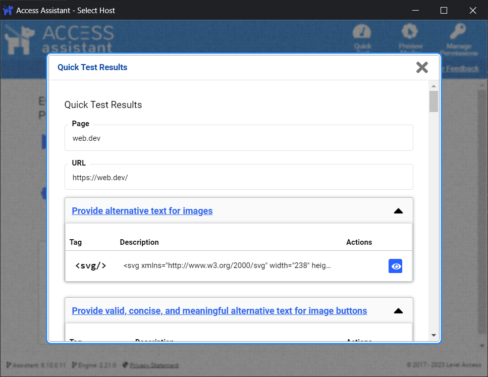
* denotes violations flagged by AMP:
- Provide alternative text for images.*
- Ensure text and images of text provide sufficient contrast.
- Provide valid, concise, and meaningful alternative text for image buttons.
- Ensure heading level matches the heading’s visual importance/level. [4 instances]
- Ensure list items are found in a list container. [28 instances]*
- Ensure all active elements receive keyboard focus or can be activated with the keyboard.
- Avoid placing inactive elements in the focus order. [2 instances]*
- Provide an informative, context-sensitive page title.
- Ensure link text is meaningful within context.
- Ensure ARIA roles, states, and properties are valid. [28 instances]*
- Avoid inappropriate use of ARIA roles, states, and properties. [2 instances]
- Provide synchronized captions for video (which includes audio) or other multimedia.
The Quick Test found one issue to check that was not flagged by AMP as either a violation or alert: Ensure text and images of text provide sufficient contrast.
Conclusion
The automated testing results from the Level Access tools are comparable with the other automated tools Adrian tested with manual testing finding more than 9x the unique success criteria issues. Use automated testing tools in tandem with manual testing to find the most potential accessibility issues. Relying on any automated testing alone will leave you with access gaps for your users.
Update: 27 January 2023
I’ve updated the Highlights data tables to reflect Adrian’s findings for the four automated tools he tested. For the sample, Access Assistant found more issues than WAVE Evaluation Tool, axe DevTools, and ARC Toolkit, and fewer than Equal Access Accessibility Checker.