I went to the movies this week for the first time since the pandemic began. I looked up showings at the Alamo Drafthouse and discovered little has improved with their payment process since I reviewed it on desktop back in 2016. This time, I completed the purchase on an iPhone using the responsive mobile website in the Firefox browser.
While I found several accessibility issues with the site, I’m highlighting concerns with the “Payment” screen. I’m neurodivergent and this post focuses on five things that cause me anxiety and make the experience frustrating:
- Required fields are not marked
- Submit button is disabled
- Error messages don’t offer suggestions
- Data formats are placeholder text
- Optional checkbox is already checked
Required fields are not marked
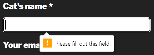
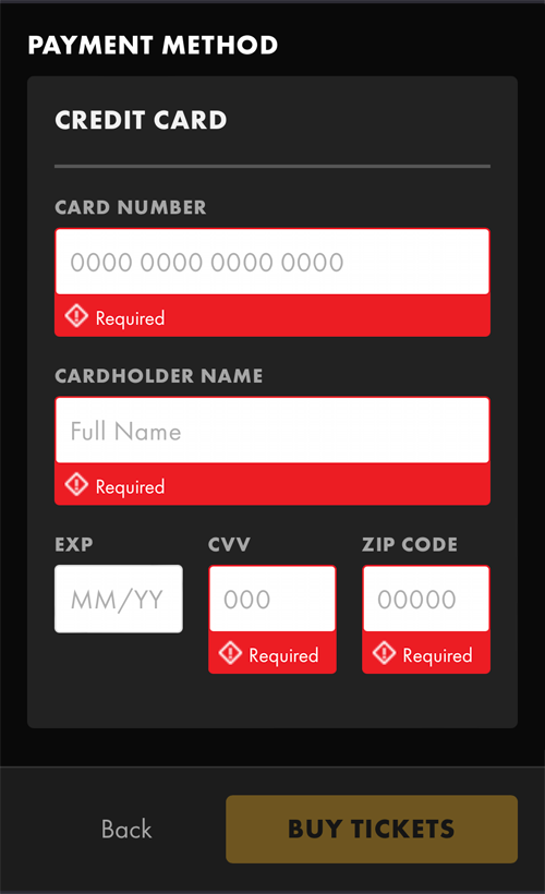
I’ve done enough online ordering that I assumed that all the credit card-related fields are required, but many people will not understand that. E-commerce research suggests that marking all fields, required or optional, improves the customer experience. It certainly lessens my anxiety to know exactly which fields to complete.

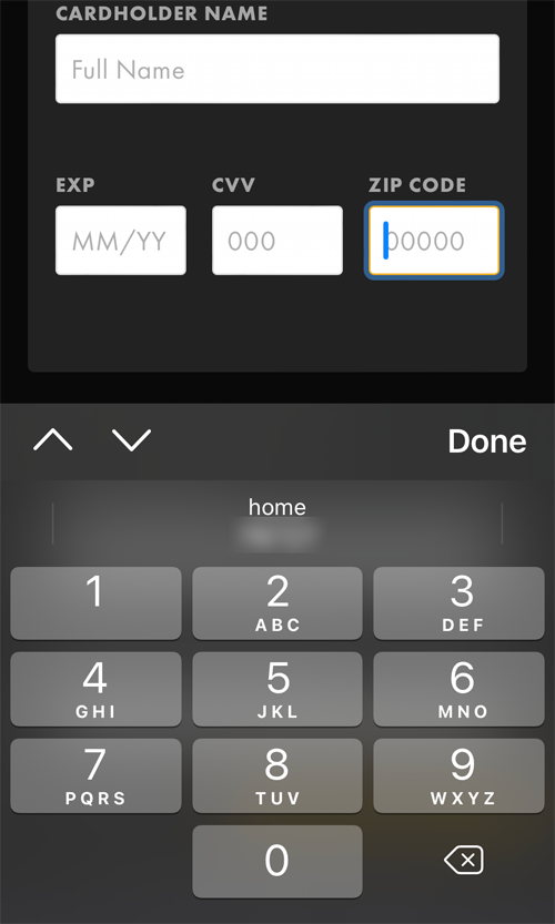
Not only are required fields not clearly marked, but merely interacting with a field causes the display of an angry, red “Required” message. (This does not work for the “EXP” field even though it is required.) These input fields use a combination of the HTML required attribute with an aria-describedby attribute for the error message which causes assistive technology to announce fields are required multiple times.
Submit button is disabled
From the previous screenshots, we can see the next issue that causes me a lot of anxiety when using a website. The “Buy Tickets” button, which is the submit button for the form, is disabled by default. The button becomes enabled only after data has been entered into all the required form fields, which are not clearly marked.
There are two more required form fields below the credit card fields but they are easy to miss because of the sticky footer with the “Buy Tickets” button, meaning that after entering all credit card details, this button is still disabled.
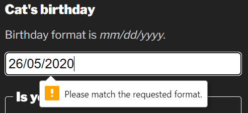
Error messages don’t offer suggestions
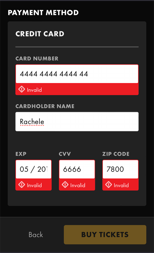
The default error message for empty fields is “Required”. If a user enters data in the wrong format, the error messages change to “Invalid”. This doesn’t help the user in any way to figure out how to fix the error.
Here are some examples of helpful error messages:
- Card Number: Please enter 16 digits
- EXP: Please enter 2-digit year
- CVV: Please enter 3 digits
- Zip Code: Please enter 5-digit US zip code
“Zip Code” is the only field requesting numerical data that displays the numerical keyboard on mobile devices. Adding the inputmode="numeric" attribute to every field requesting numerical data will display the numerical keyboard too, which improves the accuracy of data entered into these fields.
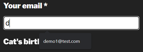
Data formats are placeholder text
The requested data format for all the “Payment” screen fields are implemented as placeholder text. This means that once a person starts to enter data into the field, the required formatting of that data disappears. People are forced to recall from memory how to enter the data correctly. On top of this, the “EXP” and “CVV” fields allow someone to enter more digits than the data format allows.
The video below demonstrates what a person using assistive technology, like a screen reader, experiences when exploring the form. Notice how placeholder data are not consistently announced by VoiceOver.
Optional checkbox is already checked
Following the credit card-related fields is the “Email Confirmation” section which includes a checkbox that is already checked:
Join Alamo Victory
By checking “Join Alamo Victory” you start earning visits with this purchase for rewards and you agree to Alamo Drafthouse Cinema’s terms of use.
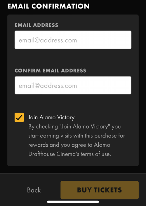
This is an optional field. It should require that I choose to check it. Because of its location behind the sticky footer, it’s very likely people will not see this checkbox and inadvertently join this program. Having to look for sneaky UI patterns like this makes for a bad experience.
Conclusion
This website has made some improvements like providing a “Back” button after timeout and inline form field validation. I also give the developers kudos for appropriately implementing the autocomplete attribute on the credit card-related fields. I’d make the following changes to the “Payment” screen to create a better experience for neurodivergent people:
- Clearly indicate which form fields are required
- Don’t disable the submit button
- Offer suggestions for fixing data input errors
- Display required data formats at all times
- Don’t pre-check checkboxes for optional promotions