Structuring accessible forms

Last updated: 27 January 2023

Forms have a strong semantic structure from labeling controls to ensuring the states of controls are announced by assistive technology. We look at the basics of building a form with different input types, adding in the necessary HTML attributes to link our form elements semantically, sprinkling in ARIA attributes and data validation and errors.

Below is the Code Pen for my accessible form example. Access the code in the GitHub repository.

See the Pen Accessible Forms by Rachele (@racheleditullio) on CodePen.

Creating our form fields

The two basic parts of a form field are its <label> and <input> elements. We semantically link the two by

  • Using the <label for="uniqueID"> attribute which matches the <input id="uniqueID"> attribute; or
  • Making the <input> element a child of the <label> element

Doing so allows screens readers to announce the field’s <label> when the <input> gets focus. It also enables the <label> as an additional hit area when using the mouse to focus on an <input>, which is especially useful for checkboxes and radio buttons.

We also need to specify the type of input using the <input type=""> attribute. Putting those together, we have a basic form with one text field and two radio buttons.

<form>
  <label for="name">Cat's name</label>
  <input type="text" id="name" name="name">

  <label><input type="radio" id="yes"> Yes</label>
  <label><input type="radio" id="no"> No</label>

  <button type="submit">Send</button>
</form>

A note on comboboxes

As much as possible, use native HTML <select> and <option> elements to create an expandable list of single-select options.

...
<label for="markings">Cat's markings</label>
<select name="markings" id="markings">
  <option value=""> select an option </option>
  <option value="solid">Solid</option>
  <option value="bi">Bi-color</option>
  ...
</select>
...

autocomplete attribute

Part of structuring an accessible form is providing information about the type of data required by the field and providing autocomplete options if available. We do this by adding the autocomplete attribute to form fields asking for personal information.

<input type="email" id="email" name="email" autocomplete="email">

Below are some common examples of fields asking for personal information and their autocomplete values. Reference the full list of autocomplete values.

  • First name: given-name
  • Last name: family-name
  • Email: email
  • Username: username
  • Company: organization
  • Zip code: postal-code

If autocomplete information is available in the browser, fields with the autocomplete attributes will offer suggestions.
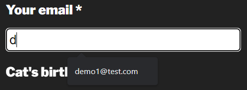
Autocomplete suggestion for an email field in Chrome

Grouping similar fields

Our radio buttons are labeled ‘yes’ and ‘no,’ but what are they for? We need to use the <fieldset> and <legend> elements to provide that semantic meaning. The <fieldset> groups the related form fields while the <legend> provides a name for the grouping. These are most often used for checkboxes and radio buttons but they can be useful for grouping other related fields, e.g. Shipping address.

Since radio button options may have similar names, group like radio buttons with the name="groupName" attribute. Keyboard users move between radio buttons in a group with the arrow keys.

...
<fieldset>
  <legend>Is your cat altered?</legend>
    <label><input type="radio" name="altered" id="yes"> Yes</label>
    <label><input type="radio" name="altered" id="no"> No</label>
</fieldset>
...

Marking required fields

Provide a visible indication of the required fields for sighted users, such as an asterisk. Include text before the form indicating how users can recognize required fields. See Kitty Giraudel’s article The required fault in our stars for a discussion on ways to denote required fields. Research from Baymard suggests e-commerce sites need to mark both required and optional fields.

Then there are two attributes we can use to programmatically define required fields: aria-required="true" and required. Use one (not both) of these attributes to ensure required fields are conveyed appropriately to assistive technology. Screen readers will say required when announcing the form field name, role and state.

...
<label for="name">Cat's name*</label>
<input type="text" id="name" name="name" required>

<label for="email">Your email*</label>
<input type="email" id="email" name="email" autocomplete="email" aria-required="true">
...

The required attribute provides a first layer of form validation on submit. Many modern browsers will not submit a form with empty required fields and will even provide a visible error message.
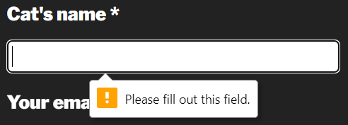
Required field in Chrome

However, user agent error handling is not dependable as these error messages are not always announced or available to assistive technology; they can’t be styled or resized; and they are not persistent. To disable browser validation testing, include the novalidate attribute in the <form> element.

Verifying data

In addition to marking fields as required for assistive technology, we also have to indicate if the data entered into each field is valid. All required fields should also include the aria-invalid="true" attribute added with JavaScript once the form has been submitted. Remove this attribute once valid data is entered.

We can further enforce data validation in HTML for fields that aren’t necessarily required by using the pattern attribute that accepts a regular expression. Let’s create a field for collecting birthday with a required format of mm/dd/yyyy.

...
<input type="text" id="birthday" name="birthday" pattern="^\s*(1[012]|0?[1-9])\/(3[01]|[12][0-9]|0?[1-9])\/((?:19|20)\d{2})\s*$" aria-describedby="error4">
<p id="error4">Birthday format mm/dd/yyyy</p>
...

This pattern matching prevents the form from submitting if the data entered does not match the specified pattern.
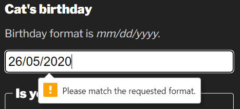
A form field that fails pattern validation in Chrome

Ensure users of assistive technology are aware of the required pattern by programmatically linking the help text with the form field using the aria-describedby attribute.

inputmode attribute

We can make it easier for people entering the date into the form field on mobile devices by adding the inputmode attribute. This attribute allows us to specify which virtual keyboard is displayed in supported browsers. Since dates are numeric, we can use inputmode="numeric" to display the numbers keyboard which provides fewer options and larger hit areas for each key.
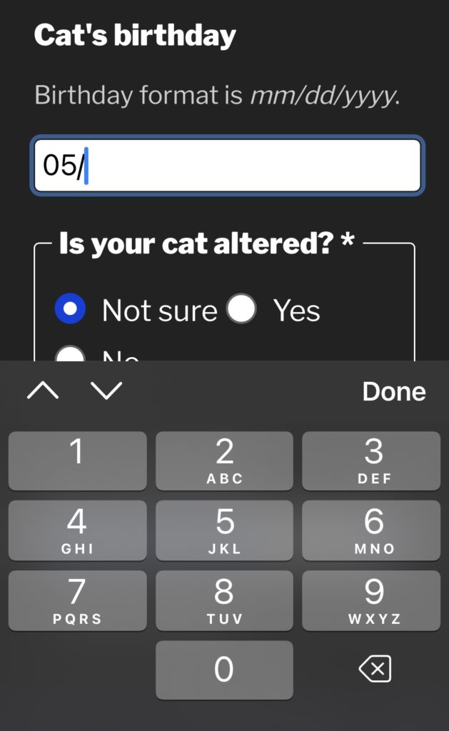
screen shot of a mobile website form with the cursor in a field called Cat's birthday while the numeric virtual keyboard displays below.
Numeric virtual keyboard on iOS

Note: In my demo, I use JavaScript to add the slash characters to the date automatically as the slash character is not available on the numeric virtual keyboard.

Handling errors

It’s important to provide a list of all errors at the top of the form or provide them in-context of the field in error. We can programmatically link the error message with the form field using the aria-describedby attribute. This is only necessary when an error message provides information that helps the user enter the correct data.

...
<input type="email" id="email" name="email" autocomplete="email" aria-required="true" aria-describedby="error-email">
<p id="error-email">Email format email@domain.com</p>
...

When assistive technology users focus on the email field, the error message is announced along with the name, role and state of the field.

Error messages must be visible, persistent and close to the field in error. Don’t rely on color alone to convey errors. Include an icon with “error” as the text. Move focus to the error messages at the top of the form or to the first field in error on form submit.
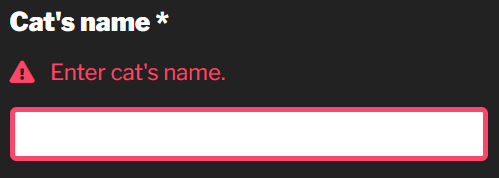
A form field in error using JavaScript validation

Conclusion

I hope you found something to make your forms more accessible. I like forms because they have such a strong semantic structure. There are a lot of things to get right but it’s pretty straightforward what “right” means in this context: Make sure anything that is conveyed visually is also conveyed to assistive technology, including the states of form fields.

How accessible is the 2020 US census?

Like most US households, I received my 2020 census form in the mail this past week and I decided to see how accessible the process really is since it’s a US government website subject to Section 508 compliance.

back of the envelope for the 2020 US Census form. It says shape your future start here Census 2020

The first thing to note is that someone with low vision or who is blind might have trouble with this whole process because the paper form that arrived in the mail does not have particularly large print nor does it include even cursory instructions in Braille. For deaf or hard of hearing people, there is a TDD number but only if you speak English. I think it’s safe to say that many people with disabilities will have to rely on someone else’s help to complete the process.

Let’s take a look at the website that the paper form directs you to visit: my2020census.gov.

screen shot of the Census 2020 homepage

I found a few oddities with the home page while using a screen reader:

  • The very first text a screen reader user encounters is a technology warning: If you are using a screen reader, it is recommended that you use the latest version of Internet Explorer and the JAWs [J-A-W-S] screen reader. I’m testing with Chrome and NVDA and this website should work with all major browser/screen reader combinations.
  • The first focusable element is a “skip to main content” link which works fine for a keyboard user but announces blank when using a screen reader because focus is moved to a <div> element with a role=button but no label.
<div role="button" tabindex="0">
<img src="/static/images/start-here.png" class="img-responsive" alt="Start Here Shape your future">
<button type="button" title="Start Questionnaire" name="Start Questionnaire">Start Questionnaire</button>
<div id="recaptcha-container"></div>
  • And as we can see from the screen shot below, the reading order does not match the focus order. The “skip to main content” link sends focus to after all the important instructional information.
screen shot of the census 2020 home page with the focus on the right side of the page
  • Lastly, neither the home page nor the questionnaire pages have <h1> headings or unique page titles to adequately convey place in site.

Start the questionnaire

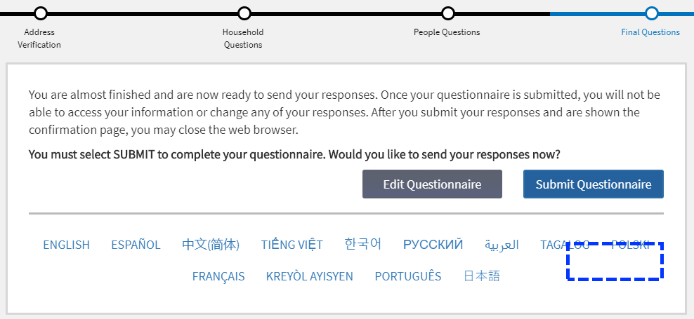
At the top of the questionnaire pages is a status bar similar to what you might see during a checkout process for online shopping.

screen shot of the census 2020 status bar starting with address verification, household questions, people questions, then final questions.

There are two problems here:

  1. There isn’t any screen-reader accessible help text explaining that it’s a status bar, like a heading, nor any text to indicate which step the user is currently on so it’s useless for someone using a screen reader.
  2. This is the login in screen but the “Address Verification” step is highlighted in the status bar.

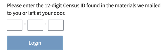
The login form itself has very good screen reader label text for the three form fields.

screen shot of the census ID form fields and login button.
  • Enter the first 4 digits of your Census ID
  • Enter the next 4 digits of your Census ID
  • Enter the last 4 digits of your Census ID

But it’s kind of ironic because someone who can’t see the paper letter with their census ID won’t be able to type it in anyway unless someone reads it off to them.

Address verification section

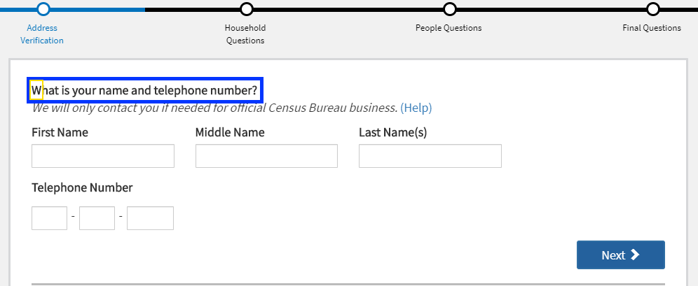
Once you get past the login screen, the status bar at the top properly indicates to a screen reader user where they are the process: progress bar You are on section 1, the address verification section. But, they are unlikely to benefit from this because every time you click the “Next” button, focus is moved to the question text, not the top of the page.

screen shot of a census question with focus indicator on the question text.

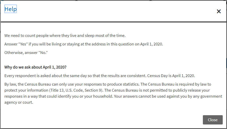
Each question has a “Help” link next to it that opens a modal dialog window which is properly coded by:

  • Moving focus to the modal window heading <h1>
  • Keeping focus in the modal window
  • Providing close buttons to exit the modal window
screen shot of a modal window with focus on the help heading and includes an x button and a close button.

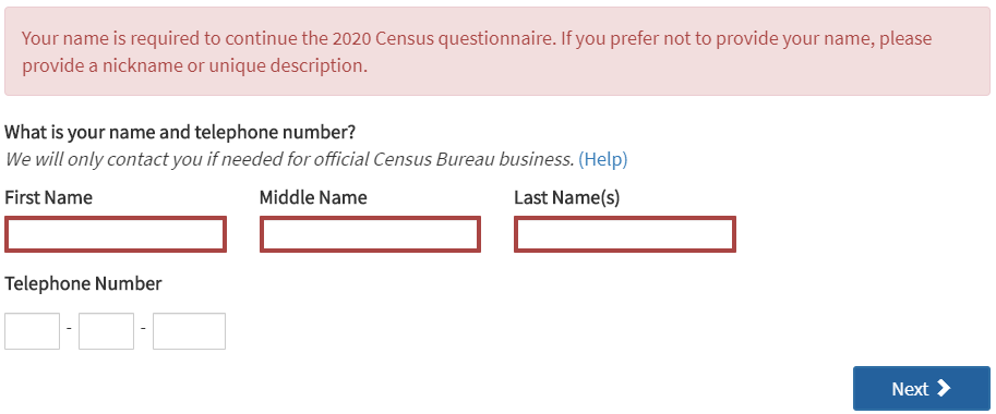
If you click the “Next” button without completing the required fields, you get an alert and the required fields are outlined in a thick, red border.

<div role="alert">Your name is required to continue the 2020 Census questionnaire. If you prefer not to provide your name, please provide a nickname or unique description.</div>
screen shot of an alert message above required form fields that are blank.

The three “Telephone Number” fields are required but leaving them blank triggers a separate alert message after filling out the name fields. All required fields should be clearly indicated both visually and to a screen reader user.

Household questions

When the “Household” section loaded, the screen reader was silent so there’s something going on with managing focus on this section. It’s hard to troubleshoot because the application is not designed to let you go back to previous questions or sections.

Instead of a “Help” link for the first question, there was this link text: For more information on who to include, click here. What the screen reader announced, though, was: Help link popcount question. A look at the code shows there are both a title attribute and an aria-label attribute on the link with this nonsensical name.

<a href="#" title="Help link popcount question" aria-label="Help link popcount question">For more information on who to include, click here.</a>

People questions

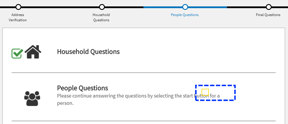
Just as with the “Household questions” section, when the questionnaire moved to the “People questions” section, the screen reader was silent and I could see focus remained on the “Next” button that was removed from the DOM.

screen shot of the census dashboard with focus indicator on invisible button.

These are not marked up as headings.

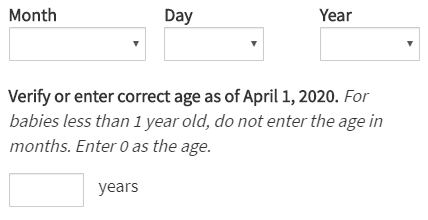
This section asks information about each of the persons entered in the “Household questions” section, including birthday.

screenshot of a form asking for birthdate as month, day, year and then verify calculated age.

After selecting the month, day and year, the next input displays a calculated age but the help text after the label does not get read by a screen reader in forms mode because it is not programmatically associated with it using aria-describedby or located inside the <label>.

<label for="P_AGE_INT">Verify or enter correct age as of April 1, 2020.</label>
<span>For babies less than 1 year old, do not enter the age in months. Enter 0 as the age.</span>

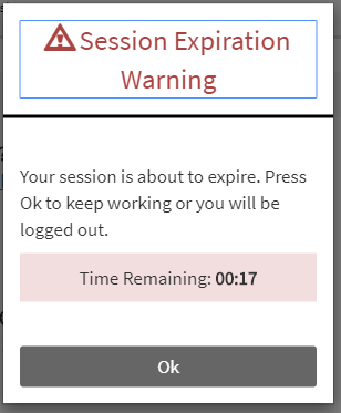
The site does a nice job with its session expiration warning both visually and by sending an alert to screen reader users.

screen shot of a session expiration warning with 17 seconds remaining.

Submit questionnaire

This screen also has a focus management issue. The screen reader doesn’t announce anything when the final screen loads and you can see in the screen shot below how focus remains on the “Next” button that was removed from the DOM.

screen shot of the last screen in the questionnaire with focus left on an element removed from the DOM.

And the same thing happens after clicking the “Submit Questionnaire” button and you’re shown the confirmation page. This site needs more testing with a screen reader and better focus management.

Texas Gas Service Homepage

Another accessibility disaster. It’s great that people are finding creative ways to use JavaScript but it is not okay to ignore progressive enhancement techniques.

Your users should never see this instead of content:

Our site requires javascript, please enable javascript and refresh the browser window.

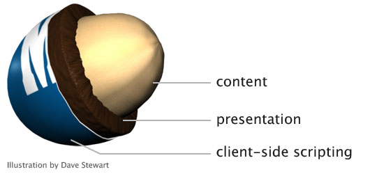
JS frameworks do a disservice to the Web after all the innovation and hard work that has gone into creating a separation model for content, presentation and client-side scripting.

drawing of a peanut M&M candy showing content as the peanut, presentation as the chocolate layer and client-side scripting as the candy shell
Layering content, presentation and client-side scripting – Drawing by Dave Stewart

The Texas Gas Service website gives us lots of examples. Let’s see how well we can use the site without a mouse, a.k.a tabbing through.

(Step 0: What is with this trend to play videos as background images? I thought we learned this lesson years ago. Having movement your users can’t disable is annoying and bad practice. Stop it.)

screenshot of the Texas Gas Service home page with user login form
Texas Gas Service homepage

  1. Links I can’t click; let me count the ways
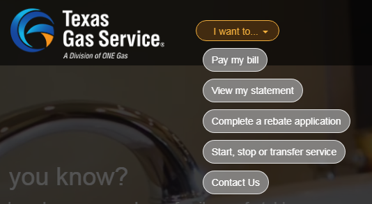
    From the “I want to…” select menu to the hamburger menu to the footer, dozens of “links” are not marked up as <a href> and cannot be tabbed to, nor would they be read as links by a screen reader.

    screen shot of the expanded I want to... menu
    These aren’t links

    This is lazy and wrong. If something is a link, make it a link. Fake links achieved with JS only are a large accessibility barrier.

    <div click.delegate="goTo('home', true)" class="btn pill-btn white-fill-btn au-target" show.bind="!session.loggedIn" au-target-id="111">Pay my bill</div>

  2. Tabbing order fail
    The tabindex attribute can be a really useful tool. It can also completely screw up a user’s ability to access important information, like the “username” field. When I could not tab to the “username” field, I looked at the code and saw the field was set to tabindex=-1. I had to look this one up. Here’s a 2014 explanation from The Paciello Group:

    When tabindex is set to a negative integer like -1, it becomes programmatically focusable but it isn’t included in the tab order. In other words, it can’t be reached by someone using the tab key to navigate through content, but it can be focused on with scripting.

    From my perspective as a customer who visits this page, being able to log in is the number one user story but it isn’t possible using a keyboard.

  3. Form validation errors
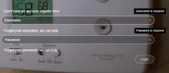
    The only time the “username” field seems to get focus is if that field is empty when clicking the “Login” button. Plenty of client-side field validation solutions work without removing a field from the tabbing order.

    screen shot of the login form with validation errors for the empty username and password fields
    Login form validation errors with login button disabled

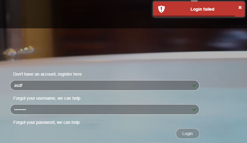
    If a user tries to login with bad data, a small modal window with a an unhelpful developer-style error message of “Login failed” appears at the top right of the page. There is no associated help text about the causes of the error, or which fields have errors, and focus is removed from the form making it that much harder to update the data.

    screenshot of the error message login failed in a modal window
    Login failed error modal window

    Adding to the confusion is the little green check in both fields indicating what would usually mean the field data is valid. But for this form, a green check merely indicates that a field isn’t blank. There isn’t any robust client-side validation occurring at all.

Pet peeve: What is the point of removing the browser scrollbar from the page? It provides a simple and useful way to indicate where I am on the page. This is something I really miss on mobile devices.