Last updated: 27 January 2023
Forms have a strong semantic structure from labeling controls to ensuring the states of controls are announced by assistive technology. We look at the basics of building a form with different input types, adding in the necessary HTML attributes to link our form elements semantically, sprinkling in ARIA attributes and data validation and errors.
Below is the Code Pen for my accessible form example. Access the code in the GitHub repository.
See the Pen Accessible Forms by Rachele (@racheleditullio) on CodePen.
Creating our form fields
The two basic parts of a form field are its <label> and <input> elements. We semantically link the two by
- Using the
<label for="uniqueID">attribute which matches the<input id="uniqueID">attribute; or - Making the
<input>element a child of the<label>element
Doing so allows screens readers to announce the field’s <label> when the <input> gets focus. It also enables the <label> as an additional hit area when using the mouse to focus on an <input>, which is especially useful for checkboxes and radio buttons.
We also need to specify the type of input using the <input type=""> attribute. Putting those together, we have a basic form with one text field and two radio buttons.
<form>
  <label for="name">Cat's name</label>
  <input type="text" id="name" name="name">

  <label><input type="radio" id="yes"> Yes</label>
  <label><input type="radio" id="no"> No</label>

  <button type="submit">Send</button>
</form>
A note on comboboxes
As much as possible, use native HTML <select> and <option> elements to create an expandable list of single-select options.
...
<label for="markings">Cat's markings</label>
<select name="markings" id="markings">
  <option value=""> select an option </option>
  <option value="solid">Solid</option>
  <option value="bi">Bi-color</option>
  ...
</select>
...
autocomplete attribute
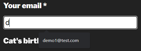
Part of structuring an accessible form is providing information about the type of data required by the field and providing autocomplete options if available. We do this by adding the autocomplete attribute to form fields asking for personal information.
<input type="email" id="email" name="email" autocomplete="email">
Below are some common examples of fields asking for personal information and their autocomplete values. Reference the full list of autocomplete values.
- First name:
given-name - Last name:
family-name - Email:
email - Username:
username - Company:
organization - Zip code:
postal-code
If autocomplete information is available in the browser, fields with the autocomplete attributes will offer suggestions.
Grouping similar fields
Our radio buttons are labeled ‘yes’ and ‘no,’ but what are they for? We need to use the <fieldset> and <legend> elements to provide that semantic meaning. The <fieldset> groups the related form fields while the <legend> provides a name for the grouping. These are most often used for checkboxes and radio buttons but they can be useful for grouping other related fields, e.g. Shipping address.
Since radio button options may have similar names, group like radio buttons with the name="groupName" attribute. Keyboard users move between radio buttons in a group with the arrow keys.
...
<fieldset>
  <legend>Is your cat altered?</legend>
    <label><input type="radio" name="altered" id="yes"> Yes</label>
    <label><input type="radio" name="altered" id="no"> No</label>
</fieldset>
...
Marking required fields
Provide a visible indication of the required fields for sighted users, such as an asterisk. Include text before the form indicating how users can recognize required fields. See Kitty Giraudel’s article The required fault in our stars for a discussion on ways to denote required fields. Research from Baymard suggests e-commerce sites need to mark both required and optional fields.
Then there are two attributes we can use to programmatically define required fields: aria-required="true" and required. Use one (not both) of these attributes to ensure required fields are conveyed appropriately to assistive technology. Screen readers will say required when announcing the form field name, role and state.
...
<label for="name">Cat's name*</label>
<input type="text" id="name" name="name" required>

<label for="email">Your email*</label>
<input type="email" id="email" name="email" autocomplete="email" aria-required="true">
...
The required attribute provides a first layer of form validation on submit. Many modern browsers will not submit a form with empty required fields and will even provide a visible error message.
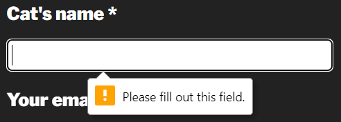
However, user agent error handling is not dependable as these error messages are not always announced or available to assistive technology; they can’t be styled or resized; and they are not persistent. To disable browser validation testing, include the novalidate attribute in the <form> element.
Verifying data
In addition to marking fields as required for assistive technology, we also have to indicate if the data entered into each field is valid. All required fields should also include the aria-invalid="true" attribute added with JavaScript once the form has been submitted. Remove this attribute once valid data is entered.
We can further enforce data validation in HTML for fields that aren’t necessarily required by using the pattern attribute that accepts a regular expression. Let’s create a field for collecting birthday with a required format of mm/dd/yyyy.
...
<input type="text" id="birthday" name="birthday" pattern="^\s*(1[012]|0?[1-9])\/(3[01]|[12][0-9]|0?[1-9])\/((?:19|20)\d{2})\s*$" aria-describedby="error4">
<p id="error4">Birthday format mm/dd/yyyy</p>
...
This pattern matching prevents the form from submitting if the data entered does not match the specified pattern.
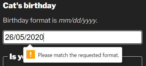
Ensure users of assistive technology are aware of the required pattern by programmatically linking the help text with the form field using the aria-describedby attribute.
inputmode attribute
We can make it easier for people entering the date into the form field on mobile devices by adding the inputmode attribute. This attribute allows us to specify which virtual keyboard is displayed in supported browsers. Since dates are numeric, we can use inputmode="numeric" to display the numbers keyboard which provides fewer options and larger hit areas for each key.
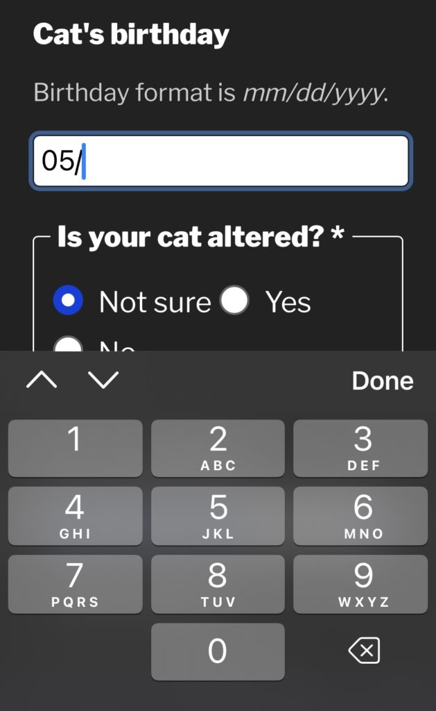
Note: In my demo, I use JavaScript to add the slash characters to the date automatically as the slash character is not available on the numeric virtual keyboard.
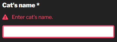
Handling errors
It’s important to provide a list of all errors at the top of the form or provide them in-context of the field in error. We can programmatically link the error message with the form field using the aria-describedby attribute. This is only necessary when an error message provides information that helps the user enter the correct data.
...
<input type="email" id="email" name="email" autocomplete="email" aria-required="true" aria-describedby="error-email">
<p id="error-email">Email format email@domain.com</p>
...
When assistive technology users focus on the email field, the error message is announced along with the name, role and state of the field.
Error messages must be visible, persistent and close to the field in error. Don’t rely on color alone to convey errors. Include an icon with “error” as the text. Move focus to the error messages at the top of the form or to the first field in error on form submit.
Conclusion
I hope you found something to make your forms more accessible. I like forms because they have such a strong semantic structure. There are a lot of things to get right but it’s pretty straightforward what “right” means in this context: Make sure anything that is conveyed visually is also conveyed to assistive technology, including the states of form fields.