The first project my manager tasked me with at my new job as a senior accessibility engineer in the Design Engineering organization was to perform an accessibility audit of the component library our team provides to the engineering team who codes the dotcom website. These components are generally page level rather than UI level, think a card or a form. In total, I audited 28 components in the context of the component library, not as the components have been implemented into the dotcom site.

Auditing solo components
Auditing components is necessary—all code should be tested for accessibility standards—but presenting a component alone on an empty page in the context of a component library has limitations.
Placeholder content
I don’t like working with placeholder content. Design should follow content creation so examples should be able to use real text and images. Instructions about how to create content should be presented separately along with instructions for how to markup content, e.g. “Optional Header” is an <h2>.
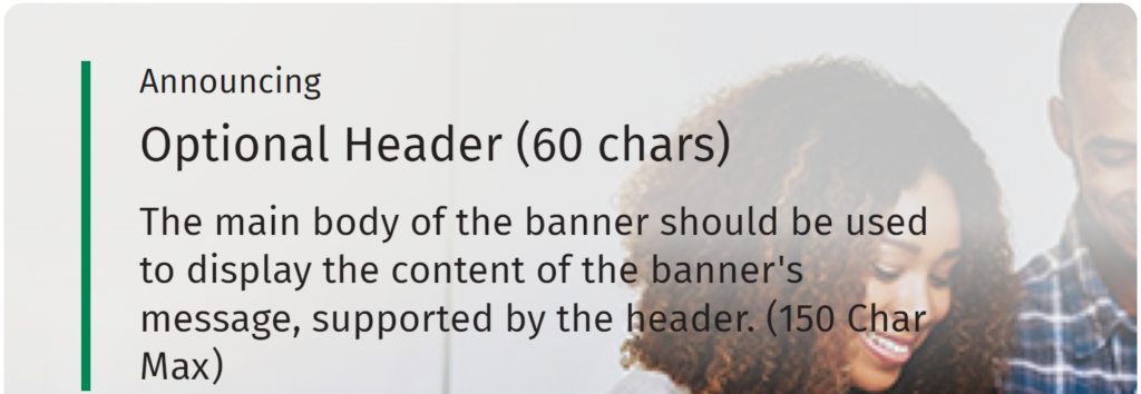
This is the issue I created for this example banner which is HTML text over a background image:
In banner variations with text on a lifestyle background image, when zoomed in up to 400% at a viewport width of 1280px, some text may overlap portions of the image that do not provide enough color contrast.
It’s difficult for me to tell if this is just a bad example image or a true color contrast concern.
No context
This complication popped up on the first component I tested: Alerts. The library page presented these message boxes on a blank page. I wasn’t sure if the message boxes were supposed to be there on page load or if something triggered them. This matters because the message box containers have the role="alert" attribute.
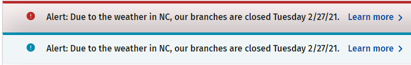
The alert role is a type of status message. It’s supposed to be assigned to a container that is empty on page load. Then, when something happens on the page, the alert is loaded into the empty container and immediately announced to assistive technology because of the alert role. It’s not designed to include a call to action like “learn more” links.
I looked at the dotcom production site and saw an alert displayed on page load. Because it has the alert role, assistive technology announces the content of this message box before anything else, before even the name of the webpage or website. It also announces the message box content twice because it is the first thing on the page.
I decided someone got carried away with the ARIA and advised that they remove the role="alert" attribute because these message boxes do not fit the expected design pattern for an alert.
Not our problem
In The Book on Accessibility chapter “Accessibility Coaching Guide”, the section “Not our problem” covers one of the pitfalls of depending solely on component library accessibility: The component library is accessible, so the development team doesn’t think it has to worry about anything.
While an individual component can be completely accessible, they can be used in patterns that are completely inaccessible.
A helpful analogy is building a wall with bricks. Individually bricks are quite strong, but they can be arranged in a way that is fragile and very weak.
This is ultimately why I was tasked with this audit. Our team wants to ensure we are not introducing any accessibility issues in the code we provide. Then we can trace any accessibility issues in production to either the dotcom engineering team’s implementation of these components or to the content entry team.
Example component audit results
The format I used in my report was to provide a bulleted list of accessibility issues I found. I did not note the specific WCAG success criteria affected because I didn’t think the team needed to know that information.
Below the bulleted list of issues, I have a “Recommendations” heading where I repeated the same bulleted list but with the advice for how to remedy each issue. Below that is an optional section for “Resources” where I link to different articles or documentation to support the remediation advice.
Carousel
The carousel does not follow the expected design pattern.
- The carousel is missing the expected role and accessible name.
- Slides and slide picker controls are missing the expected role and accessible name.
- Carousel controls are located after the slide content.
- The “play/pause” control has a confusing accessible name.
- The slide picker controls do not have sufficient contrast with the page background.
- Foreground: #999898
- Background: #FFFFFF
- Contrast ratio: 2.88:1
- “Previous” and “next” controls do not have appropriate accessible names.
- The carousel does not stop advancing when a keyboard user activates the “previous” or “next” controls.
- Visible text beneath the slide heading is hidden from assistive technology.
- The “Call to action” control is a
<button>element inside a link. - Decorative slide images are announced by assistive technology.
- Hidden slide content is accessible to assistive technology.
Recommendations
- Add the
aria-roledescription="carousel"attribute to the<section>element used to markup the carousel container. Provide an accessible name with thearia-labelattribute. - Markup slides and slide picker controls with
tabpanelandtabroles with accessible names. See example. This includes enabling arrow keys to switch between slide tabs. - Ensure carousel controls get keyboard focus before slide content. Group the “play/pause”, “previous” and “next” controls.
- When changing the name of a control depending on its state, do not use a toggle control. Remove the
aria-pressedattribute from the “play/pause” control. - Ensure slide picker controls have at least 3:1 contrast with the background.
- Remove the
titleandroleattributes from the button<svg>elements for the “previous” and “next” controls; add thearia-hidden="true"attribute to hide them from assistive technology. Use thearia-labelattribute on the button to provide the control with an accessible name. - The carousel should stop advancing when any part of it has keyboard or mouse focus.
- Remove the
aria-hidden="true"attribute from the visible slide text so that it is conveyed by assistive technology. - Use either a link or a button for the “call to action” but not both.
- Ensure decorative slide images are hidden from assistive technology by providing an empty
altattribute. - When a slide is visually hidden, it should also be hidden from assistive technology. This can be achieved by using the
display:noneCSS property on hidden slides or by adding thearia-hidden="true"attribute.
Resources
Common issues
Overall, the issues I found were pretty typical. It’s obvious people working on this component library have some accessibility knowledge and tried to create an accessible experience but likely did not do adequate testing with assistive technology, like a screen reader.
- Multiple ARIA issues with controls missing the expected roles and accessible names
- Decorative images and icons not hidden from assistive technology
- Information not available in smaller viewports or when zoomed to 400% at 1280px wide
- Color contrast issues with both text (4.5:1) and control borders (3:1)
- Some controls are not keyboard accessible
Conclusion
Testing a component library is challenging when it presents placeholder content without surrounding content for context. Testing the structure of a component is good for catching ARIA and resize issues but has limited value in ensuring the resulting website is accessible. Remember to test a representative sample of pages from your website that uses each of the library components with real content. What matters is how accessible your final content is.