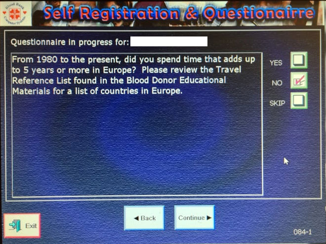
I’m a regular blood donor so I must have used this self-administered questionnaire UI dozens of times over the years. It’s old, clunky, and suffers from providing the bear minimum in functionality with little thought to usability.
Top issues
- Using check boxes for the answer responses when only one choice is allowed (yes, no, or skip). My best guess about why they used check boxes instead of radio buttons is to allow a user to remove any response to the question.
- Placing the “Continue” button at the bottom of the page, far away from the answer check boxes. This results in having to move the mouse up and down, over and over, for every question.
- No indication of how many questions there are or which question you’re on.
- No integration of the educational materials within the interface. If you want to know which European countries are on the travel list, you have to consult a paper print out.
- It’s ugly and does not provide a very friendly experience.
Design Recommendations
Here’s a mock up I did that attempts to address the top issues.

- Use radio buttons for the answer responses (yes and no) and move the “skip” option to a link that does not give the “skip” option the same visual weight as “yes” or “no.”
- Change the “Continue” button to “Next” and place it next to the radio buttons to minimize the effort of answering the question and moving on to the next one.
- Add a status bar for a quick visual of how far along you are in the questions, and indicate which question you’re on, e.g. 15 of 28.
- Add links to the educational materials within the interface.
- Update the look and feel. Use the blood bank’s logo and color palette instead of the software maker’s.
And here is what the interface looks like once the user selects an answer.
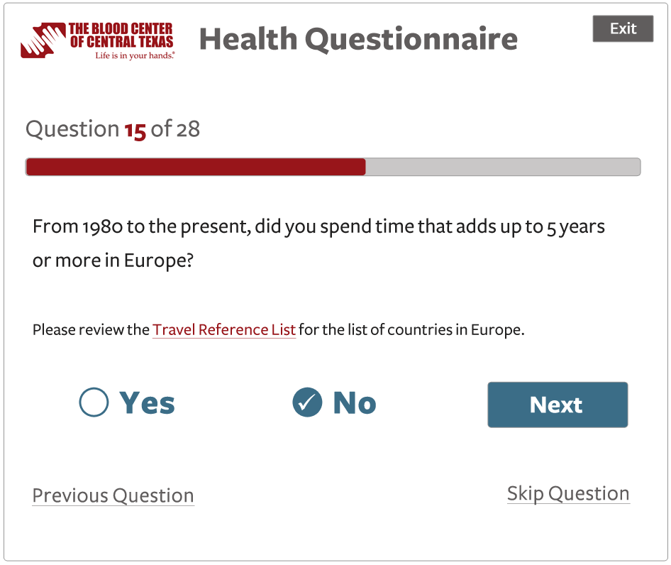
The user no longer has the option to clear a response. Maybe clicking “skip question” would clear the radio button? But since a user must answer all questions eventually, either in the software or verbally to a tech, I don’t see the ability to clear a response in the UI as very important.