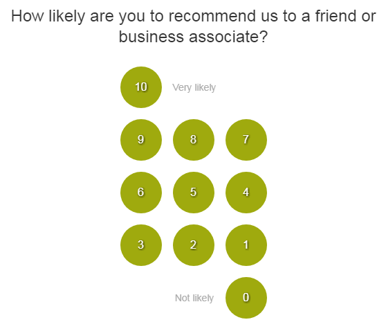
This week, I received an automated email with the title “Business Name – Feedback Request” containing a sort-of likert scale asking how likely I’d be to recommend them to a “friend or business associate”.

My feedback on this survey design from Listen360.
The design is just weird
I’ve never seen a rating scale in a keypad orientation. It confused me and my reaction was to ignore it because it doesn’t make sense. How do I know what the scale represents when it’s not presented in as a hierarchy?
Based on the tiny gray words “Very likely” next to 10, I assume clicking that will provide the highest rating while “Not likely” next to the 0, the lowest rating.
But what do the three rows of other numbers mean, really?
This scale literally goes to 11
Most likert scales rate 1-5 or 1-7 with the odd number of choices allowing the respondent to pick a neutral option instead of forcing her to agree or disagree/like or dislike. This keypad design goes one further, to 11, with options from 0-10.
Zero is extraneous unless it’s clearly marked “I hate y’all, never coming back. All I will do is complain about you on social media.” Providing 10 levels of “maybe I’ll recommend you” was overwhelming and unnecessary to me. Really, if you condense this down to where “9-7”, “6-4” and “3-1” are single choices, you have a 1-5 scale.
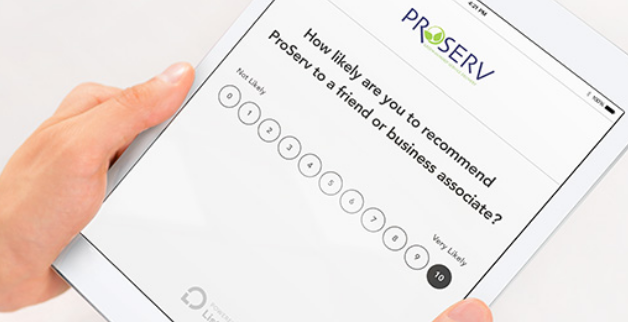
I guess this scale is standard for Listen360 as the example on their homepage is also 0-10 though at least displayed horizontally. I was not able to find anything on their methodology for using 11 options.

I’m helping you, make it easy
This company is requesting that I give them valuable response data. I expect that clicking a number would submit the survey response, done. Instead, it becomes a three-screen questionnaire requesting more and more. After selecting a rating, a web page opens asking for a long-form response.
You’re asked “What could we do to improve?” for 0-7 or “What do you like about our services?” for 8-10.

Oh, a submit button! Am I done? No…

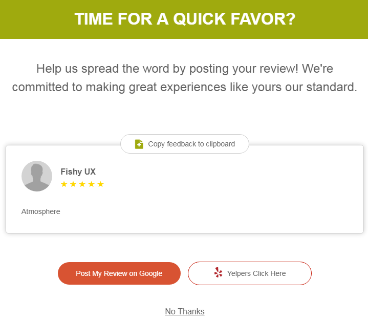
Are you for real? Do you have “time for a quick favor?” Isn’t that what I did 5 minutes ago when I clicked a number in your email? This is like when companies sneakily check the “subscribe to our newsletter” box when you just want to buy something.
No, I don’t want to rate you… What, you parsed out my name?? I have to click “No Thanks?” Why am I thanking you?
I find this kind of feedback baiting disingenuous. It began by asking if I’d recommend them, not how my experience was, and ends with an overt “LIKE US” ploy.
My feedback is, don’t send me this crap. It decreases my opinion of your company and makes me much less likely to either return to your business or to recommend you to anyone.
