When I order something online, usually from my phone, I have to enter different pieces of numerical information. If you use a mobile device, you’ve probably noticed that depending on what kind of information a form field requests, you’re sometimes presented with different on-screen keyboards.
Here is a side-by-side example for entering a credit card number:


Which of these keyboards makes it easier to enter a credit card number? For most people, it’s going to be the numbers keyboard.
- Reduces time on task: There’s no need to switch to the numerical view of the standard keyboard when the UI provides access to the numbers keyboard.
- Lessens cognitive load: You’re presented with a telephone keypad which centers numerical inputs over letters or symbols.
- Increases accuracy: The number keys are over three times the size of the standard keyboard which reduces entry errors.
Use the proper input type
Enabling the numbers keyboard for certain input types is a great usability improvement. But what about accessibility? We need to ensure we’re programmatically indicating what kind of numerical data the input requires and that we’re displaying the right version of the numbers keyboard as there are slight variations.
The HTML specification includes 21 input type attributes. One of the types is actually number but its intended use is for setting a value in a range rather than for just anything that might be numeric:
The input element represents a control for setting the element’s value to a string representing a number.
4.10.5.1.12 Number state
<label>How much do you want to charge? $<input type="number" min="0" step="0.01" name="price"></label>We also need to keep in mind success criteria 1.3.5: Identify Input Purpose which requires setting autocomplete attributes to ease data entry. Let’s look at how to properly mark-up inputs for telephone number, zip code and credit card number.
Telephone number
Use input type="tel" to enable the numbers keyboard. With the autocomplete="tel" attribute included, we can see how iOS offers telephone number suggestions as well.
<input autocomplete="tel" name="phone_number" id="phone_number" type="tel" value="">
Zip code
Since all postal codes are not numbers-only like US zip codes, use input type="text" and set the pattern attribute to enable the numbers keyboard. Include autocomplete="postal-code".
This example is for US zip code entry of 5 digits, 0-9.
<input type="text" id="deliveryZipInput" value="" maxlength="5" autocomplete="postal-code" pattern="^([0-9]{5})$">
Credit card number
Again, use input type="text" and include the pattern attribute for a 16-digit number. If you want to validate against different credit card types, use the appropriate regular expressions in your pattern attributes such as this one for Visa: ^4[0-9]{12}(?:[0-9]{3})?$
<input type="text" id="x_card_num" maxlength="16" name="x_card_num" pattern="[0-9]*" value="" autocomplete="cc-number">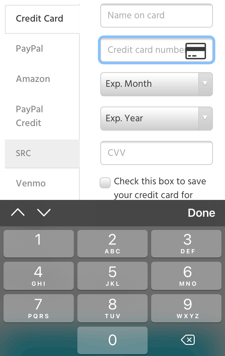
Other types
Other numerical types you might want to experiment with include date, month, time and range. Just don’t default to input type="tel" when the goal is to display the numbers keyboard.