Kudos to Half Price Books for Guest Account Creation after Checkout

I’ve studied a lot of in-depth research on e-commerce and one of the more disruptive user experiences is requiring customers to create accounts before allowing them to give you money.

Of the top 100 sites evaluated by the Baymard Institute in a 2012 study, 76% allowed guest checkout.

graph: 35% of companies grossing over $1 billion and 21% of the rest require an account to make an online purchase
Graphs: 76% don’t require an account to purchase, courtesy Baymard Institute

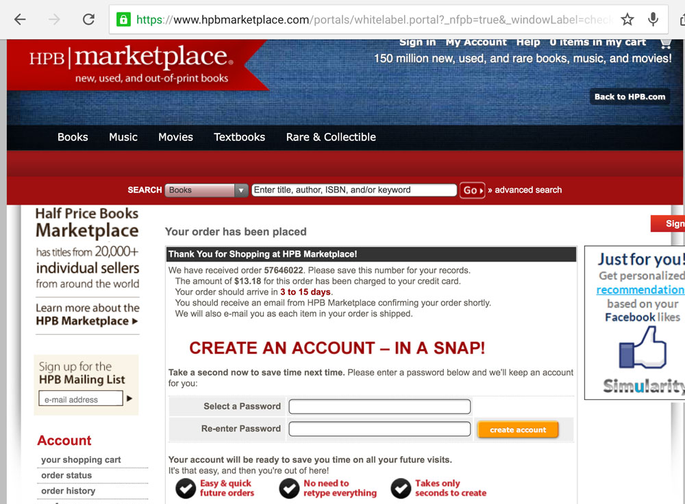
But only one of these companies (ranked #1 of 100) allowed a guest user to create an account after checkout. The checkout process should be linear, so asking a customer to create an account at the end of the purchasing process makes sense and is a better user experience.

It’s difficult to find examples of sites doing this since it requires making a purchase, but I did come across one finally: Half Price Books, a Texas-based used books chain.

Screenshot: HPB.com page allowing a customer to create an account after checking out

Good job! Now just remove the password confirmation field 🙂

Bowling!

I went bowling for the first time in a long, long time last night with some friends. I expected to see the typical scoring screen.

photo of a bowling screen with 10 frames
Tired old bowling courtesy of sunnythomas

On the screens above each lane, I could see a similarly detailed scoring outline for each player. But what I saw on a smaller screen next to the lane, very much in the eye line of players, was a simple bar chart showing player progress.

photo of a bowling scoring screen that shows a bar chart of who is winning
Updated bowling screen with bar chart

What a great idea because most folks probably don’t care if they cleared a 7/10 split or how many spares versus strikes they’ve thrown. They just want to know who’s winning and what their score right now is. Super impressed by this.

Lights Out!

Just a quick post today, folks.

The city power company mailed us a fridge magnet with the phone number to call in the event of a power outage. If the lights have been on for awhile, and then go out—presumably because of a power outage—the magnet glows in the dark. Whoever thought of that is awesome.

side by side picture of a fridge magnet that glows in the dark
Glow-in-the-dark fridge magnet

The only room for improvement I could see is having just the power outage number glow, and not the customer service number. Since both numbers are the same size and the text explaining what each is for is very small, this could be confusing in the dark. Otherwise, good job.