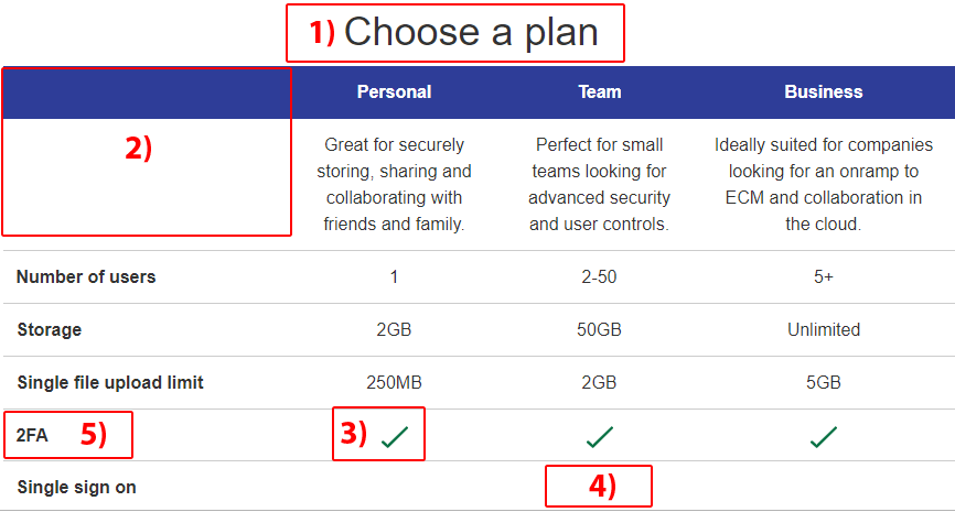
I recently came across this example of an HTML table that was marked up correctly, for the most part, but lacked some of the important coding nuances needed to make a table truly accessible. Below is a screen shot of that table with the areas of concern highlighted.

Depending on the complexity of your table, it can be helpful to review the Table Concepts tutorial from the W3C Web Accessibility Initiative (WAI).
Here are five things to check when creating your next table.
1) Caption that table
While this table has what looks like a caption of “Choose a plan”, that text was actually marked up as a heading level <h3>. Moving it inside the <table> element and marking it up as a <caption> instead allows assistive technologies (AT), like a screen reader, to announce the text as being programmatically associated with the <table>.
Table with 7 rows and 4 columns, caption, choose a plan
NVDA screen reader
2) Include header text for every column
In this example, the very first table cell is empty. The screen reader announces: row 1 column 1. That’s it. But what about the contents of the rest of the cells in this column? They need a header to explain what they are. Visually, the content author doesn’t want a header for column one, but AT users benefit when the name of the column is announced before the contents of subsequent cells.
To fix this issue, I added a hidden column header for column one of “plan feature.”
<th><span class="visually-hidden">Plan feature</span></th>Now, when a screen reader gets to the beginning of a new row, it’s clear what content is contained in the first cell of each row.
Row 3, plan feature, column 1, number of users
NVDA screen reader
3) Use alt attributes meaningfully
The content author decided to use green check mark images to indicate when a plan feature is included in a particular plan, but they didn’t include alt attributes. AT users have no way of knowing when a feature is included because the cells with images don’t communicate anything.
To fix this, make sure you include alt text on images that provides meaning to the user. An alt attribute of “check mark” would not be meaningful even though it’s visually correct. Instead, I used “feature included.” (Though I would argue using an icon font would be better than an image.)
<td><img src="icon-checkmark-green.svg" alt="feature included"></td>Team plan, column 3, [graphic] feature included
NVDA screen reader
4) Have data in every table cell
When a feature is not included, we must also communicate that to AT users. The last row of the table has three empty cells which indicate to sighted users that a feature is not included, but like 2) above, we need to add some hidden helper text.
<td><span class="visually-hidden">not included</span></td>Personal plan, column 2, not included
NVDA screen reader
5) Check your (con)text
Screen readers don’t always handle abbreviations and punctuation as expected. I found two interesting examples with this table. First, the number of users for the Team plan visually looks like “2-50” but it gets announced as “250” because the hyphen is ignored. To accurately convey this meaning, we can add the word “to” as visually-hidden helper text, and we can hide the hyphen from AT to be safe.
<td>2<span aria-hidden="true">-</span><span class="visually-hidden">to</span>50</td>Team plan, column 3, two to fifty
NVDA screen reader
Second, the plan feature “2FA” in row six does not get announced properly. My screen reader announces this as “2-fah”, not “2-F-A”. Again we need to add helper text for AT users.
<td><span aria-hidden="true">2FA</span><span class="visually-hidden">2 factor authentication</span></th>Row 6, plan feature, column 1, 2 factor authentication
NVDA screen reader
Please check out the full HTML for this <table> in my first Codepen entry.
See the Pen Accessible Table by Rachele (@racheleditullio) on CodePen.