Originally posted in 2014 to my personal blog. Twitter has since made some changes to its mobile form.
Today’s usability issue comes from Twitter’s mobile website sign in page.
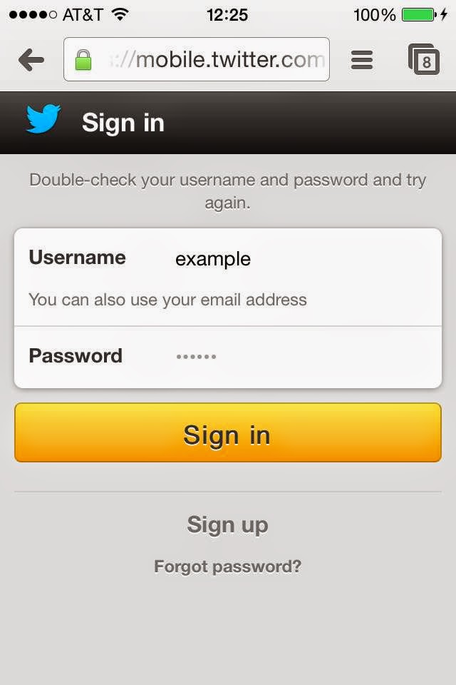
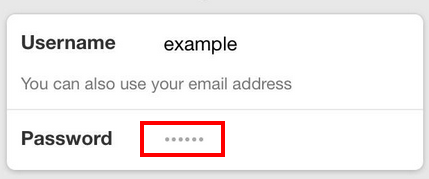
My username was pre-populated because I have used the site on my phone before. I thought my password was also pre-populated, because the placeholder text Twitter uses in the password field is a series of dots, which look just like an obfuscated password.
Thinking my password was already entered into the password field, I tapped the “Sign in” button. The page refreshed and I wasn’t signed in, but I didn’t see why, so I tapped “Sign in” again, thinking the site had a glitch.
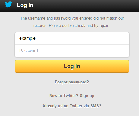
What actually happened was that I had not entered my password, and the error message on the page was located at the top in a light gray text, hardly noticeable, and resulting in frustration while I tried to figure out what was wrong.
Two easy fixes Twitter should make
- Remove the dots as placeholder text from the “Password” field. They are not necessary and cause confusion. Placeholder text in form fields are harmful because it makes it hard for users to know what information they have already entered.
- Move the error message next to the field where the error occurred and make it obvious. By placing it at the top of the form, away from the “Password” field, and making it a light gray, it isn’t obvious for users.
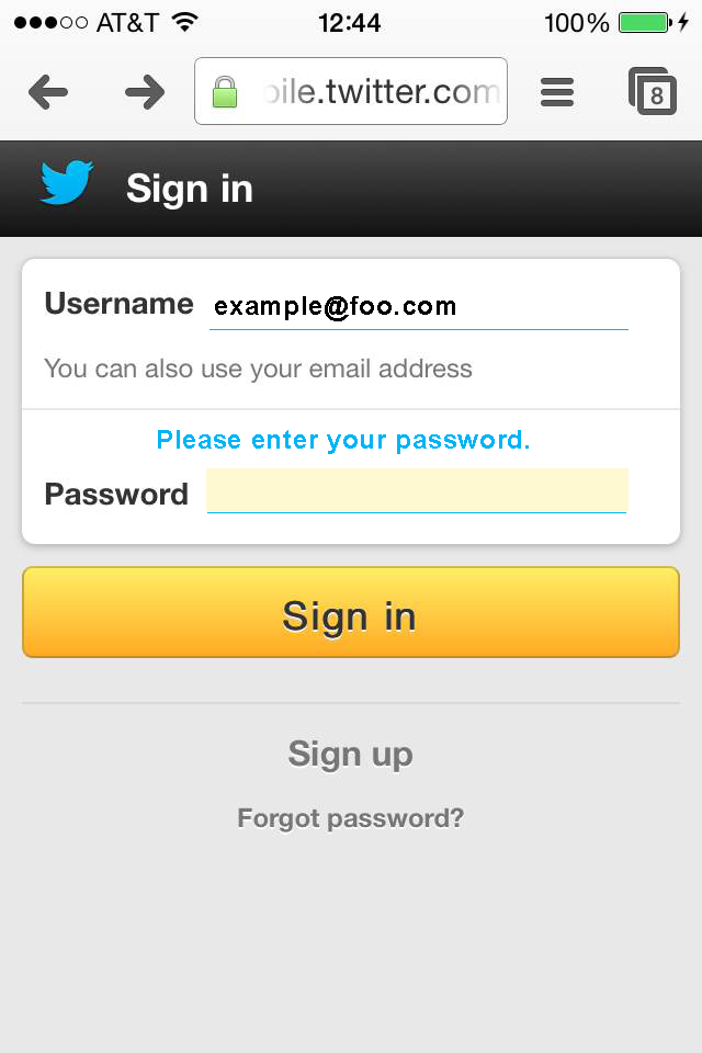
In working on a quick mock-up of these improvements, I realized that Twitter developers likely added the placeholder text so that users would know where to type. Without the placeholder text, it’s not obvious. That said, adding placeholder text isn’t the best solution.
Though Twitter has made some changes, such as removing the dots as placeholder text in the password field, it continues to use placeholder text and the error message still displays above the form in hard to see gray text.