Podcasts App Changes in iOS9

I started listening to podcasts regularly back in April and have used the iOS Podcasts app exclusively. It was easy enough to figure out and it did what I needed.

When I updated my iPhone to iOS9, I was met with a reconfigured Podcasts app that is no longer usable the way I want it to be. (I’d like to know how Apple decides what to change.) Below are the top three issues I struggle with.

No More “On-The-Go” Station

In iOS8, you could add any podcast episode individually to this station and quickly create a playlist of episodes you want to listen to. I could keep a backlog of older episodes in case I ran out of new episodes, and I could easily add new episodes and move them to the top of the list. The ability to change the order of episodes was a key feature.

screen shot of the iOS8 Podcasts app screen
Podcasts App “On-The-Go” station screen

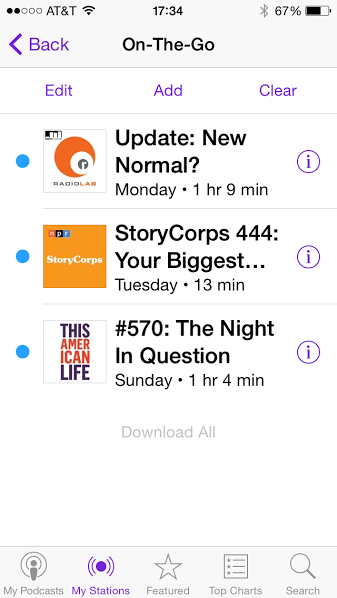
In its place is a buried and confusing option called “Add to Up Next”.

Up Next is Crap

You can add an episode to “Up Next” but not remove it, and the episode list is accessible only from an unlabled icon on the screen of a podcast already playing.

screen shot of the podcast play screen with the "Up Next" button highlighted
iOS9 Podcast play screen

Tapping this icon brings up a long list that begins with a history of played episodes, then shows what is currently playing, then at the bottom shows what’s coming up next. What?

screen shot of the iOS9 Podcast app Up Next screen listing episodes
iOS9 Podcast app “Up Next” Screen

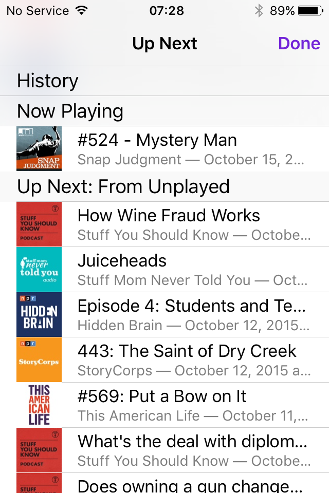
There is no option to remove anything (no swipe left) and no option to reorder the episodes that are up next.

Unplayed List Not Configurable

In place of the “My Stations” button on the bottom of the app, there is now an “Unplayed” button. Unlike the “All Unplayed” station in iOS8, the “Unplayed Episodes” list can’t be configured, at all. The ‘Edit’ option allows you to select episodes to mark as played, save, or delete only.

screen shot of the iOS9 Podcast app Unplayed Episode screen
iOS9 Podcast app “Unplayed Episodes” screen

All episodes are listed chronologically, newest to oldest, and the episodes can’t be grouped by podcast—both features that were available in iOS8.

Design Recommendations

If “Up Next” is intended to replace the “On-The-Go” station, it needs to provide similar functionality and it needs to be easy to find.

  • Allow users to add, remove, and reorder episodes quickly.
  • Provide a button to view the “Up Next” list from somewhere other than the play screen, probably the top of the “My Podcasts” screen.

Upping the profile of “Unplayed” episodes by giving them a button on the bottom menu bar should not come at the expense of functionality available when “Unplayed” was a station.

  • Allow users to sort the list in ways other than newest to oldest; in particular, allow a manual sorting option if “Up Next” is going to rely on the sort order of the “Unplayed” list.

Adding a Bookmark in Safari – Part 1

I was on a call with my manager trying to login to an application that requires Safari or Firefox. He was using a Mac with Safari so I decided to use Safari as well, but on Windows.

Apple uses what I consider non-standard design patterns for some features. I say non-standard because if the other three major browsers are using similar patterns but Safari uses something different, well, it’s annoying.

I was trying to bookmark this application. Nothing in the Safari UI jumped out at me. I didn’t see anything that said ‘bookmark’ or ‘favorite’. I didn’t see a star icon. I was stumped.

screen shot of the Safari menu bar on Windows
Safari menu bar

I did notice the ‘plus’ icon to the left of the address bar but I was not willing to click it. Neither its location nor icon led me to believe it had anything to do with bookmarking a page.

I eventually clicked the ‘book’ icon, which opens a pane called “Collections” and allows one to manage existing bookmarks but does not include a way to bookmark the current page. UGH!

As it turns out, the ‘plus’ icon is the way to bookmark the current page. Such a simple task should not cause this level of uncertainty or confusion.

screen shot of Safari menu bar with plus icon highlighted
Safari menu bar ‘bookmark’ button

Design Recommendation for Safari on Windows

Safari on Windows should use the ‘star’ icon for adding a bookmark and that icon should be to the right instead of on the left, the pattern familiar to Windows users.

For comparison, here is how the other three major browsers do it.

screen shot of Chrome menu bar with star icon highlighted
Chrome menu bar
screen shot of Firefox menu bar with star icon highlighted
Firefox menu bar
screen shot of IE menu bar with star icon highlighted
Internet Explorer menu bar

Next time, I’ll examine the bookmarking UI patterns on mobile.

Managing Favorites on Hulu’s Mobile Apps

The Hulu interface differs in confusing ways between its desktop website, iPhone app, and Android app for managing your favorite shows.

Desktop Website

On Hulu’s website, it’s easy to “favorite” a show. You go to the show’s overview page and click the link with a plus icon and “favorite” label. Once a show is a favorite, the plus changes to a check mark.

What’s more difficult is removing a show from your favorites since the interface expects a user to understand that clicking the same “favorite” label will now remove it.

screenshot of Hulu's desktop website
Hulu’s desktop website

It’s not immediately obvious what adding a show to your favorites does either. You have to find the “Favorites” page by hovering over your account name, then clicking the “favorite” link in the menu.

Screenshot of Hulu's Favorites page
Hulu’s Favorites page

On the “Favorites” page, you can select what gets added to your queue automatically for any shows you’ve added as a favorite. I really like this feature. However, now that I use the mobile app exclusively to watch shows, I’ve had a very hard time figuring out how to manage my favorites.

iPhone App

On the iPhone, there is a tiny icon on the show’s detail page with no label and no feedback about what tapping it does. I already have Saturday Night Live added to my favorites, so I was really confused why it shows a plus icon instead of a check mark on my mobile.

Screenshot of the Hulu app on iPhone
Hulu app on iPhone

Tapping the plus icon takes you to a screen where you can add additional episodes, even entire past seasons, to your queue.

Screenshot if iPhone add episodes
iPhone add episodes to queue

I was left feeling very uncertain whether this show was still one of my favorites and if new episodes would get added to my queue.

An additional problem is that I had trouble finding my favorites list. There is a “Shows You Watch” icon on the navigation bar but this includes you anything you’ve watched, not just favorites.

After much digging around, I finally found the “Favorites” screen buried under the “Browse” menu icon > gear icon for “Edit Account” > “Favorites” link. Here I could verify which shows will have new episodes to my queue.

screenshot of Hulu Favorites options on iPhone
iPhone Favorites screen

Android App

By comparison, the Android app makes it very apparent whether a show is a favorite by providing a big “Add to Favorites/Remove from Favorites” button on a show’s detail screen.

screenshot of the Hulu app on Android
Hulu app on Android

What’s less clear is how to manage which episodes or clips from your favorite shows get added to your queue. The “Favorites” screen provides shortcuts to your shows only and does not have the same settings as the website and iPhone app.

screenshot of Favorite shows on Android
Android Favorites screen

Design Recommendation for Hulu

  • On the iPhone app, use the add/remove button concept too. Move the plus icon for adding episodes manually to your queue next to the list of episodes.
iphone remove from favorites button
iPhone design recommendation
  • On the Android app, provide a clear way to manage the way favorites update your queue.
  • On the website, again use two labels: “Add to Favorites” then change to to “Remove from Favorites” after a user adds it. Don’t expect a check mark icon to perform double duty. Here it expects users to understand that the check mark means a show is a favorite and that clicking it will remove it from favorites. That makes my brain hurt!