Cold Offices

Every woman in my office is cold. We have varying strategies to deal with this. I wear a long sleeved cardigan every day and a blanket as backup; some women wear fleece; one even has a sleeping bag under her desk.

Why is this? According to Alan Hedge, an ergonomics professor at Cornell University, “The temperature gets set usually by a man because often that man will be the CEO or the facility manager or the mechanical engineer responsible for maintaining the system.” And men run hotter. (For more check out the full interview “New Study Says Chilly Offices Hurt Women Workers’ Productivity, Health“.)

In our office, space heaters helped us a lot, but the building management banned them. Given the enormous energy expense of cooling a building, I propose raising the temperature several degrees and if men are cold, they can bring in fans, which are permitted and safer than space heaters.
Identifying Trash Cans

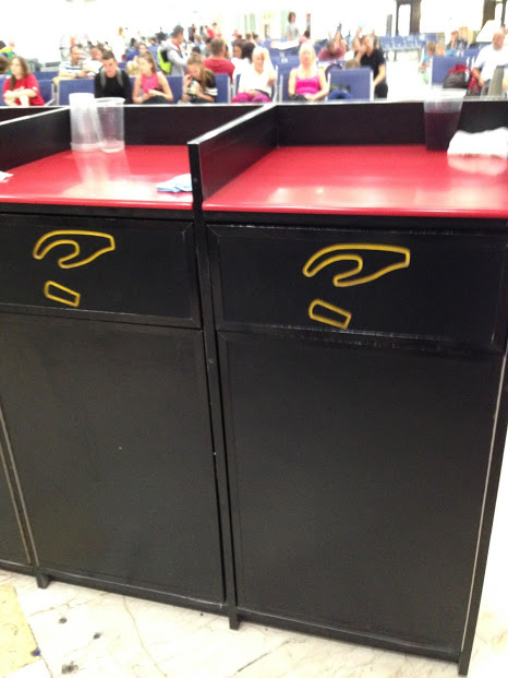
I was recently in an airport in Mexico when I saw this set of trash cans with no text, just an icon of a hand dropping what looks like a cup.

two brown trash cans with a hand icon dropping a cup
Trash can with icon instead of test

I think this is a good example of UX in the real world, especially for a multi-cultural area like an airport where people might not know the word for “trash” in the local language.

(Not to mention, some places use the name of container like “bin” instead of identifying what goes into it.)

Icons have notorious usability issues because universal icons are rare. But I think in this context, an icon used on the physical object is clearer than using text.

I think the silliest thing to label trash cans with is “Thank You” because it doesn’t give you an indication of what the container is for, yet this is rampant here in the US. I wonder how that got started?

trash can that says "Thank You" on its door
Photo Credit: Lauren Brown

Making Connections with Siren

I first heard about Siren, “A dating site that gives women more control,” earlier this year on NPR. It opened up this week to more communities, and I decided to try it out.

In lieu of a standard profile, Siren has people answer ‘Questions of the Day’. Women can chose to hide their profiles while men cannot and they have to approve any connection requests before receiving messages.

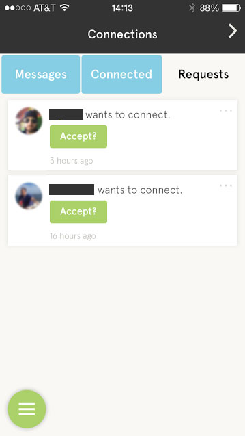
I find myself at a crossroads because of a serious UX flaw: What happens when I click the “Accept?” button for a connection request?

screen shot of the Siren app connections screen with two request
Siren app ‘Connections’ screen
  • Why does the button have a question mark?
  • If I click the button, will it automatically accept the request? Because I don’t see a ‘reject’ or ‘ignore’ option.
  • If I click the button, does it then give me an option to reject?

The main purpose of the app is to connect people, yet I find myself ready to walk away at precisely that point because I don’t want to get connected to someone by mistake, nor do I want to have a perpetual list of requests I’m not interested in.

On a user’s profile, I have the options to ‘Block User’ or ‘Report User’, neither of which is what I want to do.

For curiosity’s sake, I’ll click the damn “Accept?” button…

And there’s my answer. Clicking the button accepted the connection request, with no option to reject, and I see no option to disconnect. Bad, bad, bad.

Design Recommendations

    • Remove the question mark from the “Accept” button, remove ambiguity about what clicking the button does.
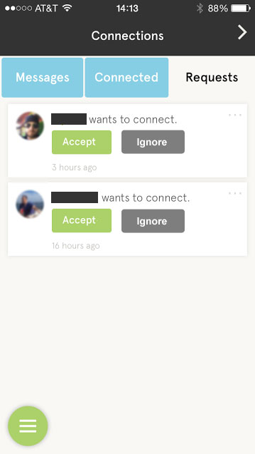
    • Provide an “Ignore” button too.
Connections screen with an ignore option added
Connections screen with an ‘Ignore’ button added
  • I found that on a user’s profile you can click some text that reads ‘Connected’ to remove the connection. I really dislike when UIs try to make text and buttons do double duty. It’s never clear, especially when the text isn’t shaped like a link or button. Just provide a ‘Remove’ button.

    Before and after screens for 'remove connection' options
    Add a ‘Remove Connection’ button