Earlier this evening, my partner’s car was hit by a guy running a red light. He sustained a concussion and wanted to go to the hospital. Here is dashcam video of the accident.
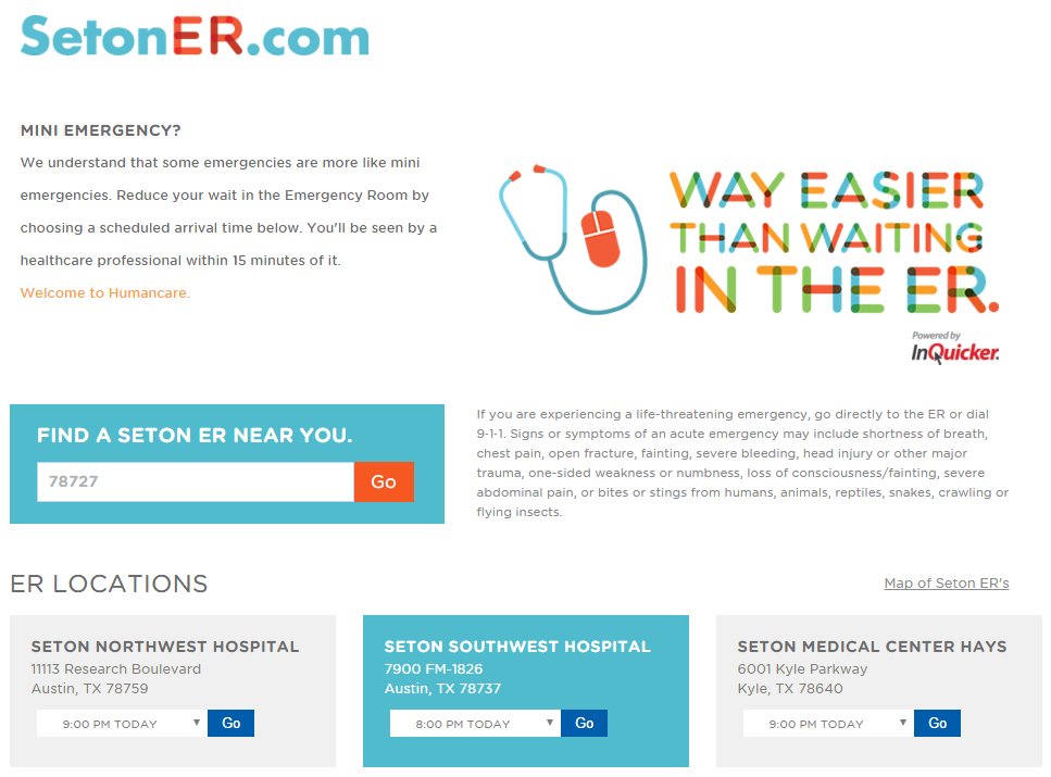
After calling insurance to find out which hospital he could visit (turns out, not the closest one!), I looked it up online to verify the address. On that page, I saw that the emergency department offered online check-in so that you can wait at home.
Screenshot: Seton ER home page
Being in a hurry since this was an emergency, I was scanning the page quickly. Only two things caught my eye:
The headline that reads “Mini Emergency?” at which point,
I scrolled down, saw the location I wanted, and clicked “Go”
What I did not notice was the most important information on the page—the statement about what conditions not to use online check-in for:
If you are experiencing a life-threatening emergency, go directly to the ER or dial 9‑1‑1. Signs or symptoms of an acute emergency may include…head injury or other major trauma…
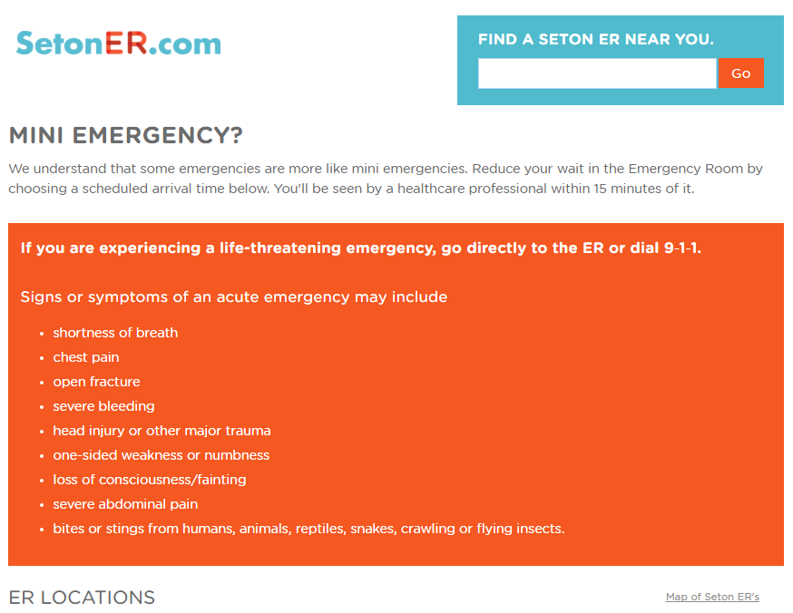
Design Recommendations
Move the when-not-to-use-this information to be in context with the page’s main heading
Make the small, gray font with poor contrast easier to read
Transform the long, boring block with a bullet list
Reduce the branding that takes up valuable real estate and obfuscates important information
Under the covers, fix the order of headings
Screenshot: Updated Seton ER homepage
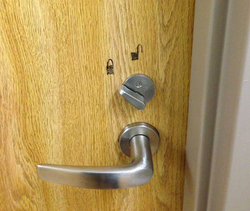
In the bathroom, I saw this great example of people making their own user experiences better. The lock was installed backwards.
On the screens above each lane, I could see a similarly detailed scoring outline for each player. But what I saw on a smaller screen next to the lane, very much in the eye line of players, was a simple bar chart showing player progress.
Updated bowling screen with bar chart
What a great idea because most folks probably don’t care if they cleared a 7/10 split or how many spares versus strikes they’ve thrown. They just want to know who’s winning and what their score right now is. Super impressed by this.
Motion on websites makes me sick. To me, automatic carousels are the equivalent of the GeoCities sites from 20 years ago that would start blasting you with some awful music on page load. The only people who liked the auto-music were the people who made the webpages, and the only people who like carousels are the content owners.
I’m not the first to lament this antiquated website trope. I’m particularly fond of yourcarouselsucks.com; the name says it all and provides a great example. The third slide proclaims:
“We have tested carousels many times and the results are crystal-clear: It is a poor way of presenting content and blocks website sales.”
The next slide demonstrates the first problem with carousels.
1) They move automatically
Screenshot from yourcarouselsucks.com
When a slide moves forward, not only do I have to fight a wave to nausea, but I have to squelch my frustration with moving the carousel back to finish reading. And if it only has backwards and forwards arrows…
2) They don’t stop
More often than not, I encounter carousels that do not have a pause feature. When I was working with an agency during my company’s last redesign project, I had to point out their code was missing a pause feature—and this was a huge agency.
Some expect the user to click something non-pause-button-like to stop the carousel on a particular slide. Not intuitive, and not useful when you just want it to stop!
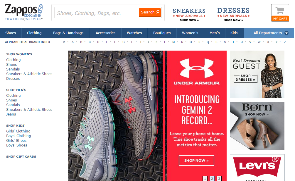
Screenshot: Zappos.com homepage
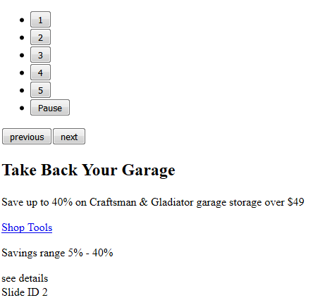
3) They have tiny hit areas
It’s common to use little, close together, almost hidden circles as a way to indicate how many slides are in the carousel and to allow the user to jump between slides. These hit areas are hard to click with a mouse, and maddeningly difficult not to fat finger on a phone or table. I frequently end up clicking or tapping the slide and get taken to another page when all I was trying to do was make the damn thing stop.
Screenshot: Amazon.com homepage
4) They are plagued with accessibility problems
Even when carousels provide controls, they often do not work for users with disabilities. Take the below example from Sears.com.
Screenshot: Sears.com homepage
The back and forward navigation controls are hidden unless you mouse over the slide
The ‘pause’ button has such poor contrast and is so small, it’s easily overlooked
There is no way to interact with the carousel controls using a keyboard
The markup used to construct the carousel does not identify it or have meaningful button text, there’s no way to skip it, and the rest of the slides and content are hidden
Screenshot: Sears.com carousel markup
5) No one likes them, other than your Marketing department
The most compelling reason to stop using carousels is that they annoy users and reduce visibility of your most important piece of page real estate.
Accordions and carousels should show a new panel only when users ask for it. Otherwise, it should stand still and let users read the information in peace, without having the rug yanked from under them.
Not convinced? Please do a usability study of your site’s homepage and let me know how it goes.