Twitter Adds Alt Text Authoring for Some Users

I posted recently about how sharing images through services like Twitter are often inaccessible to users with visual impairments because they lack meaningful alt text. In its March 28 release (version 6.50 for iOS), Twitter now provides some mobile users the option of including alt text. (No word on when the feature will be available for website users.)

To enable the ability to add alt text to your posted pictures from within the iOS Twitter app:

  1. Go to your profile page
  2. Tap the settings (gear) icon
  3. Choose the “Accessibility” option
  4. Turn on the “Compose image description” option
  5. Save your settings

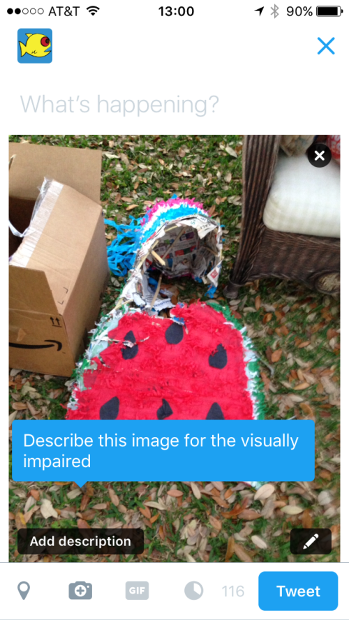
The first time you insert an image into a tweet, you will be prompted to “Describe this image for the visually impaired”.

Twitter image prompt to describe this image for the visually impaired
Screenshot of the image upload prompt

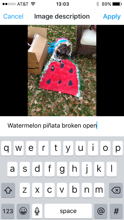
Tap the “Add description” button to provide a meaningful explanation of the contents of the image.

screenshot of the field to type in the image description for a watermelon pinata
Screenshot typing the image description

Looking at the source code via the website, we can see the image contains the description within the alt attribute.

<img style="width: 100%; top: -72px;" data-aria-label-part="" src="https://pbs.twimg.com/media/Ceu_z_PW4AEchnB.jpg" alt="Watermelon piñata broken open">

For more information on this feature, check out the Twitter Support article Making images accessible for people on Twitter.
Nissan Gas Gauge is Misleading

For more than 12 years, I’ve been staring at this gas gauge that looks like it’s divided into quarters but is actually bigger towards F and smaller towards E. The discrepancy is easier to see with the gauge rotated.

Photo of a gas gauge with the needle almost to full
Nissan gas gauge

It’s just weird and confusing. I’d like to know why they did it this way. The only plausible reason I can think of is that this car has a large reserve of 3 gallons once the needle drops to E and the gas light comes on. So taking the reserve into account, the last ‘quarter’ on the gauge kind of makes sense.

LPT: See the arrow next to the gas pump icon? That tells you which side of the car the gas cap is. Useful in rentals!

Images Embedded in Tweets

Being able to add images easily to tweets is great (even if they aren’t accessible). I find myself frustrated, though, with the inconsistent nature of how those images are displayed.

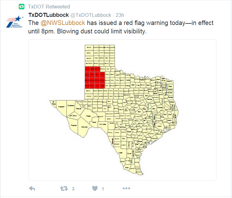
In the feed, you get a snapshot of the image based on the size of the original image. Here is an example where the original image is very small.

screenshot of a tweet with a small embedded image of the state of Texas with county names too small to read
Tweet with a small embedded image

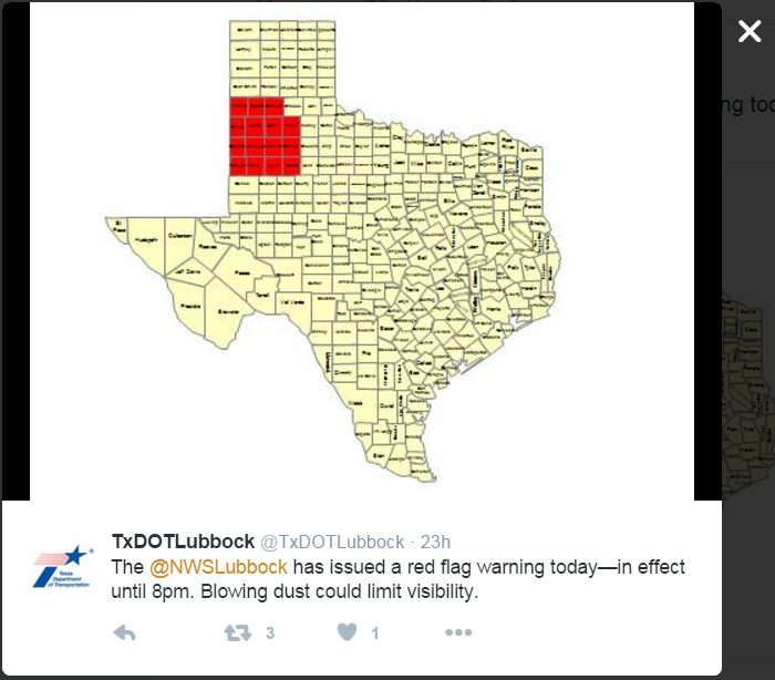
What I always expect to happen when I click a tweet—particularly one where the text is completely illegible—is to see a larger version of that image. But if the original image is small like this one (480×360), then clicking on the tweet is useless.

tweet with embedded image expanded
Tweet expanded

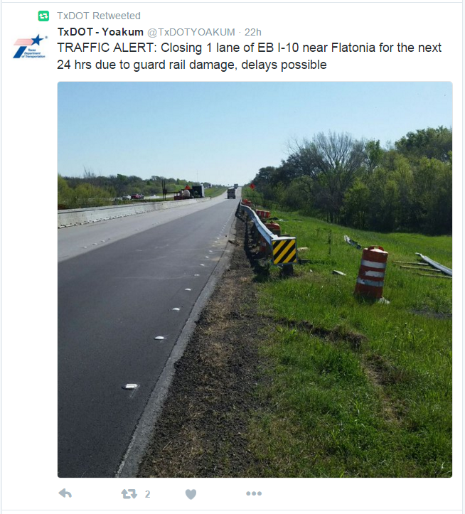
Conversely, if the original image is large (in this example 600×1067), the feed shows only part of the image cropped at 506×506.

screen shot of a tweet with a large embedded image of a road with damaged guardrail
Tweet with embedded image of 600×1067

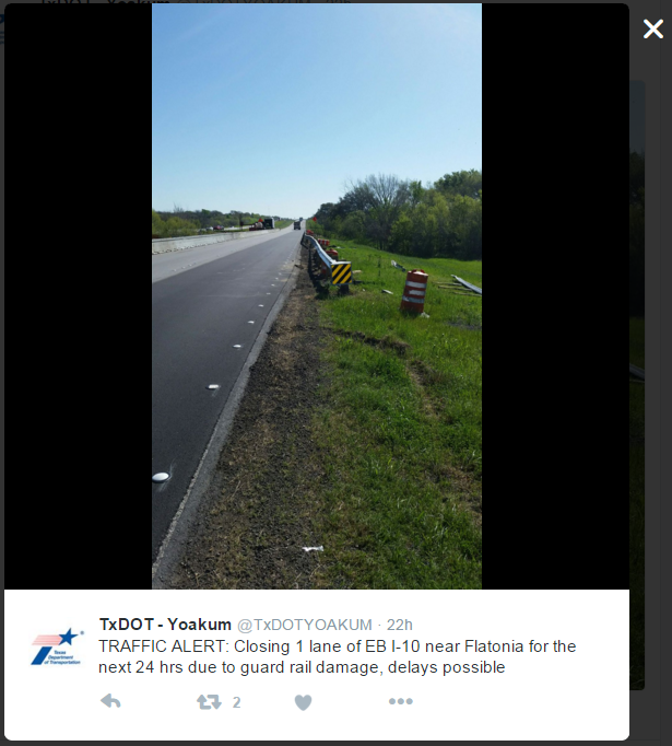
Clicking to view the tweet then shows a shrunken version of the original image at 315×558 without a way to really see the full image, which is what I want to see.

screen shot of a tweet's embedded image that is too large to fit the modal container
Tweet with full embedded image shrunk to fit the container

Design Recommendations

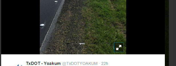
I’d like to see an icon that indicates there is a full size version available. That way, after I click on the tweet, I can click on the image to see the original.

screen shot of an icon overlay to view the original image in a tweet
Tweet expand image icon

In the first example of a small image in a tweet, the problem is partially a content issue. People can and should be able to post whatever images they want, even if they have small text no one can read. The absence of the expand icon could indicate there is no larger size to view.

On a mobile screen where even the small example here is likely smaller than what shows up in one’s feed, this problem isn’t as noticeable. But for those of us still using the desktop version, it can be quite annoying.