Kiva, a microlending non-profit that enables anyone to lend money to help end poverty, recently went through a site redesign. This included major changes to its global navigation, faceted search, and loan display. Here’s a snapshot of the Lend page highlighting four problem areas affecting keyboard users.
1) Global navigation menu doesn’t open
When tabbing through the site, the second link is the “Lend” menu in the global navigation. Only by using a mouse can the “Lend” menu be displayed. Hitting the space bar or enter keys to try to access this menu just reloads the page.
Kiva needs to implement a keyboard-friendly solution like Adobe’s Accessible Mega Menu, available on GitHub. It enables users to access drop drown menus with the space bar, and then continue tabbing through the menu links. The esc key exits the menu at any time, returning focus back to the navigation item.
2) Hidden controls
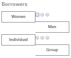
The “Borrowers” facet uses hidden radio buttons and provides no feedback to a keyboard user when one is in focus. Here, I’ve disabled the CSS rule that hides the radio buttons.
I tried repeatedly to select one of these options using the keyboard but couldn’t. Kiva needs to allow users to select all form options, even if the radio buttons are visually hidden. Mouse users click on the form labels to select options but labels do not get keyboard focus.
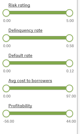
Another set of facets employs sliders to filter results. These are completely inaccessible to keyboard tabbing.
I did a little searching and came across some accessible slider examples that allows keyboard focus on the handles then employs the arrow keys to adjust the values.
3) Focus, focus, focus
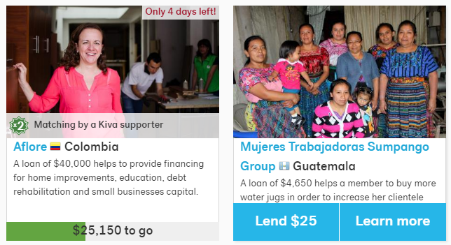
So many elements on the Lend page do not indicate they are in focus, from the above mentioned facets using radio buttons, to the lending controls for individual loans. In this example, the links for “Lend $25” and “Learn more” are visible only on hover. While the links can be tabbed to, there is no feedback that they are in focus.
Kiva needs to use the a:focus CSS selector consistently and ensure any JS used to show links works with keyboard focus too.
4) Stuck modal windows
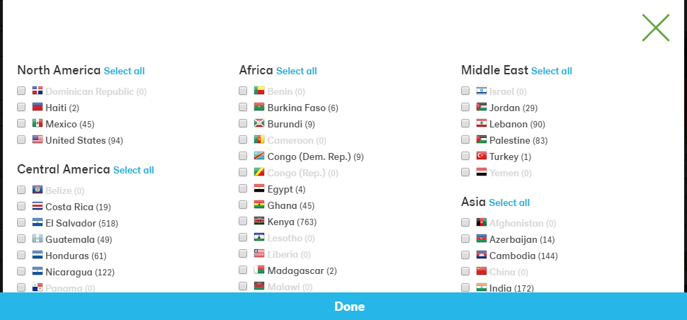
Another facet option is to “Select countries” to filter loans. This link opens a modal window.
I tried tabbing through the country checkboxes but nothing happened because the modal window did not get focus. As I held down the tab key, I could see that I was continuing to tab through the links on the Lend page instead. My only option was to hit the esc key.
Final Thoughts
Making sure your site works with focus is important and easy to implement. For visual feedback, you generally can employ the same CSS rules used for hover. Another useful enhancement would be to provide a way for keyboard users to skip the search facets and go directly to the loan options. Reviewing this site has inspired me to create a future post centered on accessible faceted search.
