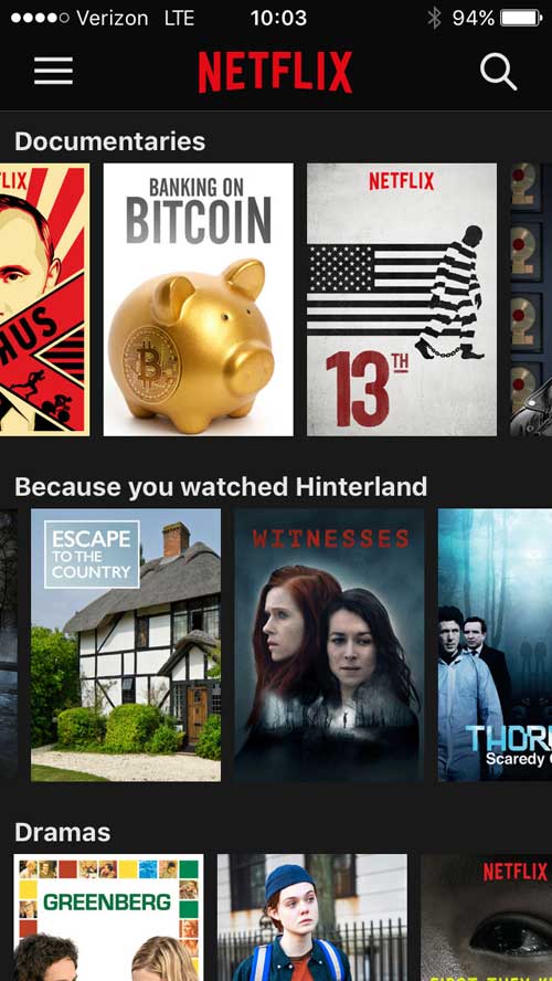
I use the Netflix iOS a lot. I’ve watch a lot of stuff and need to find new videos to watch. This app doesn’t facilitate that user task very well.
Screen shot: Selection page in the Netflix iOS app
Design Suggestions
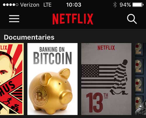
Make it obvious which videos you’ve watched already. Lower the opacity for watched items.
I’ve watched 13th
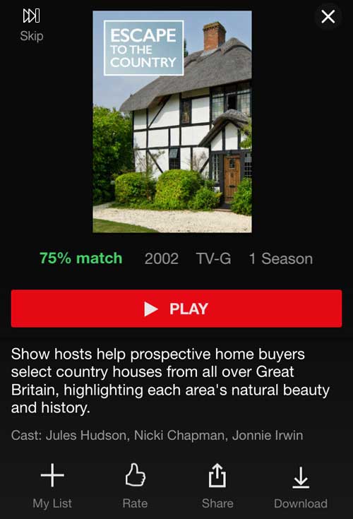
On the screen for a specific video, give an indication if you’ve watched it already. Lower the opacity of the title image and change “Play” to “Watch Again”.
Watch again
In settings, add an option to filter out anything you’ve watched. You can still search.
Remove from Suggestions in App Settings
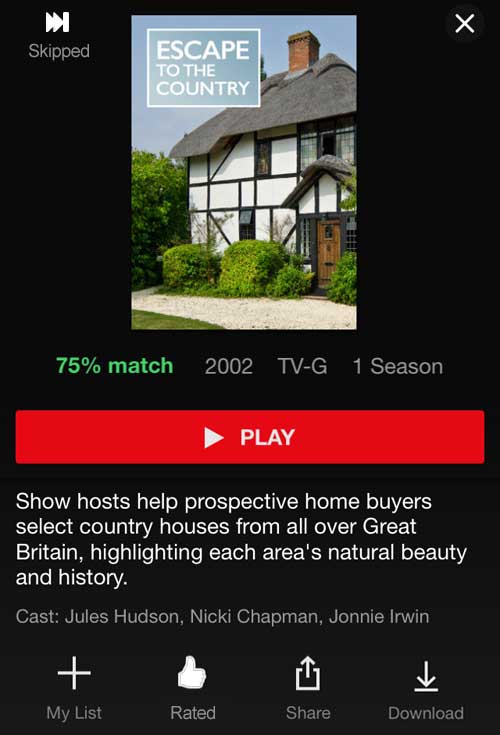
Provide a way to mark videos you don’t want to watch so they stop showing up as suggestions. I’ve added a “Skip” icon as an example. Icons are always hard. My first attempt was a “not interested” button but it was too prominent. I think employing the same design as other icons and putting it in line with the “close” icon gives it subtlety and context.
Skip option to hide videos
Once you’ve rated a video, the thumbs up icon turns white and the text “Rate” turned to “Rated”. I’ve followed that pattern with the “Skip” button, filling in the control and changing it to “Skipped”. Tapping this would allow this title to become a suggestion again.
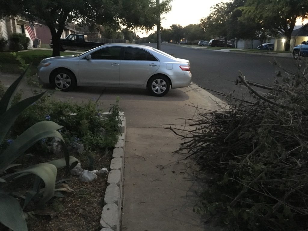
I’m that person. I get upset about cars and plants blocking sidewalks. A year ago I did a post on the walkability of communities using my neighborhood as an example. After notifying 311 (city help) about a couple of repeat offenders, they stopped parking across the sidewalk.
Now there are new cars and the problem hasn’t improved much.
Let’s walk into traffic!
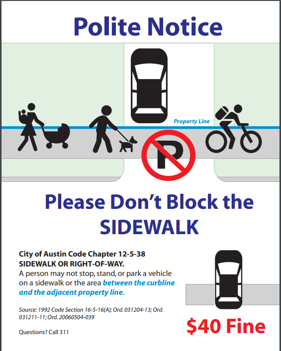
I decided to make a flyer I could put on windshields. In England, I saw a traffic sign start with “Polite Notice” and that’s always stuck with me. I think these drivers deserve the benefit of the doubt of not knowing this is a problem.
Polite Notice
I’ve yet to put any on windshields. Making the flyer was mostly a way to deal with my frustration. Lately, I get anxious during my morning walks and I wanted to “do” something. I enjoyed the creative outlet.
As I noted in my previous sidewalks post, directly confronting the driver of a car blocking the sidewalk did not go well. On a related note, I had a really unpleasant incident earlier this year where a guy had locked his dog in a car, in the sun, and I called him out on it. He and his girlfriend got upset with me, started shouting—that’s when I decided to let the police deal with things from now on.
I want to improve my Spanish—a language I started learning in elementary school, took two classes in during high school (regrettably, I took French in college) and encounter almost daily living in Texas. When I heard a News in Slow promo on NPR, I decided to check out that option. The main draw is being able to hear conversations along with reading the words. Accessing the site as a new user, I ran into many usability issues. I’ll review these:
Home page
Accessibility
Navigation
Links
At the end of the post, I’ll add a mock-up of a few suggested changes.
Home page
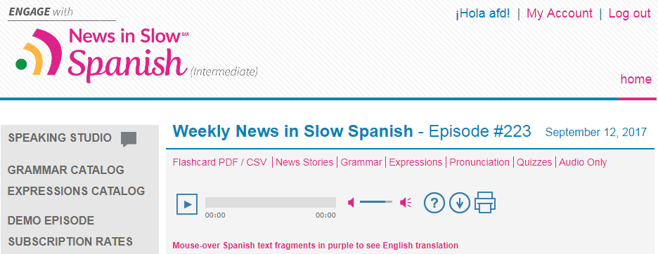
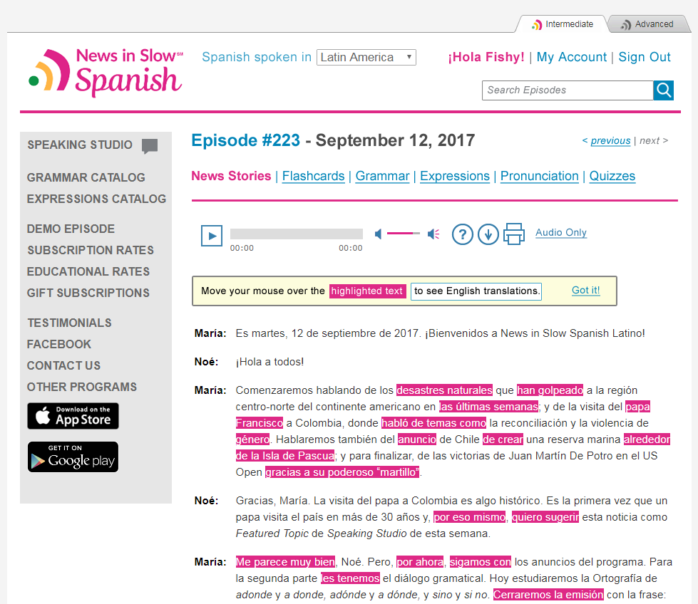
Home page for News in Slow Spanish
First impression: It’s dated looking but the core task is front and center. I immediately clicked the ‘play’ button to hear (and read) the episode. That was fine, happy to have independent volume control.
After a few seconds, though, I realized something was off. Some of the pronunciations indicated that this was news in Spain Spanish, not the Spanish we use around here. Feeling frustrated, I stopped the audio and started looking around to see if there was some option to pick different Spanish. Eventually, I saw a select menu at the very top of the page, above the logo, allowing one to switch between “Spain” and “Latin America”. Selecting “Latin America” reloads the page with a different color scheme but there isn’t anything that clearly indicates what kind of Spanish the page uses.
Accessibility
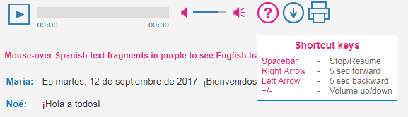
The tabbing order is inconsistent with the display order. Some controls are inaccessible with a keyboard, most importantly the ‘play’ button for the audio clips. Curiously though, there are some keyboard controls for interacting with the player.
Help text showing keyboard shortcuts for the player
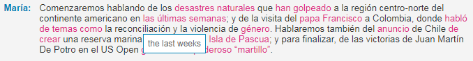
Much of the transcript text is marked up to look like links and when you hover over that text, it shows the English translation. None of these is visible through tabbing.
Title text displayed on hover
Some content is gray text on gray background with low contrast which, even as large headings does not pass WCAG.
The quizzes rely on color only to indicate whether an answer is right or wrong. (Is that really “purple”?)
Quiz example
When trying to sign in, the form loads in a modal window without focus making the task impossible. Pressing ‘esc’ does not close the modal window, leaving you trapped.
Navigation
This site uses the older convention of left navigation as the global site navigation. I’m focusing on the top and local navigation components used to access the contents of an episode.
Site navigation
Top navigation
On the site’s home page the only link in the top nav is a ‘home’ link that is right aligned. It’s hardly noticeable. Once you interact with the local navigation for an episode, the top nav gains a second link: ‘episode’ with a down arrow. Having no idea what the arrow did, I clicked it and suddenly an up arrow appeared next to it. Using these arrows is how you’re able to access past episodes…one-by-one in chronological order.
Top navigation
It’s important to note that the ‘home’ link does not take you back to the episode’s start page but to the site’s home page. The site logo also brings you back to the site’s home page, making the ‘home’ link confusing and redundant.
Switching between episodes feels clumsy to me. I’d like to see episode searching in the top navigation area.
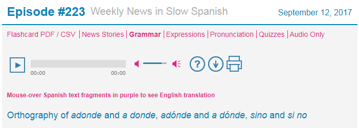
Local navigation
The local nav works as expected. It’s a list of links across the top of the episode content. The link for the section you’re on is bold to show place in site.
Local navigation bar
I think the local nav should stand out more. These links are what most users probably access the most every time they return to the site for a new episode. It feels like they are purposely small and crammed in there so that they all fit on one line for visual rather than usability reasons.
My big criticism here is that there isn’t a link to take you back to the episode start page.
Links
The use of blue in the color scheme really confused me. Sometimes blue text is a link, more often it’s not. Blue (#0000ff) is the default color for links in most browsers and various shades are used as the link color on many, many sites.
Using blue isn’t a problem but using it inconsistently and for something other than linked text within this color scheme is seriously problematic. The most annoying issue for me was the big “Episode #” text which looks so much like it should be clicked to get you back to the episode’s start page. It’s not a link :/
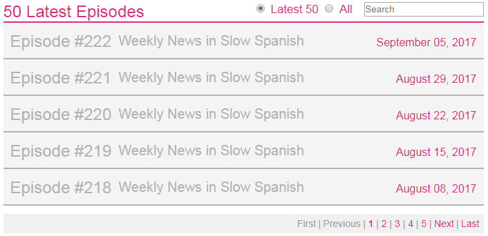
Let’s look at an example: at the bottom of the home page is a section for searching past episodes.
List of episodes with search
What here is a link? Convention tells me that the gray text indicates something that is not a link, that is disabled. That’s true for the ‘first’ and ‘previous’ links in the pagination bar. It’s not true for the episode titles which open an accordion when clicked. Maybe they expect people will see the dates in pink and click there?
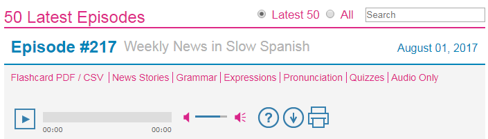
With the accordion open, the “Episode #” turns blue and is clickable in this context because clicking it closes the accordion!
Episode accordion expanded
The link colors of the icons further the confusion with the play button being blue while the volume controls are pink. The fix here is to use colors consistently. I’d stick with using blue for links only.
Suggestions
I’m not going to attempt to make broad visual design or branding changes here, just information architecture and legibility tweaks.
My changes to the home page
Tightened up the header, moving the Spanish selector into the utility nav, adding a search box and removing the existing top nav links.
Moved the local nav up to be more obvious; removed the “News in Slow Spanish” text from the title (redundant) and added ‘previous’ / ‘next’ links to still allow for tabbing between episodes.
Made sure only (all) links are blue!
Decided to highlight the text with translations in pink since they aren’t links, just text with title tool tips. See mocked-up help message that can be removed by the user.
To improve legibility, I removed the weird slanted background image in the header; removed the gray background from the transcript area; increased the line height of the transcript text; and bumped up font sizes for other text.