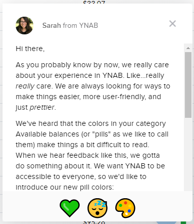
In a recent product update YNAB (You Need a Budget) announced it had made some change to the way it uses color to convey meaning about budget amounts. When I logged into the online webapp today, I saw this modal message dialog. (The content of the announcement is below the image.)

Sarah from YNAB
Hi there,
As you probably know by now, we really care about your experience in YNAB. Like…really really care. We are always looking for ways to make things easier, more user-friendly, and just prettier.
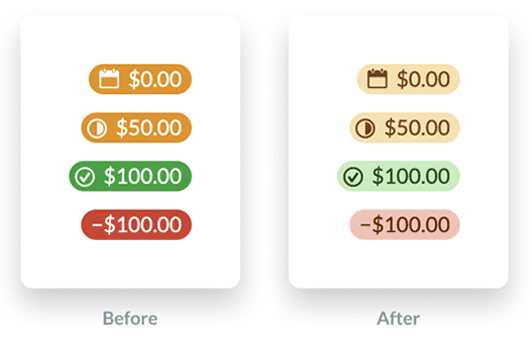
We’ve heard that the colors in your category Available balances (or “pills” as we like to call them) make things a bit difficult to read. When we hear feedback like this, we gotta do something about it. We want YNAB to be accessible to everyone, so we’d like to introduce our new pill colors:

In case you’re wondering, green still means green. Yellow still means yellow. Red still means – you guessed it – red! The only thing that’s changing is the increased contrast, which makes things a bit easier on the eyes.
The message links off to a blog post that discusses the changes further: A Budget That’s Easy On The Eyes
YNAB took note of two accessibility issues
- Previously, it used color only to convey the meaning of a budget amount which does not meet success criteria 1.4.1 (level A) Use of Color.
“We added visual signals to the Available amounts to make it clear whether there was credit overspending or an underfunded goal. We also increased the size of the negative sign for overspent categories. Both of these changes help users with visual impairments easily scan their budget by relying less on a color-based signal.” - The color combinations of white text on an orange background (2.54) and white text on a green background (3.31) failed the color contrast requirement of 4.5:1 for success criteria 1.4.3 (level AA) Contrast (minimum).
“We significantly increased the contrast between the color of the background (the ‘pill’) and the text, while muting the background color. These changes increase the contrast in general, which makes the text easier to read for everyone.”
The new color combinations do indeed satisfy color contrast requirements now.
| Amount type | FG color | BG color | Contrast ratio |
|---|---|---|---|
| Negative | #651c0b | #f7c1b5 | 7.68 |
| Positive | #1d4913 | #c4ecbb | 7.97 |
| Upcoming | #70460b | #f9e1a9 | 6.37 |
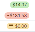
This is a screen shot of how the colors actually look when viewed in the YNAB application. Note that I don’t see a check mark icon next to the positive amount:

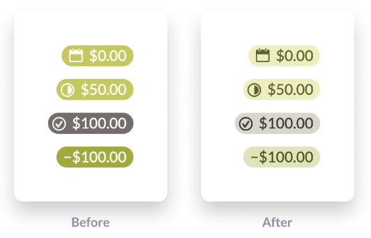
YNAB acknowledges that it is still problematic for users who experience deuteranopia:
While this helps with readability, we still use red and green to send signals about Available amounts, which isn’t the ideal experience for anyone with red-green color blindness.
Below is an example of what these colors might look like for these users. It’s actually the difference between the red and orange pills that is nearly imperceptible.

It’s great to see more web applications incorporating accessibility. Now if only it were clear what those three icons at the bottom of the modal message window mean. They have aria-label attributes on some emojis that are not at all informative:
<span class="intercom-reaction" aria-label="green heart reaction" aria-pressed="false" role="button" tabindex="0"><span>?</span></span>

<span class="intercom-reaction intercom-reaction-selected" aria-label="sleeping reaction" aria-pressed="true" role="button" tabindex="0"><span>?</span></span>

<span class="intercom-reaction" aria-label="art reaction" aria-pressed="false" role="button" tabindex="0"><span>?</span></span>