For more than 12 years, I’ve been staring at this gas gauge that looks like it’s divided into quarters but is actually bigger towards F and smaller towards E. The discrepancy is easier to see with the gauge rotated.
Nissan gas gauge
It’s just weird and confusing. I’d like to know why they did it this way. The only plausible reason I can think of is that this car has a large reserve of 3 gallons once the needle drops to E and the gas light comes on. So taking the reserve into account, the last ‘quarter’ on the gauge kind of makes sense.
LPT: See the arrow next to the gas pump icon? That tells you which side of the car the gas cap is. Useful in rentals!
Being able to add images easily to tweets is great (even if they aren’t accessible). I find myself frustrated, though, with the inconsistent nature of how those images are displayed.
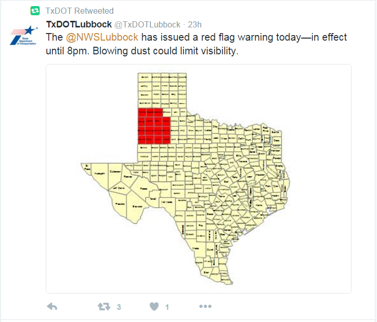
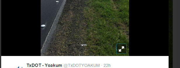
In the feed, you get a snapshot of the image based on the size of the original image. Here is an example where the original image is very small.
Tweet with a small embedded image
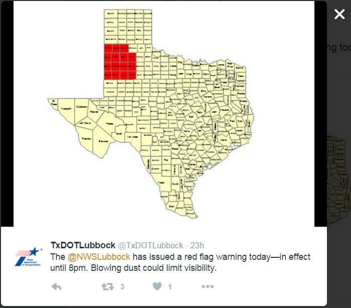
What I always expect to happen when I click a tweet—particularly one where the text is completely illegible—is to see a larger version of that image. But if the original image is small like this one (480×360), then clicking on the tweet is useless.
Tweet expanded
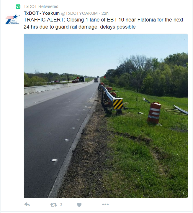
Conversely, if the original image is large (in this example 600×1067), the feed shows only part of the image cropped at 506×506.
Tweet with embedded image of 600×1067
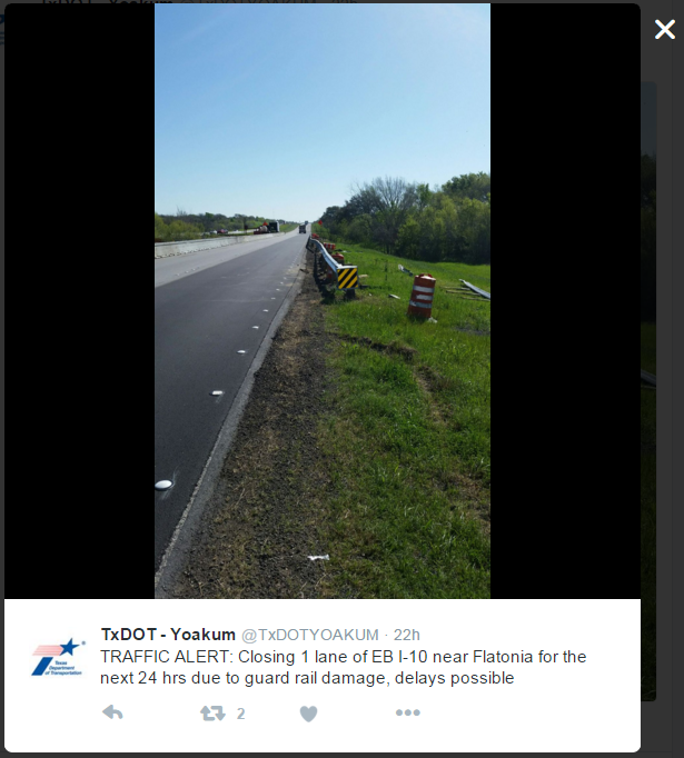
Clicking to view the tweet then shows a shrunken version of the original image at 315×558 without a way to really see the full image, which is what I want to see.
Tweet with full embedded image shrunk to fit the container
Design Recommendations
I’d like to see an icon that indicates there is a full size version available. That way, after I click on the tweet, I can click on the image to see the original.
Tweet expand image icon
In the first example of a small image in a tweet, the problem is partially a content issue. People can and should be able to post whatever images they want, even if they have small text no one can read. The absence of the expand icon could indicate there is no larger size to view.
On a mobile screen where even the small example here is likely smaller than what shows up in one’s feed, this problem isn’t as noticeable. But for those of us still using the desktop version, it can be quite annoying.
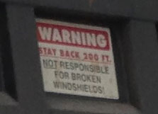
On dump trucks, I frequently see a tiny sign on the back (often partially covered in dirt) that reads:
Warning Stay Back 200 ft. Not responsible for broken windshields!
These signs are not only too small to read from 200 feet away as we’ll see, but it’s also unclear why not staying back might result in a broken windshield.
Dump truck sign on the back
See how small the sign is?
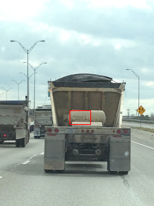
Here’s a picture of a dump truck on the highway approximately 200 feet away. I could barely tell there was at sign at all.
Dump truck approximately 200 ft. away
And here is the back of the truck at approximately 20 feet away. The image quality is low but it demonstrates just how small and illegible these signs are from the suggested 200 feet away.
Dump truck approximately 20 feet away
Some might say, “Once you’re close enough to see the sign, you’re too close so the sign is telling you to back off.” I say, if you expect people to stay 200 feet away, your sign should be visible from that distance, probably more.
Design Recommendations
The back of a dump truck has a lot of real estate for a sign; use it! I created a sign that is highly visible while also informing drivers why they should stay back. A distance of 200 feet seems arbitrary, so I would depend on drivers to choose a safe distance.