Waze, what is that bar on the left for?

I’ve been using Waze for a few months now, and every now and then, a bar shows up on the left side. I’d glance down and see that it showed “something” was estimated to happen (or last?) for a few minutes, but I could not figure out what. We have a hands-free law here, so I could not legally take my phone off its holder and look at it more closely.

photo inside a car of an iPhone in a phone holder, displaying the Waze app map
Waze app in my car

The screen is probably 18″ from my eyes and I wear polarized sunglasses which makes the app even harder to interpret when glancing down for fractions of a second.

It took using Waze as a passenger to see that the bar’s label also had the word “Jam” (traffic jam?) in a light blue font. However, other times I’ve been driving and the bar has no label, so I’m still not sure what it’s for!

screenshot of the Waze map with a status bar on the left side that has no label to indicate its purpose
Waze left bar with no label

Design Recommendation

This is an easy one. Change the font color to white and bold it so that the word “Jam” is just as visible as the time estimate. And always include a label to indicate why the bar is there.
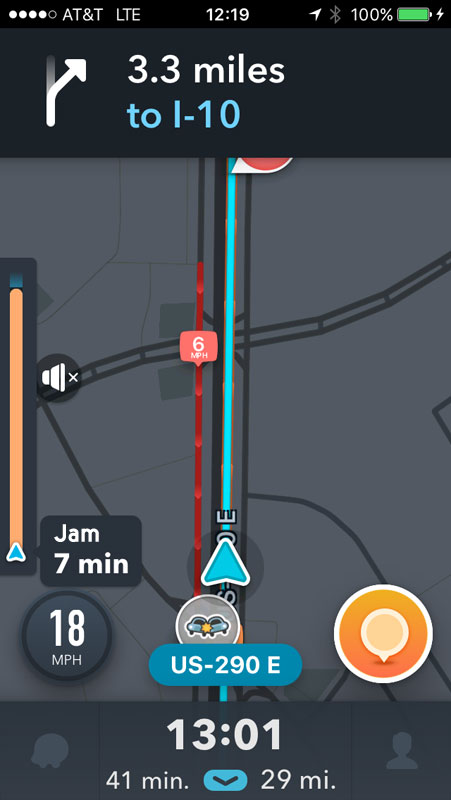
Waze map showing an orange status bar with "Jam 7 minutes"
Screen capture of the Waze map screen

Online Emergency Department Check-in Mishap

Earlier this evening, my partner’s car was hit by a guy running a red light. He sustained a concussion and wanted to go to the hospital. Here is dashcam video of the accident.

After calling insurance to find out which hospital he could visit (turns out, not the closest one!), I looked it up online to verify the address. On that page, I saw that the emergency department offered online check-in so that you can wait at home.

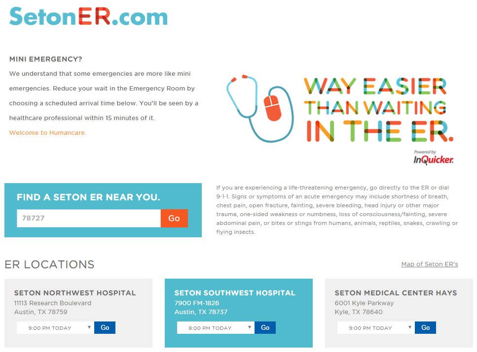
screen shot of the Seton ER hospital home page with a form to locate a hospital
Screenshot: Seton ER home page

Being in a hurry since this was an emergency, I was scanning the page quickly. Only two things caught my eye:

  1. The headline that reads “Mini Emergency?” at which point,
  2. I scrolled down, saw the location I wanted, and clicked “Go”

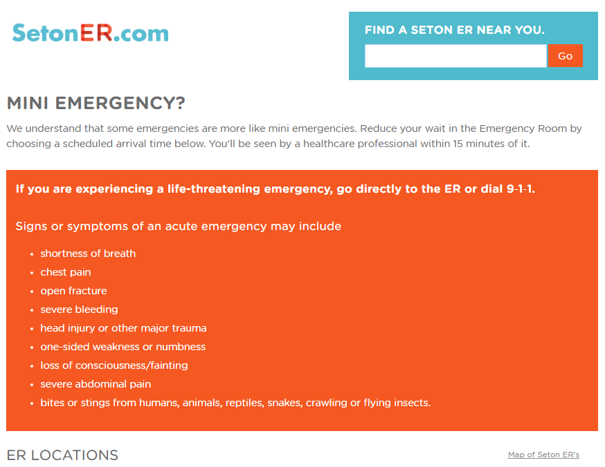
What I did not notice was the most important information on the page—the statement about what conditions not to use online check-in for:

If you are experiencing a life-threatening emergency, go directly to the ER or dial 9‑1‑1. Signs or symptoms of an acute emergency may include…head injury or other major trauma…

Design Recommendations

  1. Move the when-not-to-use-this information to be in context with the page’s main heading
  2. Make the small, gray font with poor contrast easier to read
  3. Transform the long, boring block with a bullet list
  4. Reduce the branding that takes up valuable real estate and obfuscates important information
  5. Under the covers, fix the order of headings
screenshot of design changes to the Seton ER homepage with important information highlighted
Screenshot: Updated Seton ER homepage

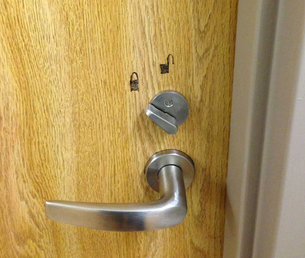
In the bathroom, I saw this great example of people making their own user experiences better. The lock was installed backwards.

Photo of a bathroom door lock where the lock is reversed so someone drew locked and unlocked icons on the door
Lock on the ER bathroom door

Bowling!

I went bowling for the first time in a long, long time last night with some friends. I expected to see the typical scoring screen.

photo of a bowling screen with 10 frames
Tired old bowling courtesy of sunnythomas

On the screens above each lane, I could see a similarly detailed scoring outline for each player. But what I saw on a smaller screen next to the lane, very much in the eye line of players, was a simple bar chart showing player progress.

photo of a bowling scoring screen that shows a bar chart of who is winning
Updated bowling screen with bar chart

What a great idea because most folks probably don’t care if they cleared a 7/10 split or how many spares versus strikes they’ve thrown. They just want to know who’s winning and what their score right now is. Super impressed by this.