I have a guest post today from my partner who works at the Pro-Desk at Home Depot helping contractors with large orders. Management decided to redesign the work space without getting feedback first. Enjoy!

This is the redesigned Pro-Checkout area of Home Depot with four Pro registers: two facing south and two facing north; drinks & snacks in between.
Primary customers: Contractors
- with large orders; and
- large pieces of lumber
Problem 1: Register bottlenecks
This aisle is wide enough for one associate with a client, plus one typical lumber/flat-top cart, which are extra wide, yet there are two registers per aisle creating a bottleneck that prevents clients from getting around someone already checking out at the front register to an available associate at the back register.
When clients finish at the front register, they are unable to move past a working client at the back register, forcing them to push the line of waiting customers back so they can exit in reverse.

This creates a further bottleneck at the output of all four registers where carts pile up and get in the way when clients have multiple carts of goods.
Problem 2: Bagging
Bags are located on the far side of the desk, away from where they are needed while checking out a customer, forcing an associate to look away from the client instead of engaging.
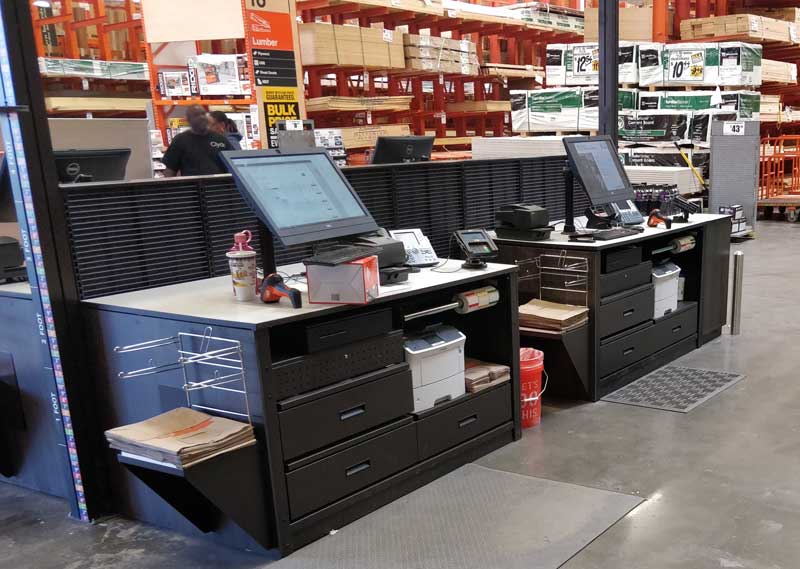
Problem 3: Lack of space
Our primary clients have large carts of long pieces of merchandise and the narrow aisles don’t leave enough room for turning the corner resulting in items getting bumped or ran into along with client frustration.

Example: A customer has 20 pieces of 12’ drywall, 4’ wide; or 16’ long dimensional lumber. The back end will hit the drinks and snacks or the person manning the back register, plus the front end may likely hit the wall or desk.
To circumvent this associates have started having customers leave large carts in the main aisle, blocking throughput, so they can scan things there. There is potential loss of product since the associate cannot keep a close eye on the terminal to ensure all items are scanned properly. Additionally this blocks waiting customers from progressing to the next available associate because of carts in the main aisle.
Problem 4: Small drink fridges
One of our biggest sellers is PowerAid which does not fit in the narrow slots for soda or the RedBull slots on the other side.

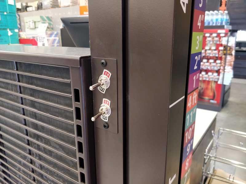
Problem 5: Light switch placement
Each lighted checkout sign has two sides that can illuminate independently. Instead of putting a switch on each side, both switches are on one side with no label. Which one turns on what light?
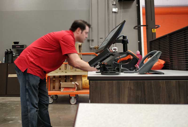
Problem 6: Desk height
The desktops sit at 2 feet 9.5 inches high, which works fine if you’re sitting in a chair. However, Pro-Desk associates stand all day making this setup less than ideal. This height creates back fatigue or severely bent wrists when using the terminal.
We devised some inventive solutions, like trying to raise the keyboard and mouse level up to a comfortable position, which management promptly nixed.
The monitor post is too short, making it impossible to raise the monitor to eye level.
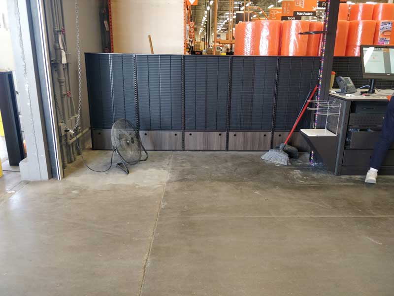
Problem 7: Dead space
Lots of unused space that should have drink machines or something in it. Space is at a premium, use it efficiently!
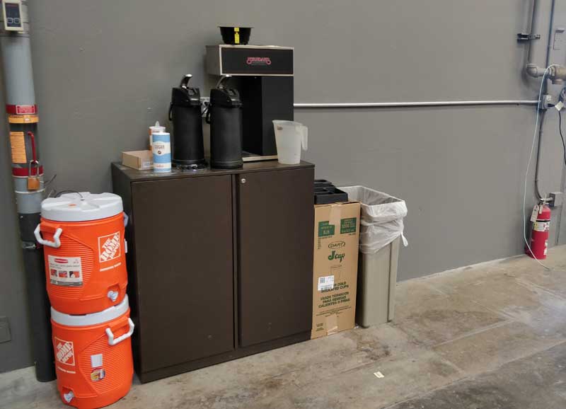
Problem 8: Coffee
Our “luxurious” coffee bar is 10 times worse than it was and has gotten comments from customers already.
Problem 9: Mouse pads
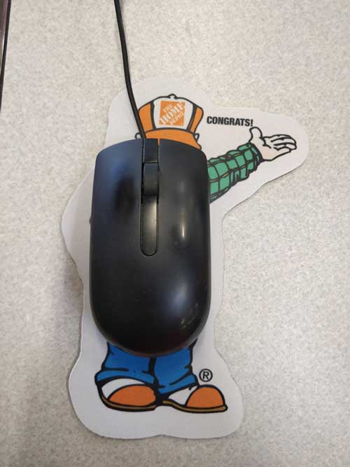
Whoever made these has apparently never used a mouse and needs to be fired.