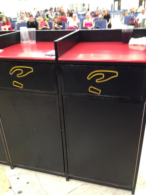
I was recently in an airport in Mexico when I saw this set of trash cans with no text, just an icon of a hand dropping what looks like a cup.
Trash can with icon instead of test
I think this is a good example of UX in the real world, especially for a multi-cultural area like an airport where people might not know the word for “trash” in the local language.
(Not to mention, some places use the name of container like “bin” instead of identifying what goes into it.)
Icons have notorious usability issues because universal icons are rare. But I think in this context, an icon used on the physical object is clearer than using text.
I think the silliest thing to label trash cans with is “Thank You” because it doesn’t give you an indication of what the container is for, yet this is rampant here in the US. I wonder how that got started?
I first heard about Siren, “A dating site that gives women more control,” earlier this year on NPR. It opened up this week to more communities, and I decided to try it out.
In lieu of a standard profile, Siren has people answer ‘Questions of the Day’. Women can chose to hide their profiles while men cannot and they have to approve any connection requests before receiving messages.
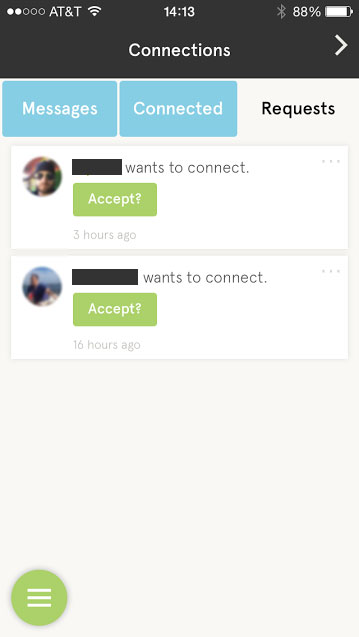
I find myself at a crossroads because of a serious UX flaw: What happens when I click the “Accept?” button for a connection request?
Siren app ‘Connections’ screen
Why does the button have a question mark?
If I click the button, will it automatically accept the request? Because I don’t see a ‘reject’ or ‘ignore’ option.
If I click the button, does it then give me an option to reject?
The main purpose of the app is to connect people, yet I find myself ready to walk away at precisely that point because I don’t want to get connected to someone by mistake, nor do I want to have a perpetual list of requests I’m not interested in.
On a user’s profile, I have the options to ‘Block User’ or ‘Report User’, neither of which is what I want to do.
For curiosity’s sake, I’ll click the damn “Accept?” button…
And there’s my answer. Clicking the button accepted the connection request, with no option to reject, and I see no option to disconnect. Bad, bad, bad.
Design Recommendations
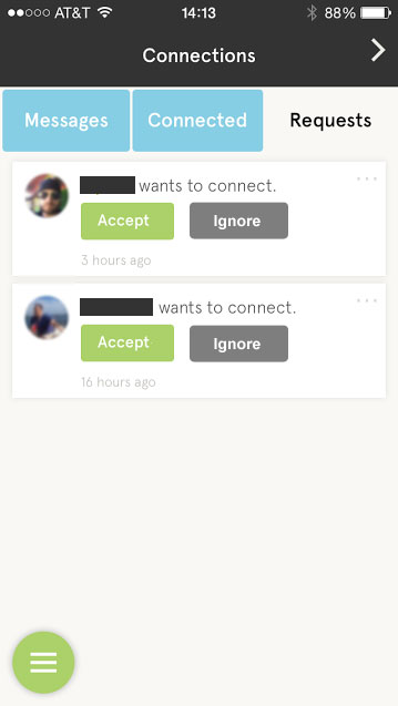
Remove the question mark from the “Accept” button, remove ambiguity about what clicking the button does.
Provide an “Ignore” button too.
Connections screen with an ‘Ignore’ button added
I found that on a user’s profile you can click some text that reads ‘Connected’ to remove the connection. I really dislike when UIs try to make text and buttons do double duty. It’s never clear, especially when the text isn’t shaped like a link or button. Just provide a ‘Remove’ button.
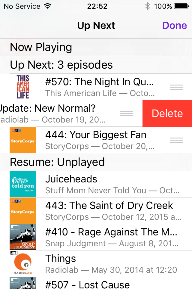
After finishing my last post, “Podcasts App Changes in iOS9“, I couldn’t stop thinking about the “Up Next” feature. I looked at the app on an iPad, the increased screen size making it easier to explore the UI, and came up with these insights.
You Can Delete and Reorder Some Episodes
Once I added several episodes manually to the “Up Next” list on the iPad, I noticed the reorder icon next to each episode. Standard hold and drag to reorder works. I could also swipe left to delete episodes I added manually.
iOS9 Podcast app “Up Next” screen on iPhone
These options aren’t available for anything else in the “Up Next” list, though.
The Flow is Broken
It took me a couple of hours to fully understand and document how the “Up Next” list works because it seemed to change unpredictably. Let’s walk through some examples.
Unplayed Episode Use Case
You want to listen to a specific episode after the episode you’re listening to right now is finished.
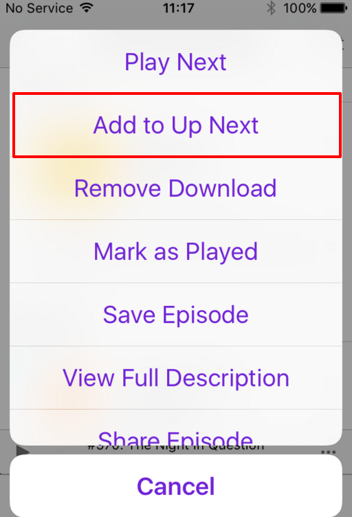
Go to the “Unplayed” screen to add an episode to “Up Next”.
Tap the menu icon to the right of any episode. (It looks like three horizontal dots.) This brings up a screen overlay with several options. Tap “Add to Up Next.”
iOS9 Podcast app episode menu
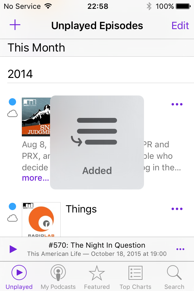
You should get a quick confirmation message flashed on the screen.
Add to “Up Next” confirmation
The episode you just added to “Up Next” will start playing as soon as the current episode ends. Sweet!
(You can add multiple episodes to “Up Next,” with each appending to the bottom of the list. But if you want to remove one or reorder the “Up Next” list, you’ll still have to find it first!)
Cut In Line Use Case
You’re bored with the episode currently playing and you want to listen to another episode immediately.
First, you add one episode to “Up Next”, then you try to play another episode.
Go to the “Unplayed” screen and tap the episode you want to listen to. Oh, what’s this alert message?
Alert message when playing an episode
This is important: Ifyou already have episodes in the “Up Next” queue, you see this confusing warning without context for the consequences and no way to view the current “Up Next” list.
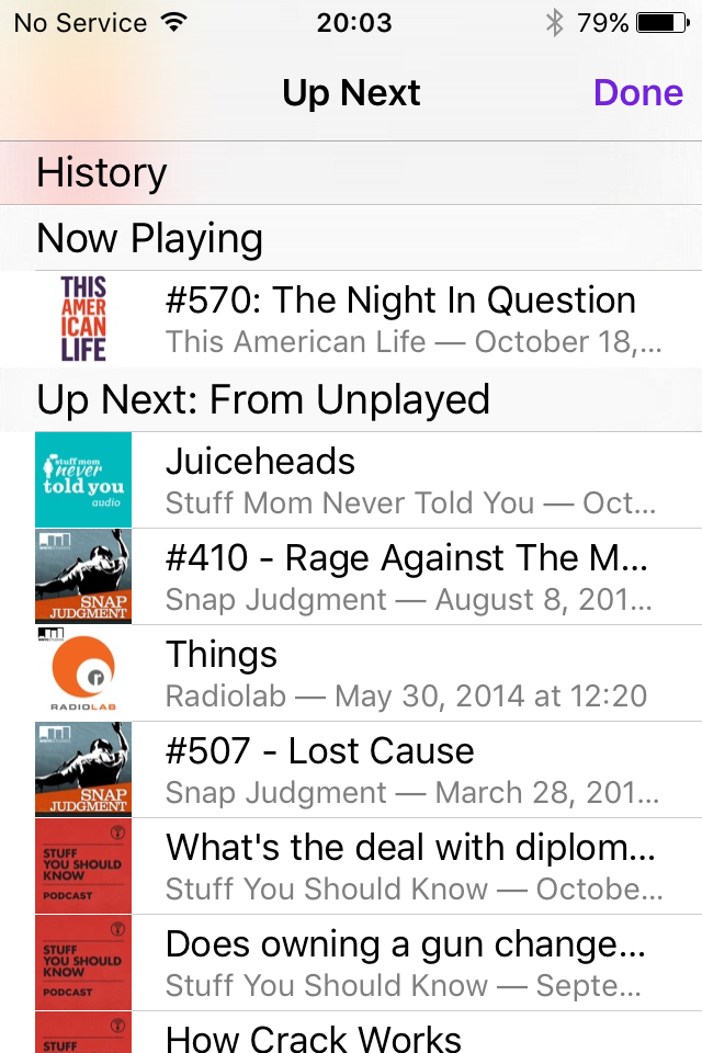
If you tap “Keep Up Next“, the episode you tried to play starts playing, and the episode you added to “Up Next” remains in the queue to play afterward. This is what I expect to happen why I try to play an episode. Getting a warning is annoying and makes me think I did something wrong. If you choose “Clear Up Next,” the episode you added to “Up Next” is removed from the queue, your “Unplayed” list becomes the new “Up Next” list, but only those episodes older than one you just decided to play. So, if you have 10 unplayed episodes, and you play episode 6 directly, episodes 7-10 become the new “Up Next” list.
“Up Next” list replaced with Unplayed episodes
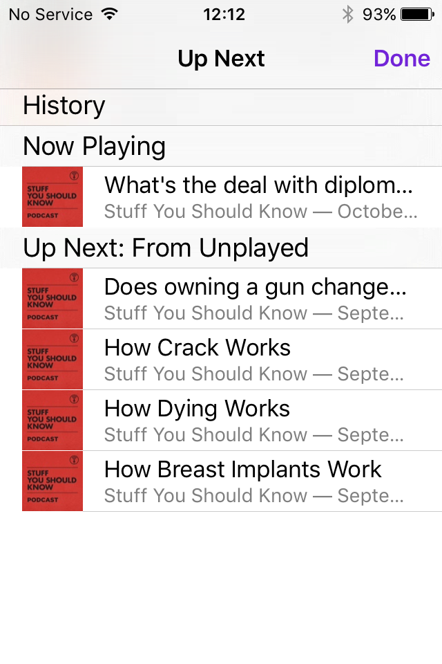
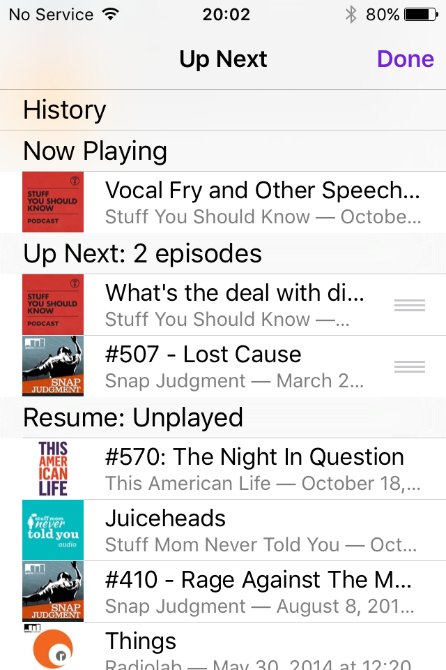
Play from “Up Next” List Use Case
While listening to the most recent unplayed episode in your queue, you add a couple of other episodes to the “Up Next” list, then want to swap the order.
You go to the “Up Next” screen to review the the queue.
iOS9 “Up Next” queue screen
While looking at the queue, you decide you’d rather listen to one of the episodes under “Resume: Unplayed”, so you tap it to start playing.You then return to the “Up Next” list to finish swapping the two episodes you added before. Except, where is your “Up Next” list? The section “Up Next: 2 episodes” with two episodes you just added manually has disappeared. WTF?
“Up Next” list changed without warning
Podcast Group Use Case
You want to catch up on several back episodes of your favorite podcast.
Go to the “My Podcasts” screen and browse to your favorite podcast.
Tap the first episode listed to start playing it. (If you have anything added to the “Up Next” queue, you’ll get the alert message screen.)
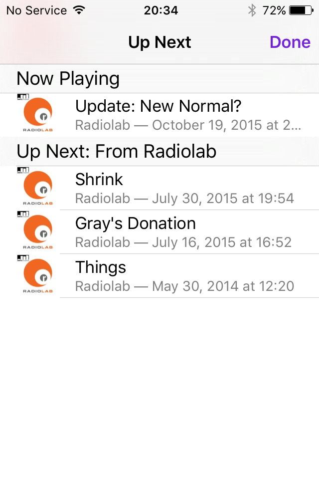
For grins, you look at the “Up Next” queue and see that now, instead of being populated by the “Unplayed” episodes list as before, it’s now populated with unplayed episodes of the current podcast only.“Up Next” screen for a single podcast
Design Recommendation
Bring back the “On-the-Go” station concept, a list that:
I can populate manually
Doesn’t change based on where I choose to start playing an episode (the “Unplayed” list, the “Up Next” list, or a podcast’s page)
Doesn’t throw confusing warnings at me about keeping or clearing the contents
As a weak substitute, you can create a custom podcast station that mimics “On-the-Go”, but it auto-populates based on station settings only. You can’t add individual episodes to it from other parts of the app, and this includes re-adding an episode you removed from the station.
The bottom line is that “Up Next” is way too complicated to be useful every day.