Blog

Creating useful alternative text for your images

Providing alternative text (alt text) for images is necessary to pass success criterion 1.1.1: Non-text content. On many of the websites I evaluate, it’s very common for alt text to be incomplete, incorrectly applied or missing entirely. When performing accessibility testing, I find it helpful to use a tool like this image bookmarklet to highlight all the images on the page and display their alt attributes.

screen shot of two images with alt attributes displayed by a bookmarklet tool.
Two webpage images highlighted using a bookmarklet tool for alt attributes

The key to writing good alt text is to consider the purpose of the image when trying to decide how to describe its meaning. Let’s look at five types of webpage images:

  1. Informative
  2. Actionable
  3. Decorative
  4. Redundant
  5. Complex

Informative images

These are images intended to convey pertinent information to the user. Most images in the main content of a webpage, like a photo supporting a news story, are informative images.

  • Informative images must have programmatically-discernible alt text that is accessible to people using assistive technologies (AT) like screen readers and braille displays.
  • Alt text must be meaningful and accurately convey the purpose and intent for those who can’t see it.
  • Alt text shouldn’t include words that identify the element as a graphic or image because screen readers announce that automatically.
  • Alt text should be concise. (We will look at complex images that require long descriptions separately.)

Let’s look at an example. Below is a screen shot of a table with two columns. Each table row lists a feature in the first column and has an icon of a check mark in the second column. The content author gave the check mark icon alt text of “check mark”.

screenshot of the header row and 2nd row of a table. the first column is labeled what's included and the 2nd column has a checkmark icon.
Alt text provided: check mark
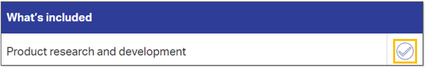
<img class="block--center" src="icon-check.svg" alt="check mark.">

But what is the actual meaning of the symbol of a check mark in this context? It’s there to indicate visually which features are included. Better alt text would be the word “yes” because that conveys through text what the icon conveys symbolically. A screen reader would announce:

Table
Row two column one What’s included
Product research and development
Row two column two Included
Yes

Tip: End your alt text with a period (full stop). This prevents it from being announced by a screen reader like a run-on sentence with text that follows.

Actionable images

Any time an image is used as a link, button or control, it must provide alt text that conveys its purpose in that context so that AT users understand what will happen if they follow the link or activate the control. Let’s look at the following carousel banner image:

screenshot of an image with lots of embedded text.
Alt text provided: Forrester names OpenText a leader in ECM Content Platforms. Read the report.
<a href="/info/forrester-wave">
<img src="forrester-wave.jpg" alt="Forrester names OpenText a leader in ECM Content Platforms. Read the report.">
</a>

When an image is used as a link, its alt text must explain the purpose of the link or control.

Tip: Avoid embedding text in images when it’s possible to display the content using real text.

Decorative images

When an image serves a purely visual function, it doesn’t need to convey anything to AT users. All inline images must include the alt attribute on the <img> element but it can be empty when the context is decorative. If the alt attribute is missing, though, a screen reader will often try to announce the file name instead of moving past it to the next block of text.

screen shot of a block of text and link with a decorative image above it.
<img src="circuit-board.jpg" alt="">

Redundant images

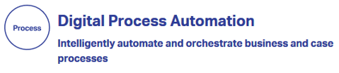
Sometimes, an image is redundant because its context is conveyed by adjacent text. Like decorative images, it’s okay to have a null value for the image’s alt attribute if it doesn’t need to convey additional meaning to AT users. In the image below, a circle icon with the word “Process” is visible to the left of a heading reading “Digital Process Automation.”

screen shot with an icon that repeats the adjacent heading text
<img src="icon-process.svg" alt="">
<h2>Digital Process Automation</h2>

The icon is redundant to the heading text and serves a mostly decorative purpose. It doesn’t convey additional meaning.

Complex images

When an image is complex in nature, like a chart or diagram, alt text should should describe the image briefly. Provide a complete explanation in an associated long description. Some content authors use a supporting element like <figcaption> with an aria-describedby attribute to programmatically link the <figcaption> to <img>.

Diagram of the OpenText intelligent and connected enterprise.
Alt text provided: Diagram of the OpenText intelligent and connected enterprise.
<figure>
<img aria-describedby="long-desc" alt="diagram of the OpenText intellgent and connected enterprise." src="opentext-intelligent-and-connected-enterprise-graphic.jpg">
<figcaption id="long-desc">The OpenText EIM Suite and OpenText Cloud combine to support EIM applications and EIM platforms with an intelligent information core of automation, AI, APIs and data management.</figcaption>
</figure>

The long description should be visible for sighted users as well as they might benefit from the robust explanation, particularly when it comes to lengthy charts and graphs.

Conclusion

Alt text is both simple and complicated at the same time but a little forethought into the purpose of your images in each context goes a long way towards making them meaningful for AT users who won’t perceive them visually.

Accessibility review of the We Are Blood online questionnaire

I’m a regular blood donor with our local blood bank, We Are Blood. If you’ve ever donated blood, you know that part of the process is answering a bunch of health-related questions first to help determine your eligibility. Being sick, taking certain medications or having had certain illnesses can exclude you from donating.

I’m donating blood this Friday and was thrilled when today’s reminder email announced a new option to complete the pre-donation questionnaire online, before coming in for my appointment. I decided to check this process for web accessibility. Let’s begin!

Welcome to QuickPass page

The email links to the Welcome to QuickPass! page which has a lot of accessibility issues, and this is just the instructions. I ran both the Lighthouse and Axe accessibility audits in Chrome and the results were not good.

  • Lighthouse score: 47/100
  • Axe automated issues found: 28
Screenshot of the top of the Welcome to QuickPass page

Some site-wide issues

  • The entire We Are Blood website is missing a “skip to content” link that would allow users to bypass the repetitive navigation links.
  • The “We Are Blood” logo is embedded SVG code that does not provide any text alternative and is announced by the NVDA screen reader as “weareblood.org link.” The logo should include a <title> element with the text “We Are Blood. Drawn together since 1951.” Doing this will enable a screen reader to communicate the logo to users with visual impairments who cannot see it.
  • The five links in the site’s main navigation all have dropdown menus that are accessible on mouse hover only. To be accessible, users must be able to use all website components with a keyboard.
screenshot of the dropdown menus on the We Are Blood website.
  • The newsletter signup form in the footer uses positive tabindex values. The result? When a keyboard user tabs from the browser address bar into the page, the first focusable element is the “Full Name” field in the form, which is confusing because it violates the natural reading order of the content. The second focusable element is the “Email Address” field. The third focusable element, though, is not the form submit button—it’s the “We Are Blood” logo link because after the positive tabindex values, the tabindex goes to the beginning of the content.
  • The newsletter signup form submit button is missing a text label. The screen reader announces “Contentinfo landmark button.”
  • The newsletter signup form fields use placeholder text instead of <label> elements.
screenshot of the newsletter signup form showing the two fields have positive tabindex values.

There are several color contrast issues where the contrast ratio between the text color and background color fails to meet the 4.5:1 requirement for regular, unbold text. For example, the gray text in the screenshot below from the footer has a contrast ratio of just 3.13 on a light blue background.

screenshot showing poor color contrast of gray text on a light blue background.

Content issues

Arguably, the most important thing on this page is the link to start the questionnaire. While visually it looks like there is a big button that reads “Click here for QuickPass,” a screen reader announces “welcome cust=WRB link” because no alternative text is provided on the image. The alt attribute must contain the same text that is in the image.

click here for QuickPass button.
<img class="aligncenter wp-image-2040 size-full" src="https://weareblood.org/wp-content/uploads/2018/05/QuickPass-Click.jpg" alt="" srcset="https://weareblood.org/wp-content/uploads/2018/05/QuickPass-Click.jpg 600w, https://weareblood.org/wp-content/uploads/2018/05/QuickPass-Click-150x57.jpg 150w, https://weareblood.org/wp-content/uploads/2018/05/QuickPass-Click-300x113.jpg 300w" sizes="(max-width: 600px) 85vw, 600px" width="600" height="226">

The page content skips heading levels. It starts correctly with <h1> for the “Welcome to QuickPass!” main heading, but then skips to <h4> for the heading “A couple of key points”, then to <h3> for headings in the footer.

QuickPass questionnaire pages

The questionnaire begins on the ABO QuickPass page.

  • Lighthouse score: 43/100
  • Axe automated issues found: 6

This start page does not support keyboard or screen reader usage because the entire thing is marked up as a form. Screen readers enter a different mode when they encounter a form, which disables the navigation hot keys, in order to allow users to type in form fields.

screenshot of the questionnaire start page with overview text and a large button that reads start questionnaire.

Here is how the body copy is marked up inside the <form> element:

<h1 style="text-align:center">
<font color="#E36B50">Hey Blood Donor!</font><br><br>
<font color="#01426a">Thank you in advance for taking the time to fill out this questionnaire.<br><br>Please ensure you are answering all questions in a private, confidential setting and that you read each question in its entirety before answering. Skip the question if you do not understand or have questions of your own.<br><br>Please note that your questionnaire answers are good for today only and that additional questions will need to be answered at the donation site.</font></h1>

Donor information page

Since this page actually contains form fields, it works better with the keyboard and screen reader, but it still has serious HTML markup issues.

  • Lighthouse score: 55/100
  • Axe automated issues found: 5
screenshot of the donor information request form with fields for name, gender and birth date.

Here’s the markup for the “First Name” field:

<span class="formleadinglabel">First Name:<span class="required-indicator desktop">*</span></span>
<span class="formfield">
<input type="text" id="firstname" name="firstname" maxlength="15" class="required" value="" autofocus="" autocomplete="given-name" placeholder="First Name">
<span class="required-indicator in-field mobile">*</span></span>
  • The form field labels are not <label> elements and, therefore, are not associated programatically with their <input> elements.
  • None of the text input fields are announced as required.
  • The day, month and year combo boxes are not announced as being for “Birth date” so screen reader users have no idea what date they’re being asked to enter.

Even if keyboard users are able to complete the form fields, they cannot continue to the next screen because the “Continue” control isn’t marked up as a button, preventing it from gaining keyboard focus. It’s also a background image without any text alternative.

<div id="btnContinue"></div>

Question pages

I didn’t complete the entire questionnaire today but the question screen has repeatable patterns and problems.

screenshot of the individual questions within the QuickPass app which have a question and three radio buttons for yes, no or skip.
  • The volume controls do not have text labels, which is really ironic if you think about someone trying to use this with a screen reader.
  • Keyboard users cannot tab to the radio buttons or select an answer.
  • There are two <label> elements per radio button <input> and the one with a text label has a CSS class which hides it. ? The screen reader announced “clickable, clickable, clickable.” Here’s the markup:
<input id="yes" class="answers" type="radio" name="answer" value="Y">
<label class="default-label" for="yes"></label>
<label for="yes" class="hidden">yes</label>

I am happy to have the option to complete these questions before I head to the blood bank, but it’s not accessible for many people with disabilities. I hope We Are Blood requests that the vendor make its software comply with the Web Content Accessibility Guidelines so that everyone can use it.

How to give your Yammer image uploads alternative text descriptions

At work, we use Microsoft’s social media tool Yammer. It wasn’t clear to me how to give alt text to uploaded images, so I searched through the Yammer support documentation and found a page on accessibility in Yammer. But neither that page nor a supplemental page on using a screen reader with Yammer mentions alt text or images.

screenshot of my Yammer feed with an uploaded image

Looking at the HTML code in my feed, I saw that images are marked up as background images on <figure> elements and contain default descriptions as <figcaption> elements.

<figure style="background-image: url('https://www.yammer.com/image-file-path/preview');">
<figcaption>Attached image: No description set. Image-File-Name.jpg Click to open full-page preview.</figcaption>
</figure>

When you click on an image in your feed, it opens in a modal overlay and displays the image as an <img> element which does have an alt attribute with similar default text.

<img src="image-file-path" alt="Uploaded image: No description set. IMAGE-FILE-NAME.jpg">

In both instances, the default text shows No description set.

Usually, alternative text would not include the image file name. I think Yammer does this because it is also a file sharing tool and in that context, knowing the file name could be useful.

Add a description when attaching an image to a post

Like Twitter and Facebook, Yammer offers the ability to provide an image description when attaching a file to a new post. This option is so hidden, though, that I never noticed it and assumed for a long time it wasn’t possible! I messaged the Microsoft Accessibility team to ask when Yammer would support alt text for user-posted images and got this response:

Thanks for reaching out. When you upload an image to post in Yammer, there is some helptext below the image prompting you to add a description. Please let us know if that’s not what you’re looking for.

@MSFTEnable on Twitter

Sure enough, after the image uploads, there is a tiny line of text beneath the file name that you can click on to enter an image description. It reads:

File attached. Before you post, add a description to this file so it’s accessible to everyone.

screenshot of an image attachment on a Yammer post with the input field to add an image description highlighted

Tip: End your description with a period so that screen readers pause before announcing the file name.

Add a description to any previously uploaded image

  1. If you’ve already uploaded your image, click it to see the full-page preview screen
  2. At the bottom right of the screen, click the Go to File link
  3. On the file details page, there is an input field that reads “This file doesn’t have a description yet, click here to add one”.

    Click the input field, enter your image description, then click outside of the field to save it.
screenshot of the Yammer image details page with a highlight around the input field to add an image description

From my testing, I’m able to add and edit descriptions for images uploaded by other users too, even if I don’t follow them or belong to the group where the file is posted.