On Walkability of Communities

My community cause is keeping the sidewalks clear in my neighborhood, primarily the very busy street leading to both a middle school and an elementary school, part of which is in a school zone. On my morning walks, I see parents and kids leaving the sidewalk to avoid things blocking the right of way (ROW).

Our city requires property owners to keep sidewalks clear because the area from the top of the sidewalk to the street is a public easement and intended for equal use by all residents.

map showing public easement between sidewalk and street

What’s the big deal? Well, anything impeding pedestrian traffic makes the community less walkable and presents hazards to those trying to navigate the neighborhood safely. It’s dangerous (and annoying) to lots of community members, including

  • Parents and kids going to school
  • Bikers
  • People pushing strollers
  • Joggers
  • People walking dogs
  • Wheelchair users
  • Blind pedestrians

These hazards fall mainly into two categories: cars and plants.

Cars

In Texas, impeding sidewalks with a vehicle is a ticketable offense. Cars are not supposed to park on or over sidewalks in any way, both by state law and further by city ordinance. Period.

§ 16-5-21 PARKING BETWEEN THE CURBLINE AND THE PROPERTY LINE PROHIBITED
It shall be unlawful for any person to park or permit or cause to be placed, stored or parked any motor vehicle on that portion of the public right-of-way between the curbline and the property line.

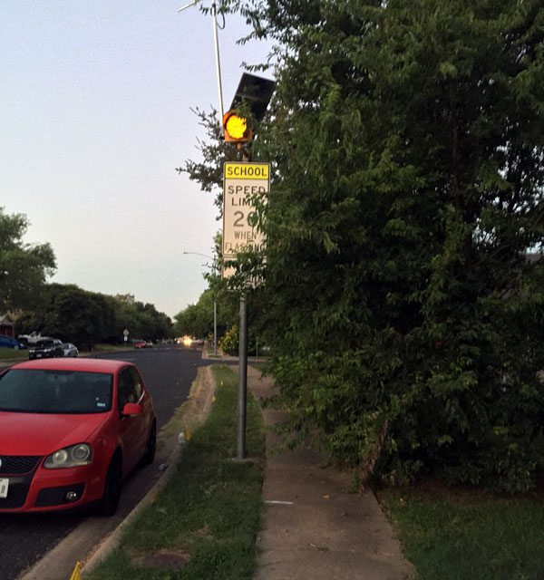
car parked over sidewalk near a flashing school zone sign

Some folks want to rationalize their choice to block sidewalks, illustrated nicely in this article.

Here’s a video from a similar story:

In my neighborhood, street parking is not a problem. The roads are wide and there is plenty of room.

Plants

One of the things I love about this neighborhood is that it doesn’t have a homeowners association. No one can tell you what to plant or do with your yard; and with that freedom comes a necessity to keep plants under control. As an ardent gardener, I’m sympathetic to the amount of work it takes to maintain landscaping, until it becomes a safety issue.

overgrown shrubs blocking the sidewalk

The city started a campaign this summer to inform residents of their foliage responsibilities.

Streets, sidewalks, and other public rights of way are for everyone’s use. Property owners are responsible for their private trees and all other vegetation in the public right-of-way next to their property. Overgrown vegetation is a safety hazard and limits the use of sidewalks, trails, streets and alleys. It further threatens public safety when vegetation blocks the view of traffic signs, signals, vehicles, or cyclists. Trimming vegetation and caring for your trees are effective ways residents can enhance neighborhood safety.

Next Steps

I think this is primarily a problem of apathy. People don’t care if their cars impede sidewalks probably because they don’t use sidewalks. One morning, I tried asking someone in his car blocking the sidewalk to keep it clear and it did not go well.

Our city has a very useful 311 (code compliance) app where you can log a complaint in real-time with a photo of the issue and geolocation of the address, leaving enforcement to the professionals.

Just as we have to advocate continually for usability and accessibility of digital spaces, the same still holds true for many physical, public spaces. Education and laws are our current tool set. I’m hopeful we can change some minds though awareness, but for the rest who don’t care, it’s important that we make concerns known to community leaders.

4 Ways Kiva’s Redesign Limits Keyboard Users

Kiva, a microlending non-profit that enables anyone to lend money to help end poverty, recently went through a site redesign. This included major changes to its global navigation, faceted search, and loan display. Here’s a snapshot of the Lend page highlighting four problem areas affecting keyboard users.

screen shot of the Kiva.org Lend page

1) Global navigation menu doesn’t open

When tabbing through the site, the second link is the “Lend” menu in the global navigation. Only by using a mouse can the “Lend” menu be displayed. Hitting the space bar or enter keys to try to access this menu just reloads the page.

Kiva needs to implement a keyboard-friendly solution like Adobe’s Accessible Mega Menu, available on GitHub. It enables users to access drop drown menus with the space bar, and then continue tabbing through the menu links. The esc key exits the menu at any time, returning focus back to the navigation item.

screen shot of a mega menu on Adobe's Accessible Mega Menu page

2) Hidden controls

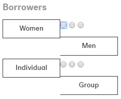
The “Borrowers” facet uses hidden radio buttons and provides no feedback to a keyboard user when one is in focus. Here, I’ve disabled the CSS rule that hides the radio buttons.

screen shot of the hidden radio buttons for the Borrowers facet

I tried repeatedly to select one of these options using the keyboard but couldn’t. Kiva needs to allow users to select all form options, even if the radio buttons are visually hidden. Mouse users click on the form labels to select options but labels do not get keyboard focus.

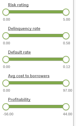
Another set of facets employs sliders to filter results. These are completely inaccessible to keyboard tabbing.

screen shot of slider filters in the Kiva faceted search

I did a little searching and came across some accessible slider examples that allows keyboard focus on the handles then employs the arrow keys to adjust the values.

3) Focus, focus, focus

So many elements on the Lend page do not indicate they are in focus, from the above mentioned facets using radio buttons, to the lending controls for individual loans. In this example, the links for “Lend $25” and “Learn more” are visible only on hover. While the links can be tabbed to, there is no feedback that they are in focus.

screen shot of the loan gallery

Kiva needs to use the a:focus CSS selector consistently and ensure any JS used to show links works with keyboard focus too.

4) Stuck modal windows

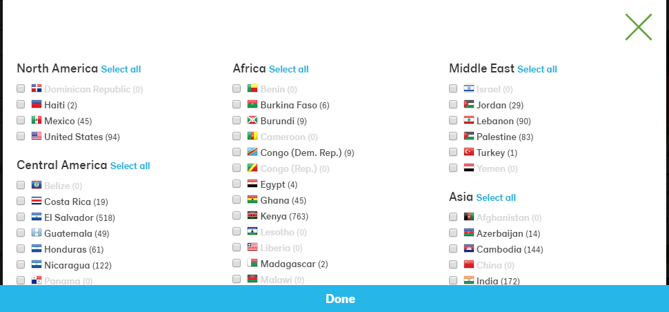
Another facet option is to “Select countries” to filter loans. This link opens a modal window.

screen shot of the select countries modal window with checkboxes for each country

I tried tabbing through the country checkboxes but nothing happened because the modal window did not get focus. As I held down the tab key, I could see that I was continuing to tab through the links on the Lend page instead. My only option was to hit the esc key.

Final Thoughts

Making sure your site works with focus is important and easy to implement. For visual feedback, you generally can employ the same CSS rules used for hover. Another useful enhancement would be to provide a way for keyboard users to skip the search facets and go directly to the loan options. Reviewing this site has inspired me to create a future post centered on accessible faceted search.

Flipboard Accessibility Audit

I’ve never used Flipboard, so I decided to make my first visit an opportunity for a preliminary accessibility audit based on the WAI Easy Checks – A First Review of Web Accessibility heuristics.

It was a challenge to get the site’s source code because everything is rendered on the fly with JS. I had to use the Chrome inspector and copy/paste the code into an HTML file for upload to the W3C validation service. (And there is no fallback for users without JS.)

screenshot of a snippet of HTML that shows up when JS is disabled on the Flipboard homepage
JavaScript disabled on Flipboard homepage

The validation service returned many errors, but this audit explains three basic accessibility problems.

1) Images Lack Text Alternatives

So basic yet so overlooked, the home page images don’t have alt attributes. This includes both images that are linked and not linked.

For linked images, lack of alt attributes means a screen reader has no context for the link; it’s like a link without text. For all images without alt text, the screen reader will read the file name, which provides little to no context for the element.

Linked image on Flipboard homepage

This is the rendered HTML for the National Geographic square:

<a class=" splash-tile partner" href="/section/national-geographic-ga7unkc6sb3qhid0?intent=invite"><img class="background-image" src="https://images.nationalgeographic.com/wpf/media-live/photos/000/898/overrides/sheep-grazing-judean-desert_89872_990x742.jpg"><img src="https://cdn.flipboard.com/dev_O/featured/svg/logo_natgeo_dark.svg"></a>

And this is how a screen reader would interpret that HTML:

LinkGraphic slash logo underline natgeo underline dark.svg

Always include the alt attribute in the <img> element. If the image is there for visual design only, include an empty attribute alt="". For images that provide contextual information to sighted users, provide meaningful descriptions of the contents.

Flipboard.com also uses a lot of SVG, none which is accessible because there are no <title> or <desc> elements used to provide text alternatives for these graphics. For example, the Flipboard logo shows up as an empty link. SitePoint has a great article on how to create accessible SVG.

2) Form Fields Lack Labels

The sign up form on the homepage relies on placeholder text to do the job of field labels. The problem with this approach is that labels provide context for form fields that placeholder text can’t. Further the poor color contrast with the light gray text on a white background does not meet accessibility standards with a ratio of 2.28:1.

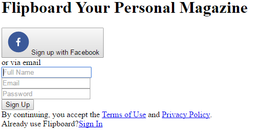
HTML for the sign up form with CSS disabled to show it does not have form labels

Labels don’t have to be visible, accessible by screen-readers only, but relying on placeholder text makes it difficult for users to remember what data to enter after they start typing; this is probably not a big deal for a three field form, but it’s a good idea to be consistent. This form could change the placeholder text into field labels while maintaining the same visual design.

screenshot of the sign up form with field labels always visible


This form does deserve some props for using a “Full Name” field instead of two fields for first name and last name, and for not having a “Confirm Password” field.

3) Poor Keyboard Access and Visual Focus

Many people cannot use a mouse (or finger) to navigate websites and rely on keyboards or assistive technologies to move between links. For this to work, links must

  • provide sufficient visual queues when they are in focus, and
  • be a logical order within the source code that closely matches the natural reading order

The simple litmus test for this is to try to tab through a site. I had a lot of trouble with Flipboard because none of the links had visual focus. For example, the “Sign In” link in the upper right changes background color on hover, but not on focus; so when users tab to this link, there is no visual indication of where they are on the page.

screenshot showing the sign in link box


Further, the “Sign In” link looks like it’s the first or second link on the page, but it’s actually the 12th link, requiring users to tab through the sign up form before they can sign in to use the site. That link needs to move up in the source code to be more readily accessible.

Some content is hidden from some users

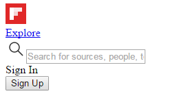
Looking at the homepage with CSS disabled, I noticed two things that cannot be reached by everyone: a search box and a “Sign In” option that opens a modal window.

screenshot showing that the sign in link and search box are not visible when CSS is enabled

All content must be accessible to all users. While users can tab to the search box, it remains invisible on focus to keyboard-only user and it lacks both a field label and a form submit button. Ironically, search appears to be more accessible to screen readers than to visual users because I didn’t see search on the page.

The “Sign In” option functions as a link but is not marked up as a link.

<div role="button" class="tab-item login-button" data-
reactid=".0.$/.0.2.3:$signintabitem">Sign In</div>

Because it is not an <a>, users cannot tab to this element; it’s not really a link. I see this all the time, and there are several more examples on the Flipboard homepage. In my experience, this is lazy coding in a JS framework.

Recommendations

These three issues are just the beginning. The site does not make use of ARIA role attributes for navigation, proper headings for the document outline, or pass a logical structure check of the HTML. Flipboard needs to work with an accessibility expert to make its site inclusive. This web accessibility checklist is a good place to start.