When I bought a new dishwasher recently, I went online to register it with Frigidaire in case I needed to use the warranty. My immediate reaction was, is this something I have to print out and mail in?

This form suffers from a lot of problems including
- Unclear form fields because they aren’t boxes, just underlines; where do I click?
- Unnecessary fields (email confirmation, first and last name instead of full name)
- Small text with poor contrast
- Required fields that aren’t marked (address, city, state, zip)
My focus for this post, though, is the next part of the form where the user is asked to enter product information.
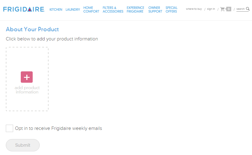
The whole reason I’m filling out this form is to add product information, yet those fields are obfuscated by an unnecessary ‘add product information’ link. When clicked, fields for model number, serial number, date of purchase and location of purchase display, and the wonky ‘add production information’ link remains.
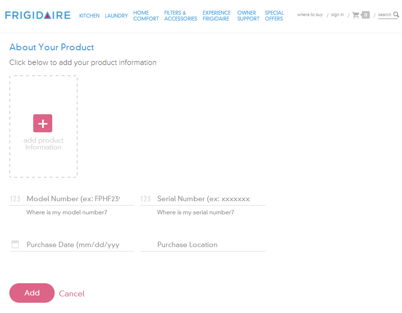
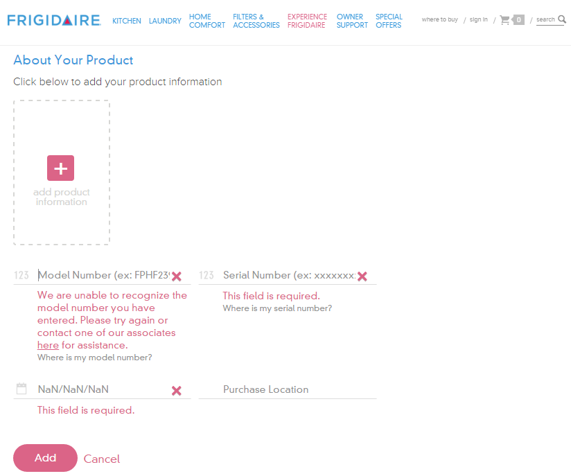
If you click the ‘add’ button without filling out these fields, you get error messages for three of the fields as it turns out model number, serial number and purchase date are required.
Design Recommendations
- Don’t require the user to click the ‘add production information’ link to see the form fields and remove the unnecessary help text above the form: “Click below to add your product information”
- Clearly indicate required fields
- Make form fields look like form fields
- Provide form labels and keep formattitng instructions visible instead of using placeholder text
- Make it easier for users to understand what model number and serial number are and where to find them
I gave the form a streamlined, top-to-bottom flow with large text and obvious form fields. To the right is an example of a product tag that shows what the user is looking for to locate model and serial numbers; I also listed the links to the help pages that show the locations of these tags for each product type.

The form checks the field data as it is entered and alerts the user of errors inline. Once a field’s data validates, a check mark displays next to it. After the user enters his model number, an image of that product and the product’s name display below the field for visual verification.
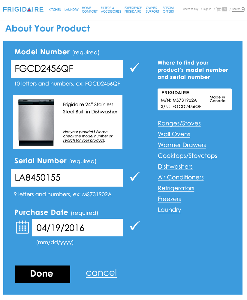
Once all required fields are verified, the “Done” button becomes active. After clicking “Done”, the user can choose to add additional products—something the existing form handles well.