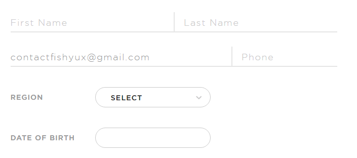
Forms.
So easy to get right, yet so often poorly constructed.
Today I came across this gem with a contrast ratio of 1.26:1, as in barely above 1:1 which is invisible. Gray on white should always have contrast checked.
Other form infractions include
- Using placeholder text as labels. Once a user starts typing, it’s no longer clear what information was requested or what format the data should be in.
- When tabbing through the form, there is no visual indicator when you’re on a select field or a button.
- I just don’t see the point in trying to reinvent the form experience. In this case, they’ve chosen a skeuomorph design, attempting to recreate a paper form experience digitally.
- I like the address suggestion but it’s not possible to tab to it and select anything.

- I could not tab through the t-shirt size options and select anything using the arrow keys, even though these were coded as radio buttons.
 Using the browser inspector, I unhid the radio buttons and then could tell that after I made a selection, I was tabbing through the radio buttons.
- It was really hard to tell if I could tab to the submit button without visual indication. Adding a button focus style with the inspector showed that it was getting focus.
So much has been written about the IA of good forms, the proper markup of form elements and form usability, it’s amazing to me designers don’t follow a known pattern for an account creation process. It’s not the time to get fancy.
