Last updated 8 May 2023.
The companion videos and information on performing an accessibility test are available from the Accessibility Testing project page.
In part one, we looked at setting up our environment for accessibility testing, including configuring the accessibility testing spreadsheet. We scoped the homepage of the test site, BoomerangTags.com, into the following eight components to make testing easier:
- [Site] Header
- [Home page] Hero
- [Home page] Pet tags
- [Home page] Ratings
- [Home page] Video
- [Home page] Business information
- [Site] Footer
- [Site] Cookies settings
The [Site] components of Header, Footer and Cookie settings appear on every page of the site and need to be tested only once. Additionally, we have a “Common Issues” component for tracking any site-wide problems affecting multiple pages, like 2.4.1: Bypass Blocks.
Explore the component
We begin our testing with the 01 [Site] Header component.

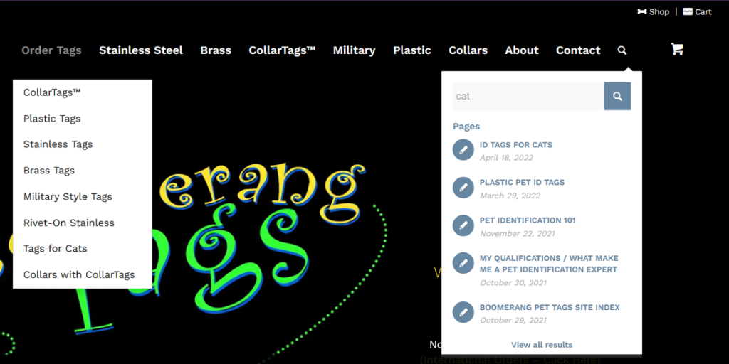
Using a mouse, keyboard and screen reader, explore the component. We want to get an idea of what kinds of controls and widgets the header contains. We can also do a first pass for success criteria like 2.4.7: Focus Visible when we’re tabbing through the focusable elements with the keyboard. We can discover hidden menus that display on hover or widgets that expand by activating a button.
The [Site] Header contains the following content:
- Utility navigation with two links
- Navigation landmark with a list of 10 items with links
- Two links have menus
- The last link in the list opens a search widget
- Search field with autocomplete and a button
- Autocomplete list contains several links
- Shopping cart link
Test the success criteria
Do a first pass through the 50 success criteria (SC) to identify which ones are applicable to the component you’re testing. For [Site] Header, we’re able to mark 21 SC as not applicable either because the content doesn’t exist (video/audio) or the content is out of scope (page level). We then did automated and manual testing of the remaining SC.
Fails (10)
- 1.1.1: Non-text Content
- 1.4.3: Contrast (Minimum)
- 1.4.11: Non-text Contrast
- 1.4.13: Content on Hover or Focus
- 2.1.1: Keyboard
- 2.4.3: Focus Order
- 2.4.4: Link Purpose (In Context)
- 2.4.7: Focus Visible
- 3.2.4: Consistent Identification
- 4.1.2: Name, Role, Value
Passes (19)
- 1.3.1: Info and Relationships
- 1.3.2: Meaningful Sequence
- 1.3.3: Sensory Characteristics
- 1.3.4: Orientation
- 1.4.1: Use of Color
- 1.4.4: Resize text
- 1.4.5: Images of Text
- 1.4.10: Reflow
- 1.4.12: Text Spacing
- 2.1.2: No Keyboard Trap
- 2.1.4: Character Key Shortcuts
- 2.3.1: Three Flashes or Below Threshold
- 2.4.6: Headings and Labels
- 2.5.2: Pointer Cancellation
- 2.5.3: Label in Name
- 3.2.1: On Focus
- 3.2.2: On Input
- 3.3.2: Labels or Instructions
- 4.1.1: Parsing
Conclusion
While we found failures of only 10 of the SC, we found more than 10 total issues. For 1.4.3: Contrast (Minimum); we have five different examples of foreground text that does not have at least 4.5:1 contrast with the background color. For 4.1.2: Name, Role, Value, we have four different issues.
Download the BoomerangTags.com testing spreadsheet to explore the results.