This is the first article in a series about how to run an accessibility test. The companion video and information on performing an accessibility test are available from the Accessibility Testing project page.
If you’re new to accessibility, check out the many resources at the W3C Web Accessibility Initiative (WAI). A good, free foundational course is the W3C Introduction to Web Accessibility.
Introduction
When I started learning about testing for web accessibility, I came across a lot of checklists of what to test for but I struggled with two things. One, I didn’t understand the Web Content Accessibility Guidelines (WCAG) well enough to know if I was covering everything. Two, I didn’t know where on the page to start testing and how much I should test at a time.
The answer to both of these is to start somewhere. A little bit of accessibility testing of what you understand is better than no testing. I like to think of accessibility as a spectrum from less accessible to more accessible. Our goal is to improve access to our websites—a progressive and ongoing task. Accessibility is a huge discipline with many facets that takes time to do well. I hope this project helps ease you into the process.
Methodology
At the beginning of each test, we must establish what we are testing for given the different versions and levels of WCAG. Industry standard is to test WCAG 2.1 Level A and AA, 50 discrete success criteria (SC); that is what this methodology follows. What I found overwhelming was the best order in which to test each SC. Do I start at the top with 1.1.1 Non-text Contrast? What if an SC isn’t applicable to the webpage I’m testing?
I’ve created an accessibility testing spreadsheet to help with this.
Download the accessibility testing spreadsheet (Updated 26 January 2024)
The Overview sheet is a place to list the project name, date, WCAG version being tested, the environment used for testing (browser/screen reader combinations) and any tools used for testing.
The Scope sheet is a place to track what you’ll be testing. Later on in the Scope section, I address how to break up a page into components, or chunks of content, for testing. Provide each component with an ID, name, description of how to locate the component and the URL of test page. Update the “Status” column to reflect if the component is in testing, under review or completed.
Below I outline the columns in the Component sheet. For each component tested, create a clone of the Component sheet and rename it. The workbook includes two components to start.
Type
Each of the 50 SC are assigned a “Type” category. The spreadsheet is sorted by “Type” initially, grouping related SC into the following 12 categories:
- Active Controls
- Adaptability
- Contrast
- Dynamic Changes
- Errors
- Interactivity
- Keyboard
- Multimedia
- Order and Focus
- Page Level
- Semantics
- Sensory
Let’s look at the SC under “Active Controls” to understand how grouping SC makes testing easier:
- 1.3.5: Identify Input Purpose
- 2.4.4: Link Purpose (In Context)
- 2.5.3: Label in Name
- 3.2.1: On Focus
- 3.2.2: On Input
- 3.3.2: Labels or Instructions
We can see from the SC numbers that these are spread across a number of guidelines with gaps in the numerical order. While there’s nothing wrong with starting at 1.1.1, I find it easier to test related SC at the same time.
WCAG success criterion
This spreadsheet lists all 50 SC (rows 2-51). Each success criterion is linked to its W3C “Understanding” page which lists use cases and remediation resources. You can sort the “WCAG Success Criterion” column to reorder the SC from 1.1.1 to 4.1.3 instead of using the “Type” grouping.
Level
Each success criterion displays its WCAG level, A or AA. You can filter the “Level” column to display just A or just AA.
WCAG criterion description
The quick reference description of each success criterion is listed in the “WCAG Criterion Description” column. In part two, I discuss what each success criterion covers from a testing perspective and what to look for. In some cases, I’ve added examples or code snippets for reference. Take some time to read these over and understand what WCAG covers.
Status
The “Status” column has a pick list with three values for tracking your testing progress: N/A, Pass and Fail. I like to go through the 50 SC and mark any that don’t apply to the content I’m testing as “N/A”. For example, if there is no video or audio content on your testing page, you can eliminate six of the “Multimedia” SC from testing right away.
If you do not find any issues for a success criterion, mark it as “Pass”. If you find any issues at all for a success criterion, mark it as “Fail”. Filter the “Status” column to see only “Pass” or “Fail” results.
Issues
This is where you will write up any accessibility issues you find while testing the component. Let’s look at an example. You’re testing 2.4.4: Link Purpose (In Context). The test page lists several articles with “Read More” links. You test with a screen reader and they are all announced the same: read more. This means an assistive technology user cannot distinguish one link from the next.
In the “Issues” column, write a concise description explaining
- What content has the issue (“Read More” links)
- What the issue is (links don’t provide context)
- Why it’s an issue (users of assistive technology can’t distinguish between “Read More” links)
For simplicity, I suggest writing up all issues you find with each success criterion in the same “Issues” cell instead of creating a new row for each issue.
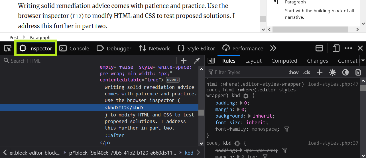
Use the browser inspector (F12) to determine if there are issues with the HTML.

Recommendations
In addition to identifying issues, we should provide advice on how to remediate the issues. This takes time. It’s only through the experience of testing different kinds of content that you learn the best way to solve accessibility issues. You might want to make recommendations after completing all testing if you need to look up examples and research how to fix problems. Writing solid remediation advice comes with patience and practice.
You need to have a good understanding of how HTML and CSS work to display content. You need to have a basic idea of how JavaScript controls page behavior, for example, enabling a button to open a menu. You don’t necessarily need to be able to code JavaScript but you do need to be able to discuss expected behavior and how to achieve it programmatically, like adding keystroke events for ENTER and SPACE keys to make a custom button keyboard accessible.
Use the browser inspector (F12) to test proposed solutions by modifying the HTML and CSS. I address this further in part two.
Source code
The browser inspector enables you to copy a source code snippet from the HTML or CSS to paste into the “Source Code” column of the spreadsheet. This enables developers to locate the issue more easily in their code base for remediation.
<a href="article.html">Read More</a>Environment
Industry standard is to test with two or more of these combinations:
- Chrome browser and JAWS screen reader on Windows
- Firefox browser and NVDA screen reader on Windows (this demonstration)
- Safari browser and VoiceOver screen reader on Mac
Below are the most-used browser/screen reader combinations in use according to the WebAIM Screen Reader Survey #9 (May-June 2021).
| Screen Reader & Browser | # of Respondents | % of Respondents |
|---|---|---|
| JAWS with Chrome | 500 | 32.5% |
| NVDA with Chrome | 246 | 16.0% |
| JAWS with Edge | 194 | 12.6% |
| NVDA with Firefox | 149 | 9.7% |
| JAWS with Firefox | 74 | 4.8% |
| VoiceOver with Safari | 72 | 4.7% |
| NVDA with Edge | 55 | 3.6% |
| ZoomText/Fusion with Chrome | 33 | 2.1% |
| JAWS with Internet Explorer | 30 | 1.9% |
| VoiceOver with Chrome | 24 | 1.6% |
| ZoomText/Fusion with Edge | 18 | 1.2% |
| Other combinations | 144 | 9.4% |
Tools
I’m using a group of freely available tools for this demonstration but I am not endorsing any one in particular. It’s important to test with different tools to find out what works best for your situation.
A good way to learn about accessibility problems is to use an automated accessibility checker. These tools will scan the source code and outline certain issues that can be tested for automatically, like color contrast. It’s important to double-check these flagged issues for yourself and add issues to the spreadsheet only if the flagged issue is valid.
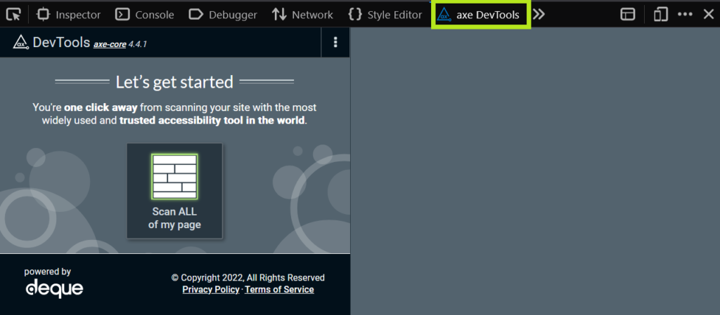
For this demonstration, I’m using the axe devtools Firefox extension. Once installed, it will add an “axe DevTools” tab to your browser devtools (F12). In part two, we’ll run the scan and explore the results.

I use the following tools to help me test for other issues:
- Contrast: Color Contrast Analyser
- Code highlights: Accessibility bookmarklets (outline headings, force focus indicator, tabindex, show tables, etc.)
- Parsing: W3c Validator, WCAG only parsing bookmarklet
- Keyboard: Trigger character key shortcuts bookmarklet
- Text: Text spacing bookmarklet, Window resizer extension
Scope
It’s important to assess what webpage or website you’re going to be testing so you can break up repeated elements into smaller components. This eliminates the problem of testing the same thing on multiple pages, e.g. navigation. If you’re testing a single webpage, that can often be treated as a single component. But if you’re testing a website with multiple pages, try to save yourself some work by breaking up the content:
- Header
- Navigation (global and local)
- Search
- Sidebar
- Footer
- Main content
Within the main content, you might want to break up lengthy pages into smaller components like carousel, image gallery, form, video player, etc. depending on what content you’re testing. There’s no sense in testing the same kind of content over and over; you want a good sample of the different types of content found within the website. It’s a judgement call by you as the tester as to how large or small a component should be.
Conclusion
You should now have a better idea of what to test and how to test it. In part two, I perform an accessibility test and track my results in the accessibility testing spreadsheet.