This is the original version of this post. An updated version from 13 April 2022 is available.
I originally created Accessible Web as a sarcastic reaction to a developer changing his website to require users to disable JavaScript to use it. The reactions on Twitter were hilarious! So many angry developers didn’t get the joke that they do the same thing when they require users to have JavaScript enabled to do anything on their websites.
I decided to create something similar but with CSS. And with a message about semantic HTML. I’ve recreated the experience below.
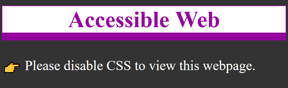
Whew! That’s better. So guess what?
The web is inherently accessible
Your weekly reminder that the web is accessible by default and it’s our design decisions that stop it being accessible #a11y
k.mar (@Kevmarmol_CT) on Twitter December 7, 2020
Why did you have to disable CSS to view this website? No reason other than a design choice that excludes sighted people.
Did you know? This is how many visitors “view” webpages already:
- Search engines
- Bots
- Site crawlers
- Analytics
- Blind people
This webpage is fully accessible to people with screen readers and Braille displays. But many websites are not due to poor design choices that exclude some people.
What is web accessibility?
When a page is accessible, it was developed with the intention of working for as many people with disabilities as possible. A good place to start learning is the W3C’s Introduction to Web Accessibility. Find out the different ways people with disabilities interact with the web.
Web Content Accessibility Guidelines (WCAG)
WCAG is a set of success criteria for determining if a page is accessible, led by four guiding principles:
- Perceivable: Information and user interface components must be presentable to users in ways they can perceive.
- Operable: User interface components and navigation must be operable.
- Understandable: Information and the operation of the user interface must be understandable.
- Robust: Content must be robust enough that it can be interpreted by a wide variety of user agents, including assistive technologies.
These contain guidelines and a hierarchy of success criteria from Level A to Level AAA. Many accessibility laws, and current best practice, point to WCAG 2.1 Level AA compliance. There are 50 discrete success criteria to evaluate, though many are not applicable to all pages. For example, if a page doesn’t contain video, you don’t have to evaluate against success criteria for captions or audio descriptions.
See the full list of success criteria
Did you know? The WCAG guidelines were first published in 1999. Web accessibility is not a new concept but a lot of people are learning about it only now.
Semantics
So what’s the point? The point is to develop accessible pages from the bottom up, starting with semantic HTML. A whole lot of developers think they know HTML but are actually pretty sloppy about it. Many don’t think it matters if they use a link or a button, but it does. Every semantic mistake introduces accessibility issues into your code. If you’ve never really “learned” HTML, check out this beginner’s guide to writing good HTML.
By far, CSS color contrast issues are the most frequent accessibility issues I see, but the HTML ones are problematic too. Outlined below are the top HTML-related accessibility issues I encounter.
Headings
If you visually scan this page, you can quickly see how it is broken up into sections. That’s due to using headings or the h1-h6 elements. It’s important that every page have at least one h1 so people and search engines know what the topic of the page is. From there, cascade down to h2, h3, and so on.
Did you know? People using screen readers can navigate by headings in much the same way that sighted people can visually scan the page for items of importance.
Form labels
Every input needs a label. It’s really that simple. And best practice is to make that label visible. This helps people remember what information they’ve entered. Programmatically link each pair using the for attribute on the label matching the id attribute on the input.
This enables a couple things:
- People can now click or tap on the label to give focus to the input. This is especially useful for checkboxes and radio buttons that often have small hit areas.
- People using screen readers will now hear the label announced when the input is in focus.
<label for="like-cats">
<input type="checkbox" id="like-cats">Please confirm that you like cats</label>
Let people know when a field is required by adding the required attribute to inputs. Many modern browsers do cursory form field validation.
<form action="">
  <label for="cat-email">Cat's Email *</label>
  <input type="email" id="cat-email" required>
  <button>Submit</button>
 </form>
Buttons and links
Buttons and links seem very similar to some developers but they have very different semantic uses. Buttons are used for controls on a page, such as a form submit or toggle, while links are used for navigation, literally for linking to another page. If you use them interchangeably, people can get confused about what a button or link is going to do when activated.
Some people try to make their own custom buttons instead of using the <button> element, which is already accessible:
<button>is keyboard focusable<button>is activated with enter and space keys
Tables
There are many legitimate uses for tables on the web but they are often coded incorrectly. Much as an input needs its label, a table data cell needs its table header. This allows the applicable table header to be read by a screen reader before the table data cell contents. Additionally, each table needs a <caption> that provides a description of the table contents to people using assistive technologies
| Cat’s name | Cat’s color |
|---|---|
| Luna | torbie |
| Stellan | black and white |
Images
The one thing about accessibility most people know is that images need alt text. This may seem straightforward but let’s look at three examples.
1) Alt text matters
Semantically speaking, every image needs an alt="" attribute. This alone will pass an automated accessibility checker. If an image is purely decorative, you can even leave the alt value empty. But if an image provides context to the content, the alt text must accurately describe the content of the image for people who cannot see it. The alt text for the image below is two cats on an easy chair under a blanket.

2) SVG
SVG doesn’t support the alt attribute. Instead, add a <title> element inside the <svg> element with the alternative text description.
Add the role="img" attribute to the <svg> element to tell assistive technologies that it’s an image.
Add the aria-labelledby attribute to the <svg> element to name the image for assistive technology.
<svg role="img" aria-labelledby="svg-title">
<title id="svg-title">universal access logo</title>
<image
width="300"
height="300"
id="universal-access-logo"
transform="matrix(0.4135 0 0 0.4135 0 0)"
xlink:href="data:image/png;base64,svg-data"></image></svg>
3) Charts and maps
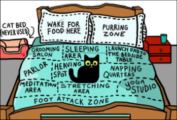
Any time you display complicated information, provide a robust description of the key points of the map or chart. All people will benefit from this for reference. No matter how you mark this up— using <figcaption> or just a <p> element—give that description a unique ID.
Add the aria-describedby="unique-id" attribute to the <img> element. This programmatically connects the image with the description for assistive technologies.
Remember to include the alt attribute with a short explanation of the image. Alt text for the image below is a cat sitting on a bed that is divided up into areas.
Thanks for reading! Happy accessibility testing.
Colophon
This site was inspired by Heydon’s JavaScript site
You can catch me on Twitter @racheleditullio
Source: Accessible Web About page