YNAB addresses color accessibility

In a recent product update YNAB (You Need a Budget) announced it had made some change to the way it uses color to convey meaning about budget amounts. When I logged into the online webapp today, I saw this modal message dialog. (The content of the announcement is below the image.)
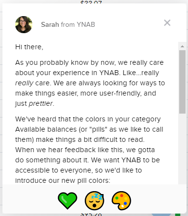
screen shot of a modal announcement dialog in the YNAB web application

Sarah from YNAB

Hi there,

As you probably know by now, we really care about your experience in YNAB. Like…really really care. We are always looking for ways to make things easier, more user-friendly, and just prettier.

We’ve heard that the colors in your category Available balances (or “pills” as we like to call them) make things a bit difficult to read. When we hear feedback like this, we gotta do something about it. We want YNAB to be accessible to everyone, so we’d like to introduce our new pill colors:

screen shot showing the before and after colors used by YNAB to show budget category information. the before colors are orange, green and red with white text. the after colors are lighter shades of the same colors but with text now a darker shade of each, which has better contrast.

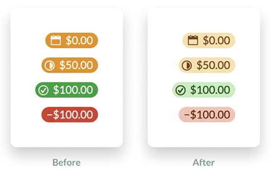
In case you’re wondering, green still means green. Yellow still means yellow. Red still means – you guessed it – red! The only thing that’s changing is the increased contrast, which makes things a bit easier on the eyes.

The message links off to a blog post that discusses the changes further: A Budget That’s Easy On The Eyes

YNAB took note of two accessibility issues

  1. Previously, it used color only to convey the meaning of a budget amount which does not meet success criteria 1.4.1 (level A) Use of Color.

    “We added visual signals to the Available amounts to make it clear whether there was credit overspending or an underfunded goal. We also increased the size of the negative sign for overspent categories. Both of these changes help users with visual impairments easily scan their budget by relying less on a color-based signal.”

  2. The color combinations of white text on an orange background (2.54) and white text on a green background (3.31) failed the color contrast requirement of 4.5:1 for success criteria 1.4.3 (level AA) Contrast (minimum).

    “We significantly increased the contrast between the color of the background (the ‘pill’) and the text, while muting the background color. These changes increase the contrast in general, which makes the text easier to read for everyone.”

The new color combinations do indeed satisfy color contrast requirements now.

YNAB budget colors
Amount typeFG colorBG colorContrast ratio
Negative #651c0b#f7c1b57.68
Positive#1d4913#c4ecbb7.97
Upcoming#70460b#f9e1a96.37

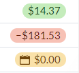
This is a screen shot of how the colors actually look when viewed in the YNAB application. Note that I don’t see a check mark icon next to the positive amount:

screen shot from the YNAB app.

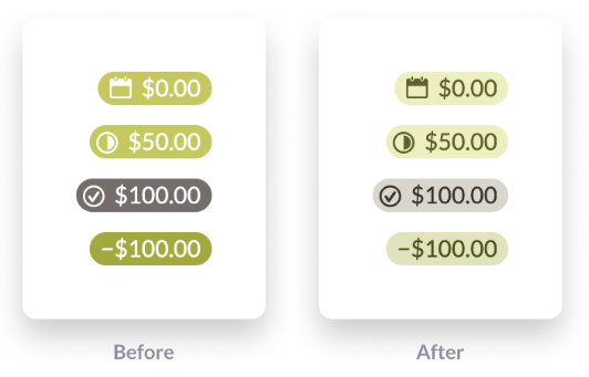
YNAB acknowledges that it is still problematic for users who experience deuteranopia:

While this helps with readability, we still use red and green to send signals about Available amounts, which isn’t the ideal experience for anyone with red-green color blindness.

Below is an example of what these colors might look like for these users. It’s actually the difference between the red and orange pills that is nearly imperceptible.

screen shot of the YNAB colors using a filter that simulates red-green color blindness.

It’s great to see more web applications incorporating accessibility. Now if only it were clear what those three icons at the bottom of the modal message window mean. They have aria-label attributes on some emojis that are not at all informative:

<span class="intercom-reaction" aria-label="green heart reaction" aria-pressed="false" role="button" tabindex="0"><span>?</span></span>

<span class="intercom-reaction intercom-reaction-selected" aria-label="sleeping reaction" aria-pressed="true" role="button" tabindex="0"><span>?</span></span>

<span class="intercom-reaction" aria-label="art reaction" aria-pressed="false" role="button" tabindex="0"><span>?</span></span>

Web Accessibility Specialist Certification

I’m not new to accessibility (a11y) but because it is not the focus of my job, I’ve had to do a lot of self-study to gain enough experience to consider myself proficient. Through the process of studying for this exam (and applying for a job along the way), I think I have finally found my passion.

I work in the United States for a large Canadian company in Ontario that is under pressure to comply with the Accessibility for Ontarians with Disabilities Act (AODA). It requires that websites updated since 2014 conform to the Web Content Accessibility Guidelines (WCAG) 2.0 Level A. Level AA is required by January, 2021.

At last year’s AccessU accessibility conference in Austin, Texas, I learned about the International Association for Accessibility Professionals (IAAP):

IAAP is a not-for-profit membership-based organization for individuals and organizations that are focused on accessibility or are in the process of building their accessibility skills and strategies. The objective of this association is to help accessibility professionals develop and advance their careers and to help organizations integrate accessibility into their products and infrastructure. The IAAP will provide a place for accessibility professionals around the world to gather, share experiences and enrich their knowledge of accessibility.

I heard they had a few certifications and I thought that would be a great way to test myself and perhaps come out with a credential that will help me in the future. The Web Accessibility Specialist (WAS) credential is where I started.

What is the WAS credential?

The Web Accessibility Specialist (WAS) credential is a technical-level credential for people who have hands-on experience with web technologies and accessibility. The exam assesses one’s web accessibility competence and takers are expected to know and use relevant technologies in a hands-on way, not just know about them. Per the IAAP, it’s ideal for intermediate level professionals (3-5 years’ experience) who have worked with WCAG 2.0 in context.

What is the WAS exam?

The WAS exam consists of 75 multiple choice questions with four options in the following content areas:

  • Create accessible web content – 40%
  • Identify accessibility issues – 40%
  • Remediate accessibility issues – 20%

The exam is pass/fail and administered by a testing service either remotely or in-person. I took it at a local testing center because I was worried about all the things that could go wrong remotely.

The exam is administered during a testing window for scoring purposes.

Preparing for the WAS exam

I reviewed the comprehensive WAS body of knowledge document which is a 20+ page overview of everything that could show up on the exam, from WCAG success criteria to testing with assistive technologies to recommending techniques for fixing issues. It’s a lot of stuff and honestly, I was pretty worried since I don’t work a job where I do accessibility evaluations every day.

I decided to study by going through a WAS exam preparation course offered by Deque University. I gave myself four weeks to prepare. My strategy was to cover about one content area per work day leading up to the exam. I took longer with those areas I had less experience in, such as ARIA widgets. I highly recommend this course and think it covered all the necessary subject matter.

My one piece of advice is to really practice using a screen reader and learn the common commands as two questions on my exam related specifically to hotkeys.

After the exam

They evaluate all candidates’ responses during the testing window and utilize a modified Angoff methodology and cut rate score exercise. Because of this, it takes a few weeks to find out if you pass. IAAP does not issue percentage scores or provide feedback on specific responses.

Three weeks after I took the exam, I got an email from the IAAP.

Congratulations!  We are pleased to inform you that you have passed IAAP – Web Accessibility Specialist (WAS) examination. Your hard work, study, and perseverance helped you achieve a significant goal – recognition of your skills and knowledge as a web accessibility specialist.

Per the email, just over 250 people have been WAS certified since the exam started in 2017.

International Association of Accessibilitiy Professionals - Web Accessibility Specialist logo

So what now? I am really  happy to have this certification and I know that going through this studying and exam process did a lot to get me used to looking for accessibility issues and communicating to developers how to fix them. I think this is a great exercise for anyone who wants a career in web accessibility.

IAAP WAS certificate for Rachele DiTullio awarded March 19, 2019.

Gold’s Gym Class Schedule

Another accessibility challenge! I like trying to use websites with just a keyboard, which rarely works. The Gold’s Gym class schedule page is no exception. It has so many elements that respond to clicks only that it’s basically useless to a keyboard. I’m going to address the three issues that make this page unusable.

  1. Week selector
  2. Day selector
  3. Class information details
screenshot of the class schedule page with multiple areas highlighted

These  examples suffer from the same issues:

  • Mark up that prevents keyboard focus
  • JavaScript that does not include key press functionality

The class schedule defaults to the current week and current day to display information. If you want to look at a different week’s schedule, you have to use the tiny forward and backward arrows next to the week dates.

screenshot showing arrows next to the week April 23, 2018 - April 29, 2018

While each arrow is marked up as <a>, it does not get keyboard focus because there is no href attribute.

<a class="display-table-cell text-left" ng-click="vm.changeWeek(-1)"> <i class="material-icons">chevron_left</i> </a>

I solved that issue by adding tabindex="0"

(That’s the recurring theme for this post!)

However, even though the arrows now gain keyboard focus, they do not respond to key presses. Looking at the code I noticed the ng-click attribute, searched to find that’s AngularJS syntax and found there are others such as ng-keypress. I tried using that via the Chrome inspector but it didn’t work. There’s probably more to it to support key presses.

Each day of the week has a similar issue. Let’s look at the code:

<div class="border border-thin" ng-click="vm.setSelectedDay(day)">...</div>

The days are not marked up as buttons or links so again, no keyboard focus and they use the ng-click attribute only. tabindex="0" to the rescue.

screenshot showing three boxes for days of the week Monday April 23, Tuesday April 24, and Wednesday April 25

The last major issue is accessing the details of a class. For a mouse user, clicking a class opens a modal window. (Once on the modal window, keyboard tabbing resumes on the parent page but that’s another issue.)

screenshot of a modal window with close button and class details

For keyboard users, at this point you’re skipped from the “All instructors” select box, passed all the class details, to a form at the bottom of the page.

The whole class details area is marked up as a table. For a mouse user, an entire table row is a hotspot, not just the word Details.

<tr ng-repeat="scheduledClass in vm.filteredSchedules" ng-click="vm.openClassModal(scheduledClass)" class="ng-scope">...</tr>

tabindex="0" to the rescue.

All of these could benefit from using the :focus pseudo class to emulate the hover states for better visibility of what’s in focus.

screenshot of a row from the classes table showing the first row highlighted and in focus

With just a few tweaks, this page would be far more accessible.