So easy to get right, yet so often poorly constructed.
Today I came across this gem with a contrast ratio of 1.26:1, as in barely above 1:1 which is invisible. Gray on white should always have contrast checked.
Other form infractions include
Using placeholder text as labels. Once a user starts typing, it’s no longer clear what information was requested or what format the data should be in.
When tabbing through the form, there is no visual indicator when you’re on a select field or a button.
I just don’t see the point in trying to reinvent the form experience. In this case, they’ve chosen a skeuomorph design, attempting to recreate a paper form experience digitally.
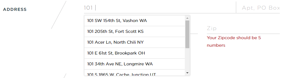
I like the address suggestion but it’s not possible to tab to it and select anything.
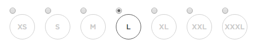
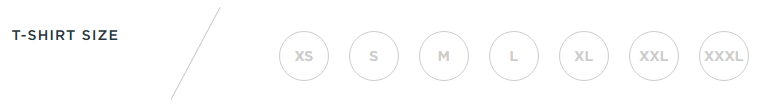
I could not tab through the t-shirt size options and select anything using the arrow keys, even though these were coded as radio buttons. Using the browser inspector, I unhid the radio buttons and then could tell that after I made a selection, I was tabbing through the radio buttons.
It was really hard to tell if I could tab to the submit button without visual indication. Adding a button focus style with the inspector showed that it was getting focus.
So much has been written about the IA of good forms, the proper markup of form elements and form usability, it’s amazing to me designers don’t follow a known pattern for an account creation process. It’s not the time to get fancy.
The Austin-based Alamo Drafthouse movie theater chain has moved to assigned seating and the ability to reserve tickets through online ordering. I went through this process for the first time over the weekend and ran into several usability problems.
1) Field types are not marked
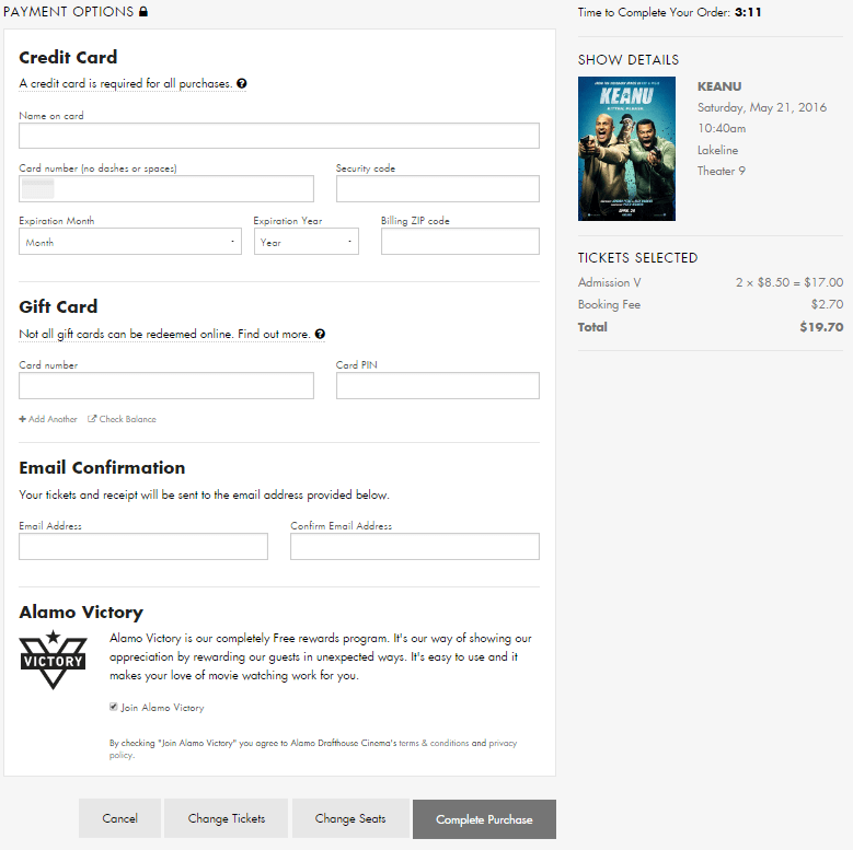
Screenshot of the Alamo Drafthouse online ticket form
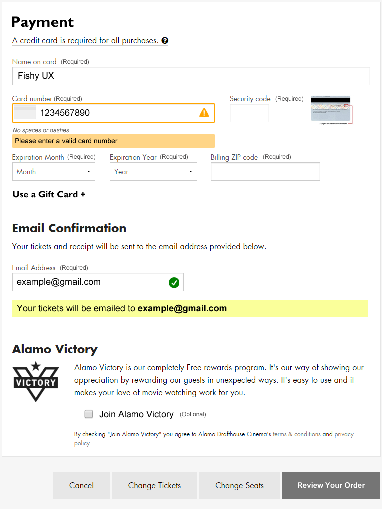
This one is so basic. I’ve done enough online ordering that I assumed the payment fields are all required, but that’s not a given for every user.
In the “Email Confirmation” section it’s unclear that an email address is required for making a purchase. It looks like an optional choice as I have no reason to believe I won’t get access to my tickets immediately after paying, but failing to enter a valid email address in two different fields results in an error after submitting the form.
Recent e-commerce research suggests that marking all fields, required or optional, improves the customer experience.
2) Poor error messaging
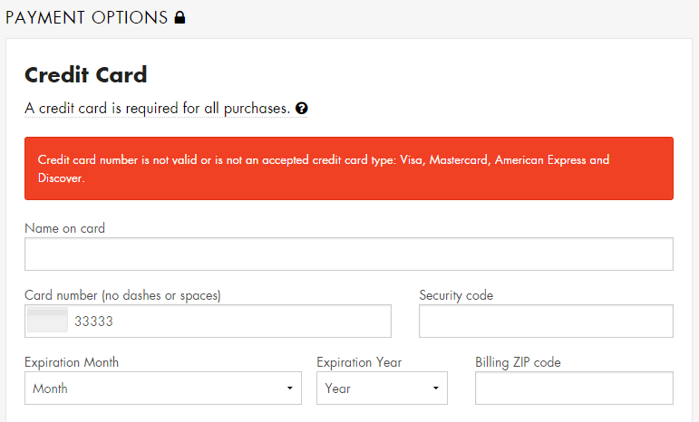
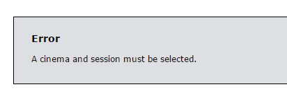
There is no immediate feedback when a user enters invalid data. I typed in my credit card number incorrectly and only after trying to complete the purchase did an error message display. However, the error was located at the top of the form, out of sight, as I sat there frustrated and wondering what was taking so long.
Screenshot of form error message
Eventually I scrolled up the page and saw the error message, but it didn’t indicate which field was in error by either putting the error in context of the field or by making the text of the error specific to the data issue.
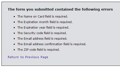
After entering a valid credit card number, I tried submitting the form without entering anything into the other fields as a test. This took me to a new page, devoid of any branding information for the site, displaying a laundry list of what I did wrong.
Screenshot of the error message page
Taking a user to a page like this immediately throws up a red flag. Am I still on the right site? What’s going on? Did my credit card number just get stolen?
If an entered value contains an error, ideally do inline validation or at least display that error message in-context of the form, next to the field with the error.
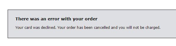
Further testing showed that if the form is submitted with a valid credit card number but invalid security code, expiration date, zip code, etc., the form returns a blank page with a “card declined” error message and no way to return to the form and fix the issues. The transaction is simply cancelled without even a link back to the page where the transaction started.
Hitting the back button provides yet another frustrating error and no way to continue with a purchase.
3) Confusing payment button
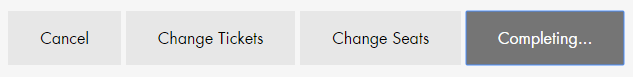
The way the form submission button functions also contributed to failure. It reads “Complete Purchase” before clicking it, but after clicking it, it changes to “Completing…”
Screenshot of form buttons
Because I had entered an invalid credit card number, my purchase wasn’t completing at all, but I sat there waiting… This button should probably be a “Review Order” button that completes all field validation. Then, the user can “Complete Purchase” from a verification screen.
4) No way to continue after timeout
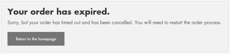
If you take longer than five minutes to complete your purchase, it times out and you see another useless error message.
I don’t know who or how they decided to set the timer at five minutes, but I timed out because of the credit card number error message issues. Maybe they did some usability testing and five minutes is enough for most users, but for those of us who timeout, this experience should be friendly and helpful.
The goal is to sell tickets, yet this message gives the impression that the Alamo Drafthouse doesn’t care if you had trouble with the process of online ticket buying, or about helping you try again.
At the bare minimum, this message needs to be smart enough to display the theater, movie and show time you were trying to purchase tickets for and provide a link back to the start of the purchase process.
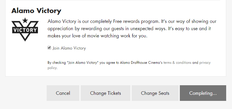
5) Optional checkbox already checked
The last section titled “Alamo Victory” takes up about 25% of the page real estate with a boring marketing blurb and an almost hidden pre-checked option for ‘Join Alamo Victory’. My favorite part is the disclaimer after it:
By checking “Join Alamo Victory” you agree to the Alamo Drafthouse Cinema’s terms & conditions and privacy policy.
Oh really? Cuz I didn’t check that box, Alamo Drafthouse checked it for me. This is the same annoying tactic of pre-checking a “sign up for our spam emails” box on other purchases. Just don’t. Always allow me to decide if I want to join extra programs.
Design Recommendations
The online ticket purchase process needs a lot of help. I think Alamo Drafthouse decision makers would be surprised how much customers struggle with this website site if they would sit and watch some usability testing.
Mark all fields as either required or optional
Do inline form field validation/improve error messages
Change the “Complete Purchase” button to “Review Order” so that all field inputs are validated first
Provide users a way to retry a transaction that times out
When I bought a new dishwasher recently, I went online to register it with Frigidaire in case I needed to use the warranty. My immediate reaction was, is this something I have to print out and mail in?
Screenshot: Frigidaire product registration form
This form suffers from a lot of problems including
Unclear form fields because they aren’t boxes, just underlines; where do I click?
Unnecessary fields (email confirmation, first and last name instead of full name)
Small text with poor contrast
Required fields that aren’t marked (address, city, state, zip)
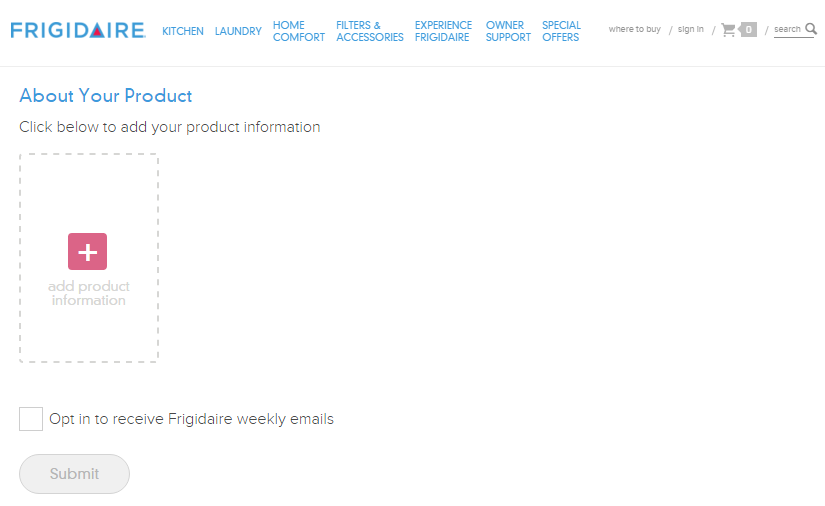
My focus for this post, though, is the next part of the form where the user is asked to enter product information.
Screenshot: Add a product
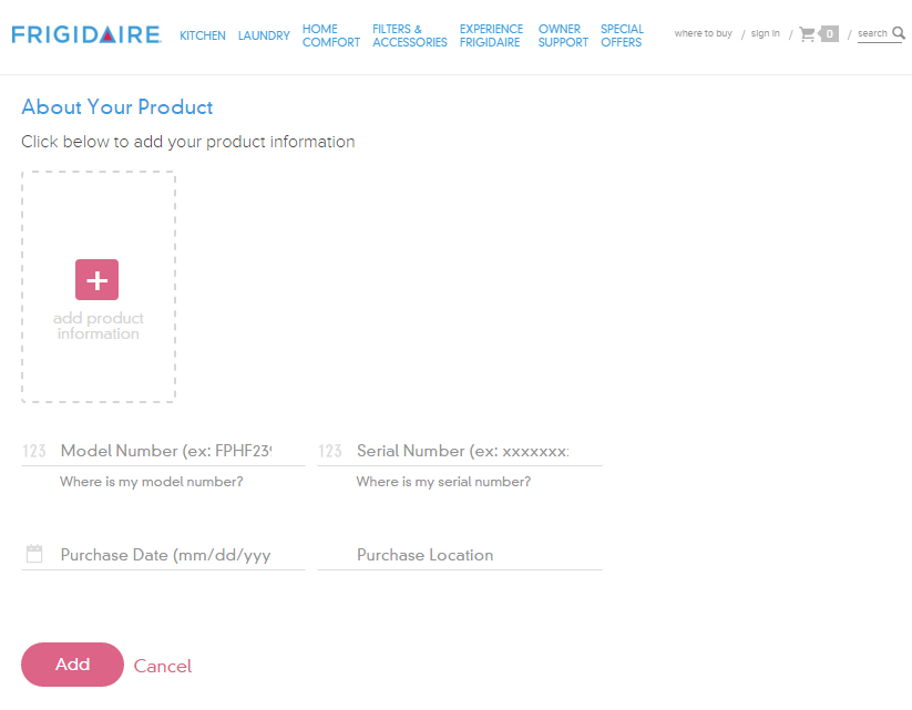
The whole reason I’m filling out this form is to add product information, yet those fields are obfuscated by an unnecessary ‘add product information’ link. When clicked, fields for model number, serial number, date of purchase and location of purchase display, and the wonky ‘add production information’ link remains.
Screenshot: Add product fields
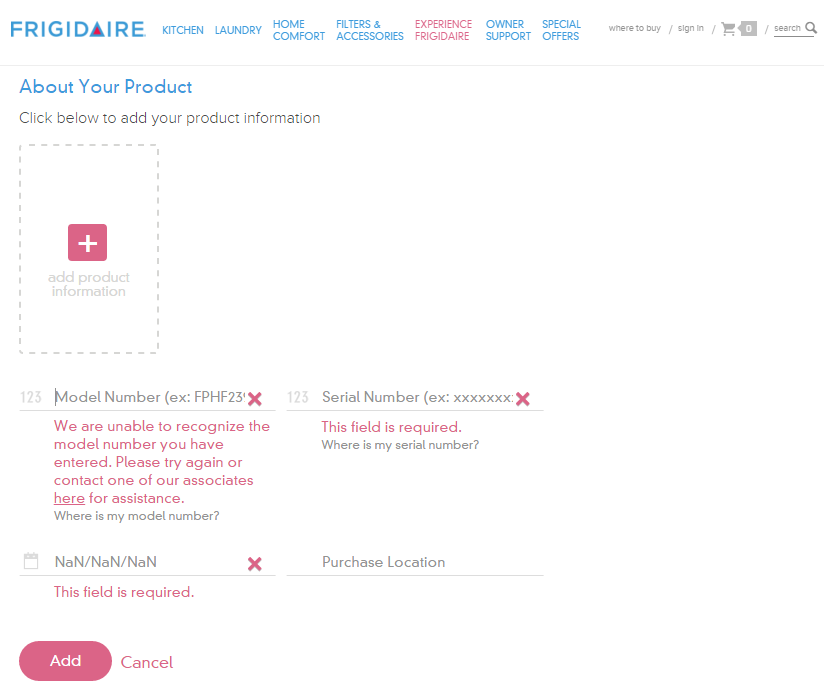
If you click the ‘add’ button without filling out these fields, you get error messages for three of the fields as it turns out model number, serial number and purchase date are required.
Screenshot: Add product form validation
Design Recommendations
Don’t require the user to click the ‘add production information’ link to see the form fields and remove the unnecessary help text above the form: “Click below to add your product information”
Clearly indicate required fields
Make form fields look like form fields
Provide form labels and keep formattitng instructions visible instead of using placeholder text
Make it easier for users to understand what model number and serial number are and where to find them
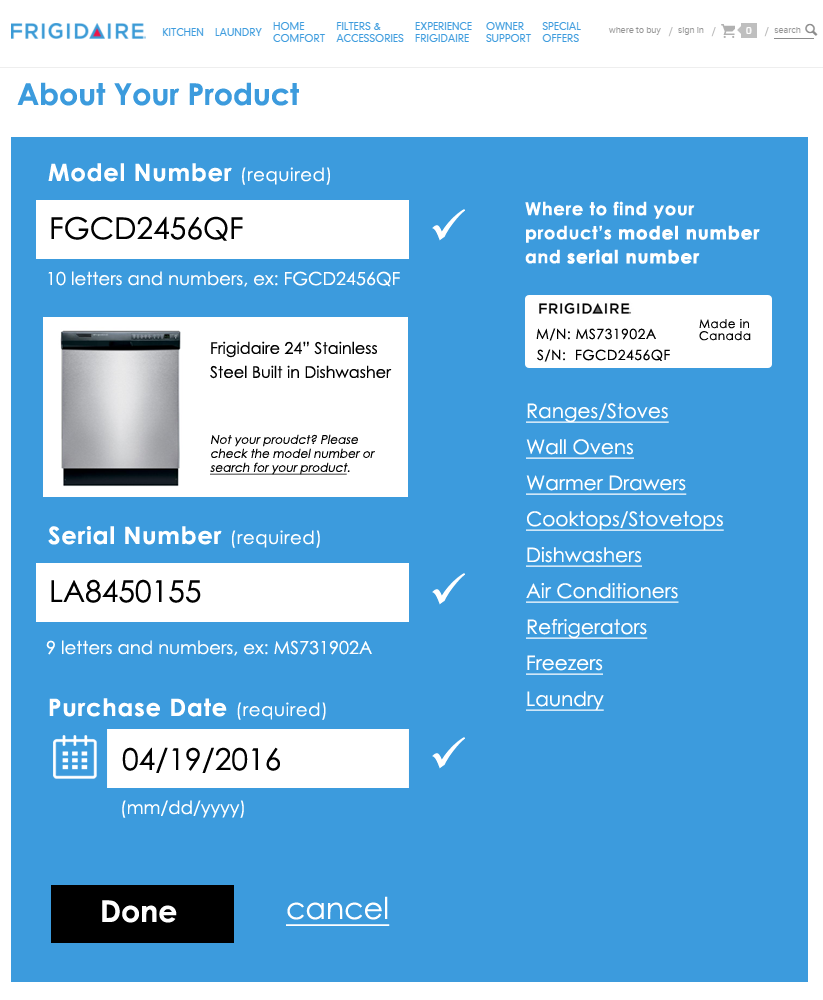
I gave the form a streamlined, top-to-bottom flow with large text and obvious form fields. To the right is an example of a product tag that shows what the user is looking for to locate model and serial numbers; I also listed the links to the help pages that show the locations of these tags for each product type.
Redesigned add product form
The form checks the field data as it is entered and alerts the user of errors inline. Once a field’s data validates, a check mark displays next to it. After the user enters his model number, an image of that product and the product’s name display below the field for visual verification.
Redesigned form filled out
Once all required fields are verified, the “Done” button becomes active. After clicking “Done”, the user can choose to add additional products—something the existing form handles well.
 Using the browser inspector, I unhid the radio buttons and then could tell that after I made a selection, I was tabbing through the radio buttons.