Sharing Images and Videos Isn’t Inclusive

A huge part of social media platforms is the ability to share images and videos. But I’ve yet to see one that takes people with visual impairments into account by enabling users to add alt tags and descriptions to multimedia assets.

Let’s look at Twitter for a moment. People more and more are using using images and the words within them to supplement their tweets.

The alt tag for all Twitter images is “Embedded image permalink”. Hardly descriptive or useful when every image has the same alt text. In the Tweet above, we see a cat but also words and meanings in the objects around him: a sign with YOLNT (you only live nine times); a book by Jonathan Frazen titled Freedom; and a bottle of Gordon’s gin. People who can’t see this image miss out on much of the intended meaning of the tweet.

In some instances, the entire purpose of the tweet is contained in the image. Look at this example from The Oatmeal where he has attached an image containing an entire comic. (Even providing a link to his website wouldn’t help because he does not provide alt text for his comics.)

Sharing platforms really need to enable users to provide alt text for images and descriptions for videos, even if they don’t choose to use them.

Changing User Names

This is a call for developers and system designers to allow user names to change while maintaining the user’s account integrity. There are many instances where someone’s name might change, but issues seems to disproportionately affect women.

At my work, when a woman gets married, her system login gets updated with her new last name. However, not all internal systems are capable of accepting an updated user name. This causes the user to have a new account, and thus no access to her old data.

This seem abundantly silly, easy to plan for, and necessary so as to be inclusive to anyone undergoing a name change whether due to marriage, divorce, or other personal reason.

The Twitter model is representative of how this should work. Users can at any time change their user names or email addresses instead of having to create a new account or go through some process of trying to combine accounts. Developers and designers, take note!

Screen shot of the Fishy UX Twitter account settings page
Twitter account settings screen

Geocaching.com App Advanced Search

Geocaching is one of my hobbies and I usually cache with just my iPhone using the official Geocaching.com app. Most of the time, I’m searching by location (find nearest caches) or by a cache’s specific ID. But occasionally, I want to narrow the results using the app’s Advanced Search feature.

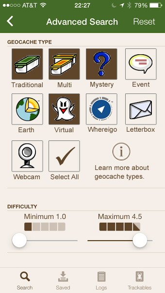
One of the advanced options is to narrow by cache type.

screen for the geocaching app advanced search show cache type and difficulty filters
Geocaching app advanced search screen

Issues with geocache type filter

  1. Use of radio buttons when the user can select multiple options. These should be check boxes.
  2. The hit area for each type is very small. I often have to hit the circle multiple times to get my selection to register.
  3. The select all/deselect all option is in a weird spot.
  4. It can be problematic to rely solely on icons because not everyone, especially newer cachers, know about all the types of caches. There is a little “information” icon but it has information about many additional cache types beyond the nine available in the app search. Other filters include labels.

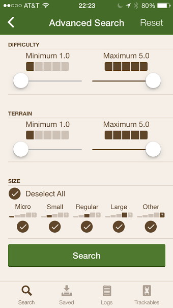
    geocaching difficult and size filters with labels on the icons
    Filter options with labels

Design Recommendations

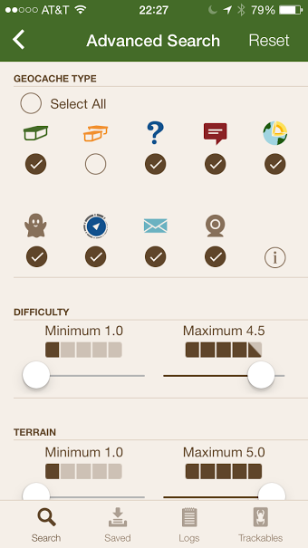
  1. Change the circles to squares and make the entire icon the hit area for selecting a cache type.
  2. Move the select all option to the end.
  3. Add icon labels.

mock up of cache type selection with boxes and icon labels in place of radio buttons
Cache type selection mock up