How accessible is the 2020 US census?

Like most US households, I received my 2020 census form in the mail this past week and I decided to see how accessible the process really is since it’s a US government website subject to Section 508 compliance.

envelope for the 2020 US census form

The first thing to note is that someone with low vision or who is blind might have trouble with this whole process because the paper form that arrived in the mail does not have particularly large print nor does it include even cursory instructions in Braille. For deaf or hard of hearing people, there is a TDD number but only if you speak English. I think it’s safe to say that many people with disabilities will have to rely on someone else’s help to complete the process.

Let’s take a look at the website that the paper form directs you to visit: my2020census.gov.

screen shot of the Census 2020 homepage

I found a few oddities with the home page while using a screen reader:

  • The very first text a screen reader user encounters is a technology warning: If you are using a screen reader, it is recommended that you use the latest version of Internet Explorer and the JAWs [J-A-W-S] screen reader. I’m testing with Chrome and NVDA and this website should work with all major browser/screen reader combinations.
  • The first focusable element is a “skip to main content” link which works fine for a keyboard user but announces blank when using a screen reader because focus is moved to a <div> element with a role=button but no label.
<div role="button" tabindex="0">
<img src="/static/images/start-here.png" class="img-responsive" alt="Start Here Shape your future">
<button type="button" title="Start Questionnaire" name="Start Questionnaire">Start Questionnaire</button>
<div id="recaptcha-container"></div>
  • And as we can see from the screen shot below, the reading order does not match the focus order. The “skip to main content” link sends focus to after all the important instructional information.
screen shot of the census 2020 home page with the focus on the right side of the page
  • Lastly, neither the home page nor the questionnaire pages have <h1> headings or unique page titles to adequately convey place in site.

Start the questionnaire

At the top of the questionnaire pages is a status bar similar to what you might see during a checkout process for online shopping.

screen shot of the census 2020 status bar starting with address verification, household questions, people questions, then final questions.

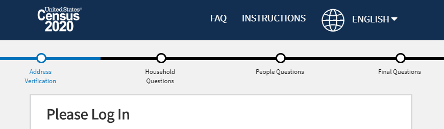
There are two problems here:

  1. There isn’t any screen-reader accessible help text explaining that it’s a status bar, like a heading, nor any text to indicate which step the user is currently on so it’s useless for someone using a screen reader.
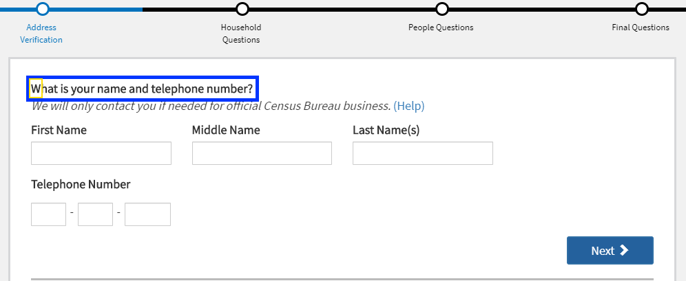
  2. This is the login in screen but the “Address Verification” step is highlighted in the status bar.

The login form itself has very good screen reader label text for the three form fields.

screen shot of the census ID form fields and login button.
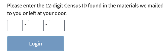
  • Enter the first 4 digits of your Census ID
  • Enter the next 4 digits of your Census ID
  • Enter the last 4 digits of your Census ID

But it’s kind of ironic because someone who can’t see the paper letter with their census ID won’t be able to type it in anyway unless someone reads it off to them.

Address verification section

Once you get past the login screen, the status bar at the top properly indicates to a screen reader user where they are the process: progress bar You are on section 1, the address verification section. But, they are unlikely to benefit from this because every time you click the “Next” button, focus is moved to the question text, not the top of the page.

screen shot of a census question with focus indicator on the question text.

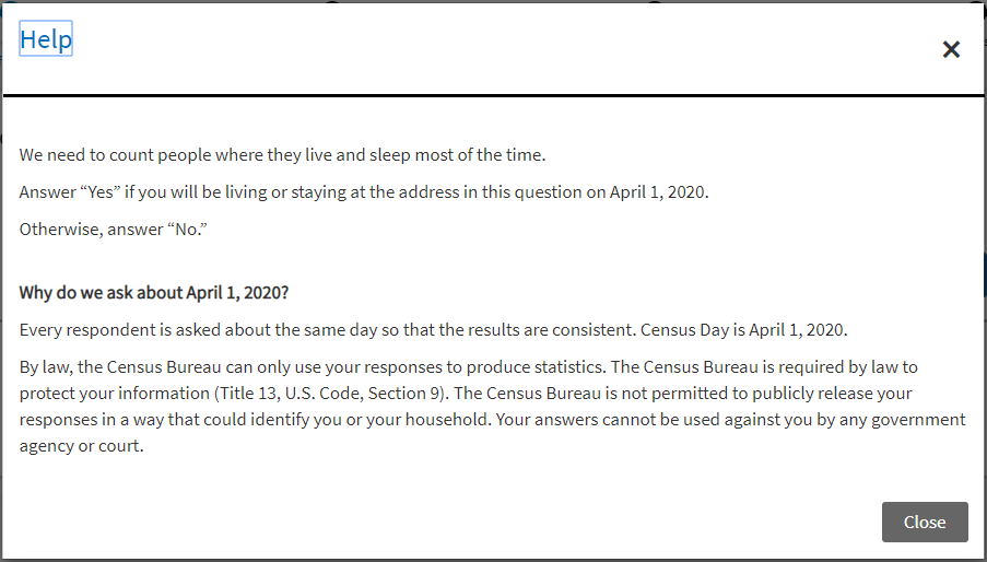
Each question has a “Help” link next to it that opens a modal dialog window which is properly coded by:

  • Moving focus to the modal window heading <h1>
  • Keeping focus in the modal window
  • Providing close buttons to exit the modal window
screen shot of a modal window with focus on the help heading and includes an x button and a close button.

If you click the “Next” button without completing the required fields, you get an alert and the required fields are outlined in a thick, red border.

<div role="alert">Your name is required to continue the 2020 Census questionnaire. If you prefer not to provide your name, please provide a nickname or unique description.</div>
screen shot of an alert message above required form fields that are blank.

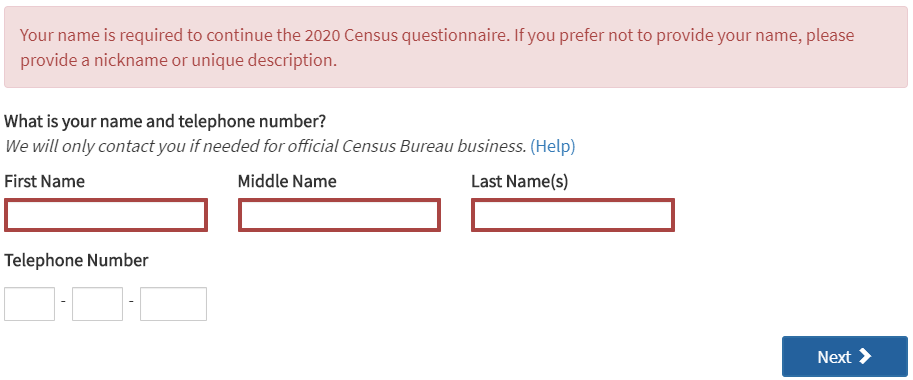
The three “Telephone Number” fields are required but leaving them blank triggers a separate alert message after filling out the name fields. All required fields should be clearly indicated both visually and to a screen reader user.
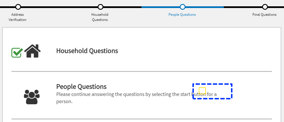
Household questions

When the “Household” section loaded, the screen reader was silent so there’s something going on with managing focus on this section. It’s hard to troubleshoot because the application is not designed to let you go back to previous questions or sections.

Instead of a “Help” link for the first question, there was this link text: For more information on who to include, click here. What the screen reader announced, though, was: Help link popcount question. A look at the code shows there are both a title attribute and an aria-label attribute on the link with this nonsensical name.

<a href="#" title="Help link popcount question" aria-label="Help link popcount question">For more information on who to include, click here.</a>

People questions

Just as with the “Household questions” section, when the questionnaire moved to the “People questions” section, the screen reader was silent and I could see focus remained on the “Next” button that was removed from the DOM.

screen shot of the census dashboard with focus indicator on invisible button.

These are not marked up as headings.

This section asks information about each of the persons entered in the “Household questions” section, including birthday.

screenshot of a form asking for birthdate as month, day, year and then verify calculated age.

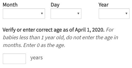
After selecting the month, day and year, the next input displays a calculated age but the help text after the label does not get read by a screen reader in forms mode because it is not programmatically associated with it using aria-describedby or located inside the <label>.

<label for="P_AGE_INT">Verify or enter correct age as of April 1, 2020.</label>
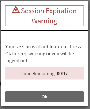
<span>For babies less than 1 year old, do not enter the age in months. Enter 0 as the age.</span>

The site does a nice job with its session expiration warning both visually and by sending an alert to screen reader users.

screen shot of a session expiration warning with 17 seconds remaining.

Submit questionnaire

This screen also has a focus management issue. The screen reader doesn’t announce anything when the final screen loads and you can see in the screen shot below how focus remains on the “Next” button that was removed from the DOM.

screen shot of the last screen in the questionnaire with focus left on an element removed from the DOM.

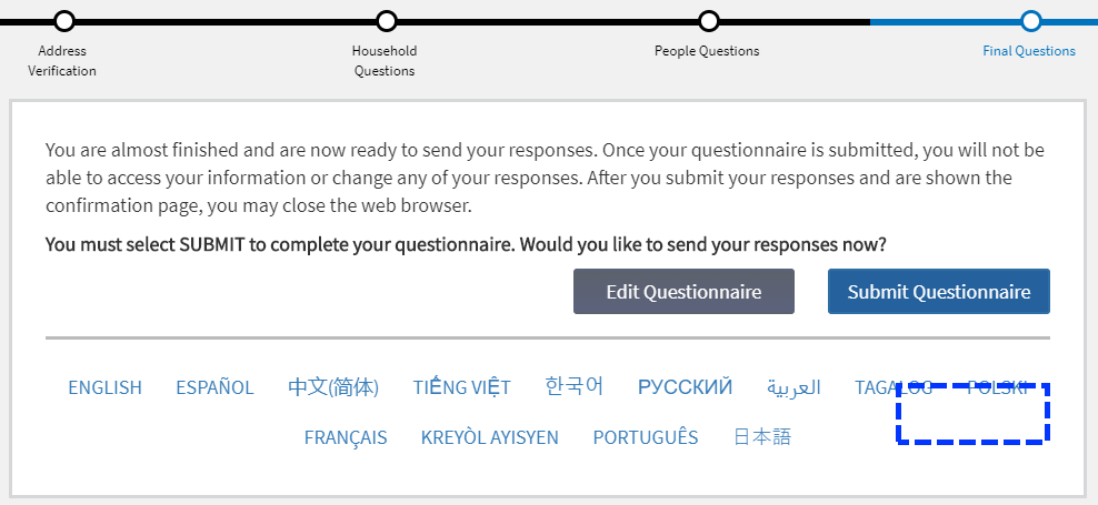
And the same thing happens after clicking the “Submit Questionnaire” button and you’re shown the confirmation page. This site needs more testing with a screen reader and better focus management.

5 ways to improve table accessibility

I recently came across this example of an HTML table that was marked up correctly, for the most part, but lacked some of the important coding nuances needed to make a table truly accessible. Below is a screen shot of that table with the areas of concern highlighted.

screenshot of an HTML table with 4 columns, a header row, and 6 data rows. Areas of the table are highlighted with the numbers 1 through 5.

Depending on the complexity of your table, it can be helpful to review the Table Concepts tutorial from the W3C Web Accessibility Initiative (WAI).

Here are five things to check when creating your next table.

1) Caption that table

While this table has what looks like a caption of “Choose a plan”, that text was actually marked up as a heading level <h3>. Moving it inside the <table> element and marking it up as a <caption> instead allows assistive technologies (AT), like a screen reader, to announce the text as being programmatically associated with the <table>.

Table with 7 rows and 4 columns, caption, choose a plan

NVDA screen reader

2) Include header text for every column

In this example, the very first table cell is empty. The screen reader announces: row 1 column 1. That’s it. But what about the contents of the rest of the cells in this column? They need a header to explain what they are. Visually, the content author doesn’t want a header for column one, but AT users benefit when the name of the column is announced before the contents of subsequent cells.

To fix this issue, I added a hidden column header for column one of “plan feature.”

<th><span class="visually-hidden">Plan feature</span></th>

Now, when a screen reader gets to the beginning of a new row, it’s clear what content is contained in the first cell of each row.

Row 3, plan feature, column 1, number of users

NVDA screen reader

3) Use alt attributes meaningfully

The content author decided to use green check mark images to indicate when a plan feature is included in a particular plan, but they didn’t include alt attributes. AT users have no way of knowing when a feature is included because the cells with images don’t communicate anything.

To fix this, make sure you include alt text on images that provides meaning to the user. An alt attribute of “check mark” would not be meaningful even though it’s visually correct. Instead, I used “feature included.” (Though I would argue using an icon font would be better than an image.)

<td><img src="icon-checkmark-green.svg" alt="feature included"></td>

Team plan, column 3, [graphic] feature included

NVDA screen reader

4) Have data in every table cell

When a feature is not included, we must also communicate that to AT users. The last row of the table has three empty cells which indicate to sighted users that a feature is not included, but like 2) above, we need to add some hidden helper text.

<td><span class="visually-hidden">not included</span></td>

Personal plan, column 2, not included

NVDA screen reader

5) Check your (con)text

Screen readers don’t always handle abbreviations and punctuation as expected. I found two interesting examples with this table. First, the number of users for the Team plan visually looks like “2-50” but it gets announced as “250” because the hyphen is ignored. To accurately convey this meaning, we can add the word “to” as visually-hidden helper text, and we can hide the hyphen from AT to be safe.

<td>2<span aria-hidden="true">-</span><span class="visually-hidden">to</span>50</td>

Team plan, column 3, two to fifty

NVDA screen reader

Second, the plan feature “2FA” in row six does not get announced properly. My screen reader announces this as “2-fah”, not “2-F-A”. Again we need to add helper text for AT users.

<td><span aria-hidden="true">2FA</span><span class="visually-hidden">2 factor authentication</span></th>

Row 6, plan feature, column 1, 2 factor authentication

NVDA screen reader

Please check out the full HTML for this <table> in my first Codepen entry.

See the Pen Accessible Table by Rachele (@racheleditullio) on CodePen.

Accessibility review of the We Are Blood online questionnaire

I’m a regular blood donor with our local blood bank, We Are Blood. If you’ve ever donated blood, you know that part of the process is answering a bunch of health-related questions first to help determine your eligibility. Being sick, taking certain medications or having had certain illnesses can exclude you from donating.

I’m donating blood this Friday and was thrilled when today’s reminder email announced a new option to complete the pre-donation questionnaire online, before coming in for my appointment. I decided to check this process for web accessibility. Let’s begin!

Welcome to QuickPass page

The email links to the Welcome to QuickPass! page which has a lot of accessibility issues, and this is just the instructions. I ran both the Lighthouse and Axe accessibility audits in Chrome and the results were not good.

  • Lighthouse score: 47/100
  • Axe automated issues found: 28
Screenshot of the top of the Welcome to QuickPass page

Some site-wide issues

  • The entire We Are Blood website is missing a “skip to content” link that would allow users to bypass the repetitive navigation links.
  • The “We Are Blood” logo is embedded SVG code that does not provide any text alternative and is announced by the NVDA screen reader as “weareblood.org link.” The logo should include a <title> element with the text “We Are Blood. Drawn together since 1951.” Doing this will enable a screen reader to communicate the logo to users with visual impairments who cannot see it.
  • The five links in the site’s main navigation all have dropdown menus that are accessible on mouse hover only. To be accessible, users must be able to use all website components with a keyboard.
screenshot of the dropdown menus on the We Are Blood website.
  • The newsletter signup form in the footer uses positive tabindex values. The result? When a keyboard user tabs from the browser address bar into the page, the first focusable element is the “Full Name” field in the form, which is confusing because it violates the natural reading order of the content. The second focusable element is the “Email Address” field. The third focusable element, though, is not the form submit button—it’s the “We Are Blood” logo link because after the positive tabindex values, the tabindex goes to the beginning of the content.
  • The newsletter signup form submit button is missing a text label. The screen reader announces “Contentinfo landmark button.”
  • The newsletter signup form fields use placeholder text instead of <label> elements.
screenshot of the newsletter signup form showing the two fields have positive tabindex values.

There are several color contrast issues where the contrast ratio between the text color and background color fails to meet the 4.5:1 requirement for regular, unbold text. For example, the gray text in the screenshot below from the footer has a contrast ratio of just 3.13 on a light blue background.

screenshot showing poor color contrast of gray text on a light blue background.

Content issues

Arguably, the most important thing on this page is the link to start the questionnaire. While visually it looks like there is a big button that reads “Click here for QuickPass,” a screen reader announces “welcome cust=WRB link” because no alternative text is provided on the image. The alt attribute must contain the same text that is in the image.

click here for QuickPass button.
<img class="aligncenter wp-image-2040 size-full" src="https://weareblood.org/wp-content/uploads/2018/05/QuickPass-Click.jpg" alt="" srcset="https://weareblood.org/wp-content/uploads/2018/05/QuickPass-Click.jpg 600w, https://weareblood.org/wp-content/uploads/2018/05/QuickPass-Click-150x57.jpg 150w, https://weareblood.org/wp-content/uploads/2018/05/QuickPass-Click-300x113.jpg 300w" sizes="(max-width: 600px) 85vw, 600px" width="600" height="226">

The page content skips heading levels. It starts correctly with <h1> for the “Welcome to QuickPass!” main heading, but then skips to <h4> for the heading “A couple of key points”, then to <h3> for headings in the footer.

QuickPass questionnaire pages

The questionnaire begins on the ABO QuickPass page.

  • Lighthouse score: 43/100
  • Axe automated issues found: 6

This start page does not support keyboard or screen reader usage because the entire thing is marked up as a form. Screen readers enter a different mode when they encounter a form, which disables the navigation hot keys, in order to allow users to type in form fields.

screenshot of the questionnaire start page with overview text and a large button that reads start questionnaire.

Here is how the body copy is marked up inside the <form> element:

<h1 style="text-align:center">
<font color="#E36B50">Hey Blood Donor!</font><br><br>
<font color="#01426a">Thank you in advance for taking the time to fill out this questionnaire.<br><br>Please ensure you are answering all questions in a private, confidential setting and that you read each question in its entirety before answering. Skip the question if you do not understand or have questions of your own.<br><br>Please note that your questionnaire answers are good for today only and that additional questions will need to be answered at the donation site.</font></h1>

Donor information page

Since this page actually contains form fields, it works better with the keyboard and screen reader, but it still has serious HTML markup issues.

  • Lighthouse score: 55/100
  • Axe automated issues found: 5
screenshot of the donor information request form with fields for name, gender and birth date.

Here’s the markup for the “First Name” field:

<span class="formleadinglabel">First Name:<span class="required-indicator desktop">*</span></span>
<span class="formfield">
<input type="text" id="firstname" name="firstname" maxlength="15" class="required" value="" autofocus="" autocomplete="given-name" placeholder="First Name">
<span class="required-indicator in-field mobile">*</span></span>
  • The form field labels are not <label> elements and, therefore, are not associated programatically with their <input> elements.
  • None of the text input fields are announced as required.
  • The day, month and year combo boxes are not announced as being for “Birth date” so screen reader users have no idea what date they’re being asked to enter.

Even if keyboard users are able to complete the form fields, they cannot continue to the next screen because the “Continue” control isn’t marked up as a button, preventing it from gaining keyboard focus. It’s also a background image without any text alternative.

<div id="btnContinue"></div>

Question pages

I didn’t complete the entire questionnaire today but the question screen has repeatable patterns and problems.

screenshot of the individual questions within the QuickPass app which have a question and three radio buttons for yes, no or skip.
  • The volume controls do not have text labels, which is really ironic if you think about someone trying to use this with a screen reader.
  • Keyboard users cannot tab to the radio buttons or select an answer.
  • There are two <label> elements per radio button <input> and the one with a text label has a CSS class which hides it. ? The screen reader announced “clickable, clickable, clickable.” Here’s the markup:
<input id="yes" class="answers" type="radio" name="answer" value="Y">
<label class="default-label" for="yes"></label>
<label for="yes" class="hidden">yes</label>

I am happy to have the option to complete these questions before I head to the blood bank, but it’s not accessible for many people with disabilities. I hope We Are Blood requests that the vendor make its software comply with the Web Content Accessibility Guidelines so that everyone can use it.