Blog

Why I Love the Harbor Freight Experience

If you don’t know about Harbor Freight Tools, you’re missing out. In my opinion it’s the best store for anyone needing tools.

Harbor Freight logo: quality tools at ridiculously low prices


Always 20% off

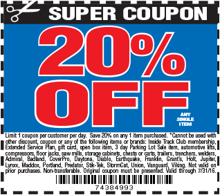
If you go to HFT without a 20% off coupon, you’re not trying at life. They usually have an ad in those weekly mailers that most of us throw away without reading but not to worry; you can always pull one up on your mobile while waiting in the checkout line.

20% off coupon

Quality tools at ridiculously low prices

Their motto says it all. It’s hard to beat the value of their products. They aren’t top of the line but most of us don’t need industrial quality tools either. I’ve had really good experiences with all my purchases. Here’s an example that compares prices between the HFT Chicago Electric brand of a breaker hammer at $369.99 ($295.99 with your 20% off coupon) to a Dewalt or Bosch equivalent at $999. Even if it breaks, you can buy three for the price of one.

comparison chart for prices on breaker hammers

We bought one last week to dig up old fence post hole concrete and it has already paid for itself.

man using a breaker hammer on a fence post hole

It’s fun!

I rarely go to brick and mortar stores anymore, but for HFT I make an exception. I enjoy walking around and just looking at what they have. Where else can you easily find a 4 foot long pipe wrench?

boy holding up a 4 foot long pipe wrench
Photo credit: denzien

Friendly, helpful employees

Most of the people working at HFT tools seem to really like their jobs and that makes the shopping experience much more enjoyable. They’re happy to answer questions, pull something from the back, or help you find an item. It’s very easy to do a return or exchange as well. I think people make or break the customer experience.

FREE STUFF

You get something free with every purchase. This incentive makes me so happy, even if it is cheap things like a pair of gloves or a flash light. My favorite item is the blue tarp because you can always find a use for a tarp.

various free item coupons like zip ties, measuring tape, multimeter

This might be one of the oldest ploys in the book to get you to buy something and it sure works on me! The next time you need a tool of any kind, give Harbor Freight a chance.

4 Ways Kiva’s Redesign Limits Keyboard Users

Kiva, a microlending non-profit that enables anyone to lend money to help end poverty, recently went through a site redesign. This included major changes to its global navigation, faceted search, and loan display. Here’s a snapshot of the Lend page highlighting four problem areas affecting keyboard users.

screen shot of the Kiva.org Lend page

1) Global navigation menu doesn’t open

When tabbing through the site, the second link is the “Lend” menu in the global navigation. Only by using a mouse can the “Lend” menu be displayed. Hitting the space bar or enter keys to try to access this menu just reloads the page.

Kiva needs to implement a keyboard-friendly solution like Adobe’s Accessible Mega Menu, available on GitHub. It enables users to access drop drown menus with the space bar, and then continue tabbing through the menu links. The esc key exits the menu at any time, returning focus back to the navigation item.

screen shot of a mega menu on Adobe's Accessible Mega Menu page

2) Hidden controls

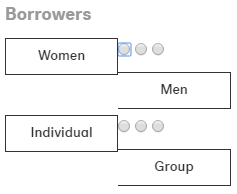
The “Borrowers” facet uses hidden radio buttons and provides no feedback to a keyboard user when one is in focus. Here, I’ve disabled the CSS rule that hides the radio buttons.

screen shot of the hidden radio buttons for the Borrowers facet

I tried repeatedly to select one of these options using the keyboard but couldn’t. Kiva needs to allow users to select all form options, even if the radio buttons are visually hidden. Mouse users click on the form labels to select options but labels do not get keyboard focus.

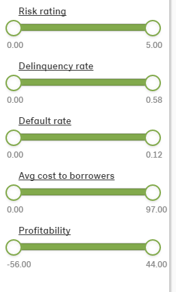
Another set of facets employs sliders to filter results. These are completely inaccessible to keyboard tabbing.

screen shot of slider filters in the Kiva faceted search

I did a little searching and came across some accessible slider examples that allows keyboard focus on the handles then employs the arrow keys to adjust the values.

3) Focus, focus, focus

So many elements on the Lend page do not indicate they are in focus, from the above mentioned facets using radio buttons, to the lending controls for individual loans. In this example, the links for “Lend $25” and “Learn more” are visible only on hover. While the links can be tabbed to, there is no feedback that they are in focus.

screen shot of the loan gallery

Kiva needs to use the a:focus CSS selector consistently and ensure any JS used to show links works with keyboard focus too.

4) Stuck modal windows

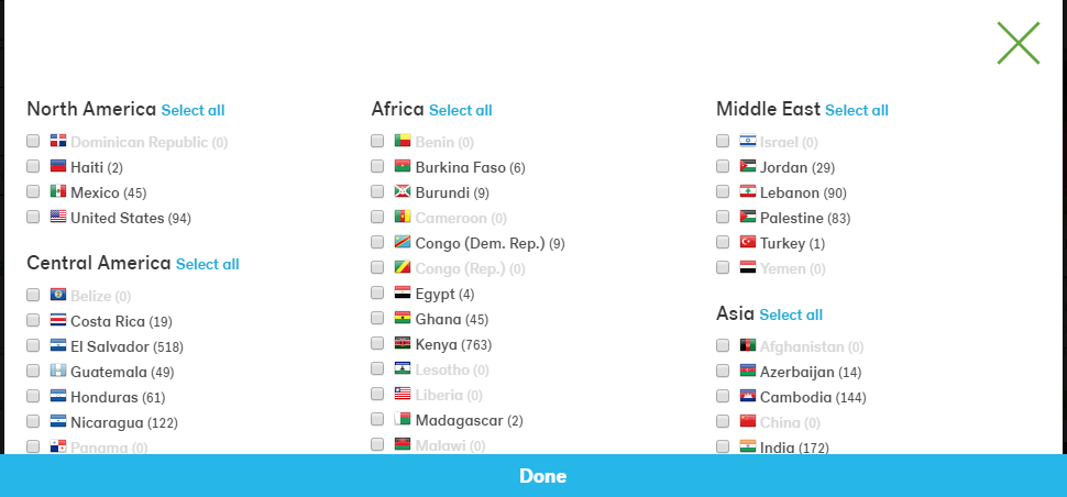
Another facet option is to “Select countries” to filter loans. This link opens a modal window.

screen shot of the select countries modal window with checkboxes for each country

I tried tabbing through the country checkboxes but nothing happened because the modal window did not get focus. As I held down the tab key, I could see that I was continuing to tab through the links on the Lend page instead. My only option was to hit the esc key.

Final Thoughts

Making sure your site works with focus is important and easy to implement. For visual feedback, you generally can employ the same CSS rules used for hover. Another useful enhancement would be to provide a way for keyboard users to skip the search facets and go directly to the loan options. Reviewing this site has inspired me to create a future post centered on accessible faceted search.

Is the term UX meaningless?

This week, a video of renowned usability expert Don Norman of the Nielson Norman Group discussing the term “UX” garnered attention when he noted that, in his opinion:

Today, that term has been horribly misused. It’s used by people to say ‘I’m a user experience designer, I design websites or I design apps’ and they have no clue as to what they’re doing and they think the experience is that simple device, the website, or the app… No! It’s everything. It’s the way you experience the world. It’s the way you experience your life. It’s the way you experience the service… It’s a system that’s everything.

I’m on the bandwagon here. Nearly every day in my work, I hear someone try to justify his or her decision by claiming that whatever they like or don’t like is hurting or helping the user experience without ever speaking with customers or observing them interact with the organization.

UX has become the go-to scapegoat and savior. We can see this in the progression of how we refer to people who work on websites, going from “webmaster” in the 90s to today’s “user experience designer.” But it doesn’t take much digging to see the numerous customer experiences being developed right now that tenuously adhere to anything approaching universal design.

Interviews, persona development, usability testing, and interaction design continue to take a backseat and are often the first tasks eliminated as projects scope-creep beyond deadlines. It’s rare to find business leads who understand the holistic nature of the user experience and who value finding out what their customers want and how their projects influence the customer’s experience with the entire organization.

I’m hopeful more companies will embrace the true intention of user experience as an end-to-end, ongoing process, not a buzzword.