Blog

Why are some toilets still inaccessible?

The other day, I was in an older office building, definitely pre-ADA (1990). I went into the bathroom and saw an interesting and flawed attempt to retrofit it for accessibility.

photo of a double bathroom stall with an outer door to close off the space for a wheelchair user
Inaccessible bathroom

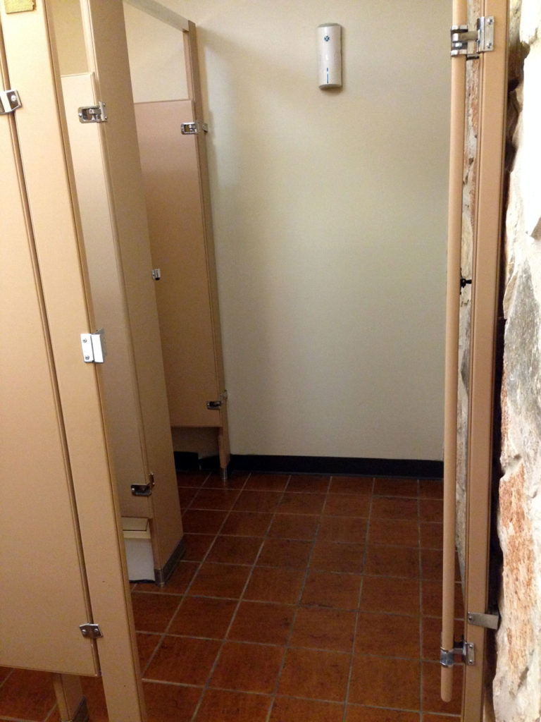
The bathroom has two regular-sized stalls with openings I estimated to be about 30″ wide. In order to accommodate a wheelchair, someone just added a door that would close off both stalls since neither stall is large enough to allow wheelchair access.

Granted the ADA regulations for bathrooms are complex and confusing to the lay person but even so, I’ve seen enough bathrooms to understand this was not cutting it.

Drawing of an accessible bathroom stall with door opening outward, width 35-37 inches, depth 60 inches, and grab bars
ADA small stall requirements

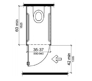
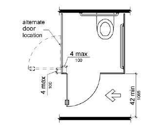
This drawing demonstrates some of the features required of an accessible stall. I can’t be sure of the width or depth of the stall, only that it lacks grab bars and the door opens inward.

This kind of oversight might not seem like a big deal to most people; but if you’re in a wheelchair and can’t use the bathroom, that’s an indignity. I’m always disappointed when I see half-ass things like this 26 years after the ADA was passed.

Design Recommendation

Seems like there are two good options:

  1. If you’re going to restrict the bathroom to use by one person only if she is in a wheelchair, remove the other stall and make one, large, accessible stall. The building is not that busy.
  2. Move the door for the first stall to the side wall so it’s usable even when someone else is in the accessible stall. Then remove the door on the accessible stall, turn the commode sideways, and install grab bars.
drawing of a wider, wheelchair accessible stall
Large, accessible bathroom stall

Audio Descriptions on Netflix

For the first time last night, I stumbled across a Netflix movie offering audio description in addition to subtitles. According to The Audio Description Project

Audio Description involves the accessibility of the visual images of theater, television, movies, and other art forms for people who are blind, have low vision, or who are otherwise visually impaired.  It is a narration service (provided at no additional charge to the patron) that attempts to describe what the sighted person takes for granted—those images that a person who is blind or visually impaired formerly could only experience through the whispered asides from a sighted companion.

The movie in question is Hush, a thriller with a deaf woman as the protagonist. I use closed captions/subtitles all the time, even though I am hearing, because I find them useful for understanding quiet dialogue. When I went to turn captions on for this film, I was surprised to see an option for audio descriptions.

screenshot showing a list of language options for audio and subtitles
Screenshot: Netflix app audio and subtitles menu

Excitedly, I chose “English – Audio Descriptions”. This film is a study in accessibility options! A couple of the characters use sign language and the descriptive audio provides spoken translation for the woman who does not speak when she signs. In a single scene we see sign language, hear audio descriptions and dialogue, both while reading subtitles.

The film has very little dialogue, providing ample time to experience the audio descriptions. I rather enjoyed them because this was a thriller and it felt less scary with someone describing the scene. It also provided a richer layer for enjoying the story since the audio interpretation at times highlighted actions and parts of the scene I might have missed as a sighted user.

It’s good to see Netflix taking accessibility more seriously and providing useful options for non-sighted customers. Netflix provides a list of content with audio description support after signing in to your account.

Registering a Product Shouldn’t be this Hard

When I bought a new dishwasher recently, I went online to register it with Frigidaire in case I needed to use the warranty. My immediate reaction was, is this something I have to print out and mail in?

screenshot of a web form on the Frigidaire website
Screenshot: Frigidaire product registration form

This form suffers from a lot of problems including

  • Unclear form fields because they aren’t boxes, just underlines; where do I click?
  • Unnecessary fields (email confirmation, first and last name instead of full name)
  • Small text with poor contrast
  • Required fields that aren’t marked (address, city, state, zip)

My focus for this post, though, is the next part of the form where the user is asked to enter product information.

screenshot of form requiring the user to click a box to show the form's fields
Screenshot: Add a product

The whole reason I’m filling out this form is to add product information, yet those fields are obfuscated by an unnecessary ‘add product information’ link. When clicked, fields for model number, serial number, date of purchase and location of purchase display, and the wonky ‘add production information’ link remains.

screenshot of a web form with four fields model number, serial number, date and location with a disabled submit button
Screenshot: Add product fields

If you click the ‘add’ button without filling out these fields, you get error messages for three of the fields as it turns out model number, serial number and purchase date are required.

screenshot of error messages when leaving the add a product fields blank
Screenshot: Add product form validation

Design Recommendations

  1. Don’t require the user to click the ‘add production information’ link to see the form fields and remove the unnecessary help text above the form: “Click below to add your product information”
  2. Clearly indicate required fields
  3. Make form fields look like form fields
  4. Provide form labels and keep formattitng instructions visible instead of using placeholder text
  5. Make it easier for users to understand what model number and serial number are and where to find them

I gave the form a streamlined, top-to-bottom flow with large text and obvious form fields. To the right is an example of a product tag that shows what the user is looking for to locate model and serial numbers; I also listed the links to the help pages that show the locations of these tags for each product type.

screenshot of the form with three fields model number, serial number, purchase date and links to find this information
Redesigned add product form

The form checks the field data as it is entered and alerts the user of errors inline. Once a field’s data validates, a check mark displays next to it. After the user enters his model number, an image of that product and the product’s name display below the field for visual verification.

screenshot of the redesigned add product form will the fields field out
Redesigned form filled out

Once all required fields are verified, the “Done” button becomes active. After clicking “Done”, the user can choose to add additional products—something the existing form handles well.