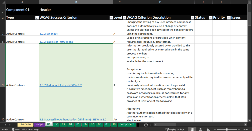
I’ve added the six new WCAG 2.2 level A and AA success criteria (SC) to the “WCAG Success Criterion” column in each component’s tab. This brings the total number of SCs for an audit to 55. (4.1.1 Parsing is deprecated but still included for 2.1.) Each new SC is highlighted in light green and includes “NEW in 2.2” in its name.
If you’re not ready to test for WCAG 2.2 SCs, just mark them as N/A.
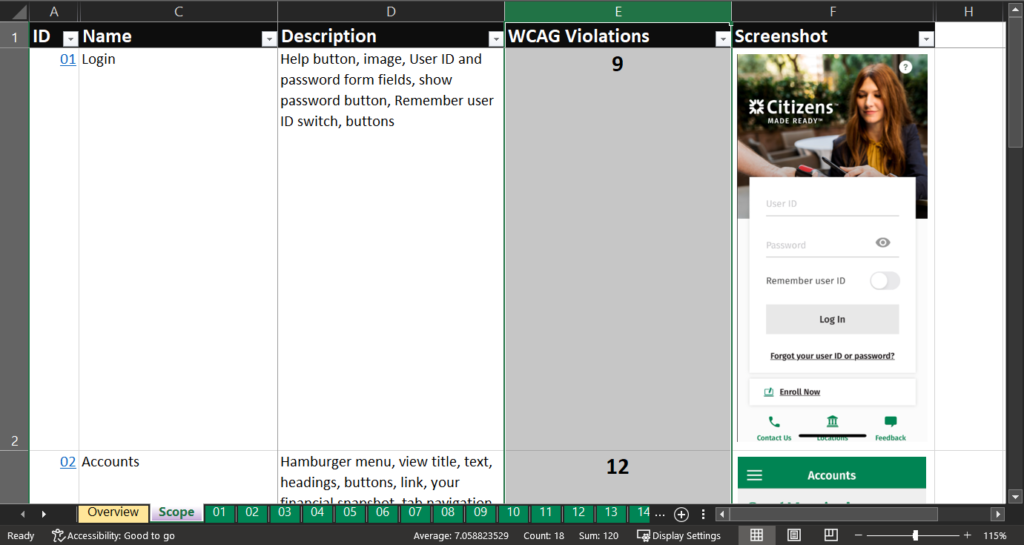
WCAG failure tracking
I’ve added rudimentary tracking of the number of WCAG violations found for each component which is displayed on the “Scope” tab in the a new “WCAG Violations” column. Each cell counts the number of “Fails” selected in the “Status” column of each component’s tab.
On the “Overview” tab, you can see a running total of all WCAG violations found for all components in the audit.
Prioritizing issues
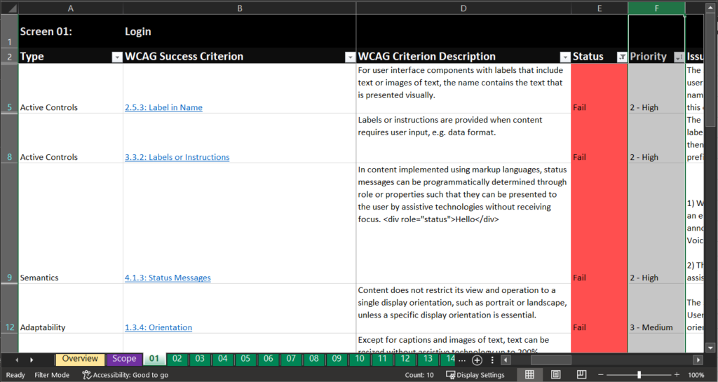
I’ve also added a “Priority” column to each component’s tab. Each SC can be assigned a priority on a five-point scale:
Critical – Blockers that prevent someone from completing a task, e.g. a button that cannot be used with a keyboard
High – Issues that present a significant barrier to someone completing a task, e.g. application times out without allowing the user to extend it
Medium – (Most issues) Issues that present a barrier to some users from fully accessing the information or interface, e.g. text has poor color contrast
Low – Issues that present an unnecessary barrier but do not prevent a user from completing a task, e.g. image text that isn’t sufficiently descriptive
Best Practice – Issues that present some accessibility barriers but are not considered failures under the Web Content Accessibility Guidelines (WCAG), e.g. using a button instead of a link to open a webpage in a browser
If you have any questions about the spreadsheet or additions you’d like to see, please contact me.
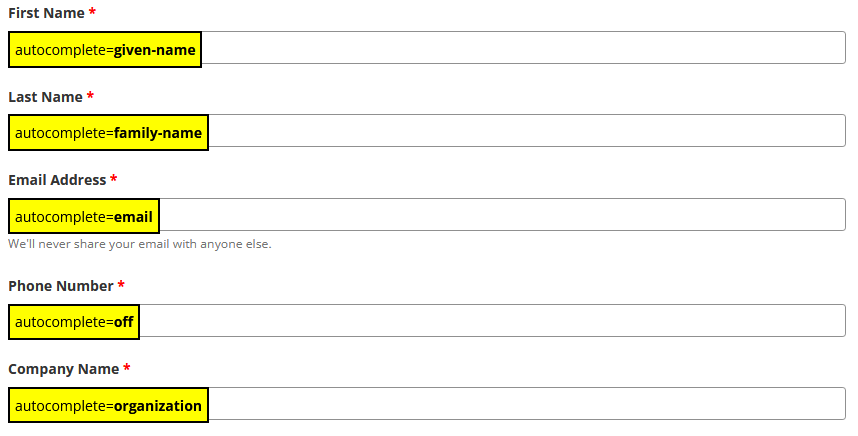
I created this bookmarklet for testing WCAG success criterion 1.3.5 Identify Input Purpose (AA) which requires that if an input field requests personal information about the user, we must apply the appropriate autocomplete value to the field. For example, an input field requesting the user’s full name would have an attribute of autocomplete="name". This allows the browser to attempt to autofill the input field with previous values entered for the same information. It is very much browser-specific.
Amazon create account screen in Firefox
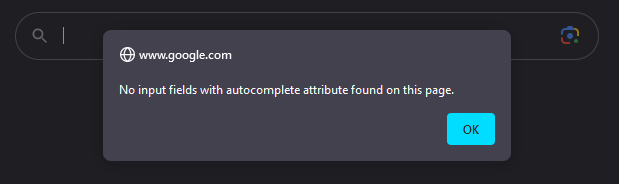
This bookmarklet checks the webpage for any input fields that contain the autocomplete attribute. If none are found, it returns an alert message.
Alert message on the Google search page
If autocomplete attributes are found, the script returns the values and displays them in context of the input field.
TPGi.com signup form with autocomplete values
This makes it easy to determine if input fields have autocomplete attributes defined and if they are valid. Click the bookmarklet again to remove the overlay text.
This is the article version of a talk I gave at work to our disability business resource group.
Hi, I’m Rachele DiTullio, a senior accessibility engineer. My day-to-day work is making sure digital information and digital systems work for people with disabilities. I’m talking to you today as a disabled co-worker. I figured out as an adult that I’m autistic. I was also diagnosed with ADHD. Learning this information about myself suddenly explained so much of the friction in my life. I got involved with the disability community and started understanding what it means to be neurodivergent.
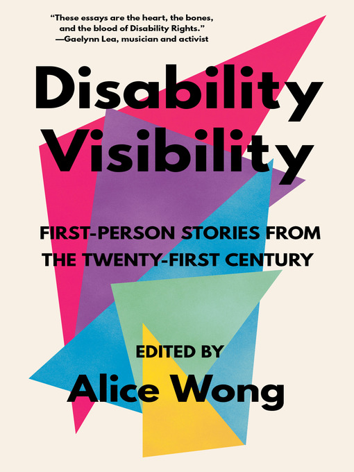
I borrowed the title of this talk from the book Disability Visibility, a collection of essays by disabled authors, edited by disability activist Alice Wong. I wanted to use this title not only to highlight this great collection as an introduction into the diverse lives of disabled people, but because it reflects what the disability community wants you to understand about disabled people.
When I was asked to do this talk, I went to the disability community on Twitter to find out what disabled people want folks to know about disability. I’ve included selected tweets in this talk in order to share what other disabled people are saying, not just me. Two things came up over and over. Not all disabilities are visible; and many people have multiple disabilities.
When we talk about disability visibility, we’re acknowledging that many hidden disabilities, like chronic pain and cognitive conditions, need awareness and accommodation too. But even those with visible disabilities have largely been made invisible from our society due to a variety of access barriers that serve to keep disability hidden, even when an estimated one in four people in the United States experiences disability.
This quote from Alice’s book stood out to me:
Taking up space as a disabled person is always revolutionary.
Many of us spend so much time masking or gritting our way through pain just to survive that being seen and having our needs met feels radical when it should be expected.
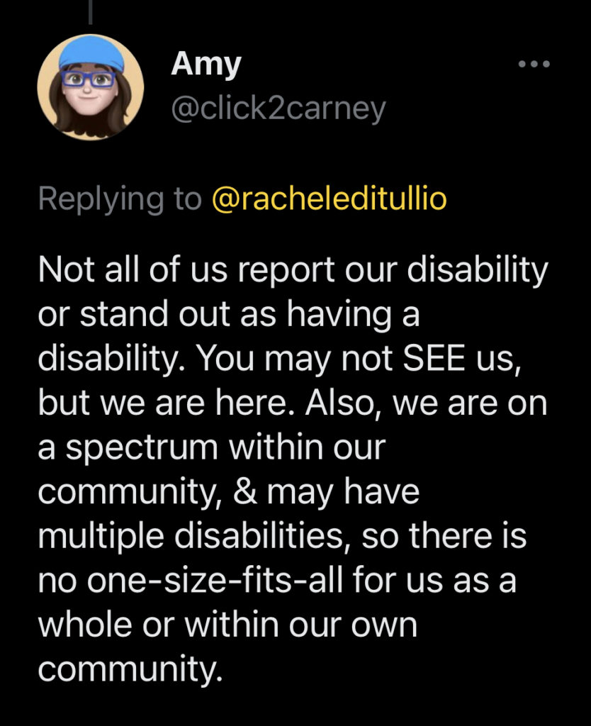
Let’s take a look at a tweet. Amy (@click2carney) says:
Not all of us report our disability or stand out as having a disability. You may not SEE us, but we are here. Also, we are on a spectrum within our community, & may have multiple disabilities, so there is no one-size-fits all for us as a whole or within our own community.
Disability is not a dirty word
In Ettie Bailey-King’s article “Disability is not a dirty word“, she reminds us that it’s okay to say the word “disability” because disabled peoples’ lives aren’t tragedies. There’s nothing to sugar-coat with euphemisms like “special needs.”
There are two main ways of talking about disability: person-first language and identity-first language.
Person-first language looks like this:
I’m a person with disabilities.
Rachele, a person with ADHD.
They have autism.
Identity-first language looks like this:
I’m disabled.
Rachele’s autistic.
They’re neurodivergent.
I prefer identity-first language but others may prefer person-first language. It’s best to ask people how they identify.
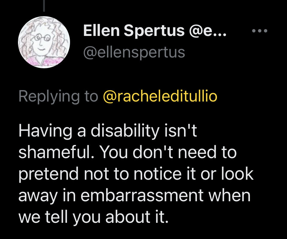
Having a disability isn’t shameful. You don’t need to pretend not to notice it or look away in embarrassment when we tell you about it.
Disability is a part of the human experience.
Let’s talk about ways of defining disability. There are many models of disability but two in particular are used frequently. Again from Bailey-King, the first is the medical model of disability, which says:
People are disabled by cognitive, physical or motor differences or impairments.
The “problem” is in their body.
People can be mildly or severely disabled, depending on how far their body is from a “normal” body.
The second is the social model of disability, which says:
People are disabled by structures. A wheelchair user is disabled by design choices, like buildings without ramps.
The problem is social systems, not people’s bodies.
Disability is a mismatch between a person and the environment they’re in.
Friendly reminder that Autism and ADHD aren’t inherent mental illnesses, however they can be linked to mental illnesses.
And for some they are inherent disabilities, for others only disabling because of society, and for others not disabilities at all.
All are valid.
Attitudes towards disabled people
Scope, a disability rights organization out of the UK, conducted a survey of attitudes towards disabled people with over 4000 disabled people and discovered that they experience a lot of negative attitudes and behaviors in their daily lives.
One third of disabled people (36%) stated that they have often experienced negative attitudes and behaviors in the last 12 months. (This increases to one in two disabled people (50%) under the age of 55.)
44% of disabled people said they feel less equal to others because of the attitudes and behaviors they experience.
42% experienced negative attitudes from work management; 41% from coworkers.
35% said they avoided [work] completely because of their negative experiences.
Ableism is a set of beliefs or practices that devalue and discriminate against people with physical, intellectual, or psychiatric disabilities and often rests on the assumption that disabled people need to be ‘fixed’ in one form or the other. Ableism is intertwined in our culture, due to many limiting beliefs about what disability does or does not mean, how able-bodied people learn to treat people with disabilities and how we are often not included at the table for key decisions.
Leah Smith, Center for Disability Rights
Let’s look at a tweet from Gregory Mansfield (@GHMansfield):
Nondisabled people: “I’m so sorry you’re in a wheelchair. It must be tough being confined to a wheelchair and wheelchair bound.”
Disabled people: “Congratulations on getting the wheelchair. You’ll have so much more mobility and freedom now.”
Ableism is endemic in our society and must be actively dismantled like other forms of implicit bias.
Types of disabilities
Disabilities are generally sorted into five broad categories:
Vision
Hearing
Mobility
Cognitive
Speech
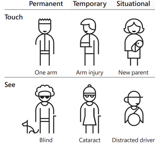
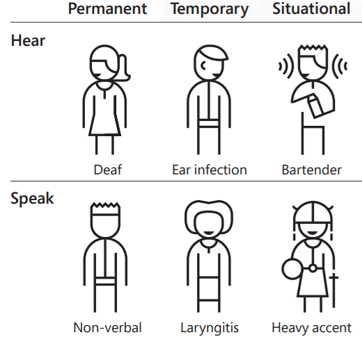
Disability is a spectrum and may be permanent, temporary or situational:
Disability is the largest minority group there is and it’s the only one that we can enter at any time.
Disability is intersectional
Disability is not a monolith and there is no singular disabled experience. Some areas of intersectionality with disability include:
Race
Gender identity
Sexual orientation
Size
Socioeconomic status
The experiences of a Black disabled person will vary from those of a trans disabled person or a poor disabled person in meaningful ways. Disability also intersects with every aspect of someone’s life:
We talked about the differences between person-first and identity-first language but let’s talk about some preferred terms for different types of disabilities.
Handicapped. You still see this word used in signage, but the preferred term is to simply refer to things as being accessible.
Using “the”, e.g. “the blind” or “the deaf”. This is very othering language that serves to exclude people.
Crippled. This word should not be used anymore but it has been reclaimed by the disability community. You may hear disabled people refer to each other as “crips”, but you should not use this in-group term if you are not disabled.
Special needs. Disabled needs are human needs. Calling them special makes it easier to ignore them.
Differently-abled. As discussed, terms like this are unhelpful euphemisms. The preferred terms are disability and disabled.
Able-bodied. This term should generally be avoided. The preferred terms are non-disable or enabled. The disability community sometimes refers to non-disabled people as “ableds”.
Crazy/insane. These terms are pejorative towards people with mental illness and should not be used as insults.
Idiot/moron. These terms are pejorative towards people with intellectual and developmental disabilities and should not be used as insults.
Wheelchair-bound. No one is wheelchair-bound. People who use wheelchairs don’t spend all of their time in wheelchairs so this term is simply incorrect.
Spastic/spaz. This is a specific medical term for some motor conditions and should not be used as an insult.
Asperger’s or “high/low functioning Autism”. Asperger’s has not been in Diagnostic and Statistical Manual (DSM) for more than 10 years and the term has roots in eugenics. It’s better to talk about Autism in term of the support needs of each person. Most people who are autistic are adults and we generally prefer the terms “autistic” or “autist”.
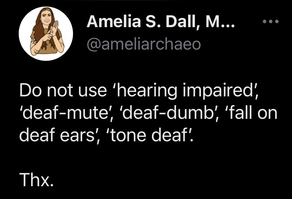
Let’s look at a tweet from Amelia (@ameliarchaeo), a Deaf archeologist:
Do not use ‘hearing impaired’, ‘deaf-mute’, ‘deaf-dumb’, ‘fall on deaf ears’, ‘tone deaf’.
Thx.
Microaggressions
Microaggressions are comments or actions that subtly and often unconsciously or unintentionally express a prejudiced attitude toward a member of a marginalized group, like disabled people. Let’s look at some examples.
Petting a person’s guide dog. Guide dogs are working and should not be touched without their owner’s permission.
“I’ll pray for you.” Many disabled people find this infantilizing because it implies that the person is disabled because they haven’t satisfied some religious requirement.
“I could never do what you do. You’re so inspiring!” Disabled people are not there as inspiration for non-disabled people. We are just going about our lives, trying to survive.
Pity. Disabled people do not want or need pity or sympathy. Most of us do not view our disabilities in such a negative light.
Talking to the interpreter not the Deaf person. It’s just rude not to speak to the person you’re having the conversation with.
Getting angry when offers for help are refused. Many disabled people don’t want or don’t need help from others and when they do, they’ll ask. Don’t be offended if a disabled person refuses an offer of help.
Never touch someone without consent. This includes their wheelchair, cane and other aids. It’s frightening even if it was meant well.
Ask questions but never demand answers.
Accessibility
Accessibility is the extent to which a product, service, physical location or digital asset works for disabled people. Accessibility is the way we benchmark how well our solutions work to break down barriers.
Let’s look at a tweet from Justin (@FatElvis04), a blind accessibility consultant:
To me, accessibility means I can do all the stuff my sighted peers take for granted. My eyeballs not working isn’t what prevents me from using your website… Your inaccessible code is the problem.
To aid accessibility efforts, we can incorporate inclusive design. Inclusive design principals seek to create solutions that are usable by a wide range of people. There’s a saying in the disability community: Nothing about us without us. This means that our design process must include disabled people. We need to hire disabled people to create and build solutions. We need to pay disabled people for their feedback on how our solutions can work better for them.
July is Disability Pride month
Each year on July 26, we celebrate Disability Independence Day which marks the day the Americans With Disabilities Act (ADA) was signed into law in 1990. This year marks the 33rd anniversary of the signing. Let’s not forget what led to Congress passing this bill.
In March of 1990, over 1000 members of the disability rights group ADAPT met at the US Capitol to speak with members of Congress about ADA legislation. But the Capitol was inaccessible to many of the activists. There were 83 stone steps separating them from Congress. Many disabled people left their canes, crutches and wheelchairs to physically pull themselves up those steps to demonstrate the barriers they face every day.