This article showcases iOS display settings that people expect native mobile apps to adapt to and support their individual needs. Note that web content displayed inside native mobile apps generally does not respond to iOS settings. Most people will not be able to make a distinction and may not understand when webviews don’t reflect their display preferences.
Let’s look at four display settings. These features used to be considered accessibility-only but are now so widely used that they have moved to the Settings app > Display & Brightness.
Dark mode
Dark mode is an expected feature these days. If your app doesn’t support dark mode, some people may struggle with reading the typical dark text on a light background. Even if they can make it work, a subset of people will have a much better experience when your app supports dark mode which can reduce eye strain.
It’s just as important to continue supporting light mode because other users may struggle to read light text on a dark background. Allowing your app to adapt to user preferences is key. Also consider providing a setting in your app that allows users to override the iOS appearance for your app in case there is a conflict.
Supporting dark mode means making sure your color combinations for text, controls and meaningful icons meet color contrast requirements on all screens with both a light and dark background.
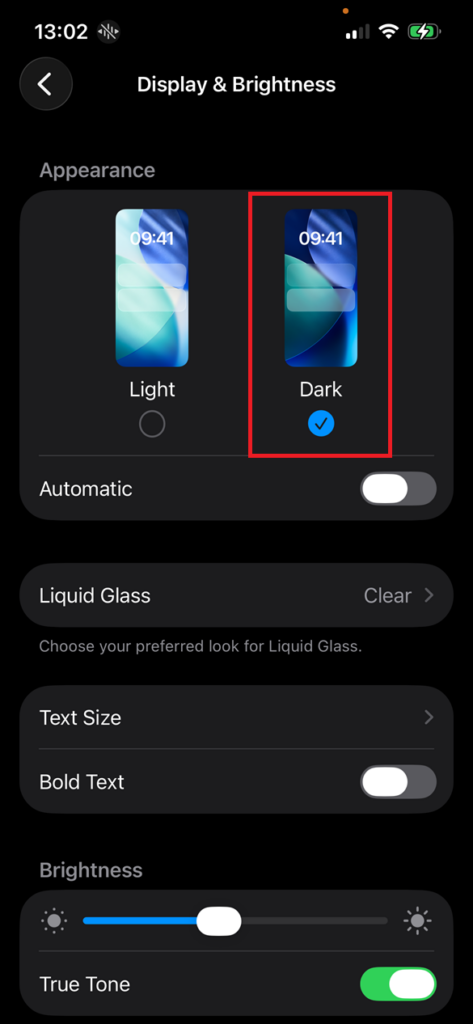
Setting dark mode in iOS
Settings app > Display & Brightness > Appearance > Select the Dark radio button
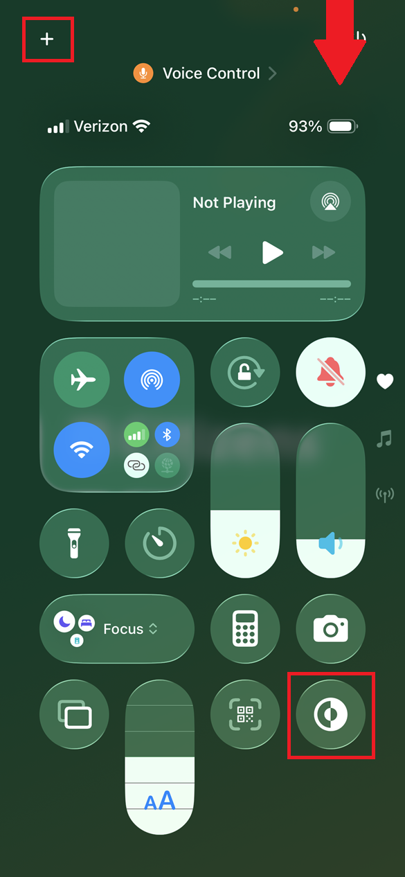
We can also add an action button to the iOS Control Panel for toggling dark mode on and off quickly. Access the control panel by pulling down from the top right of the screen. Tap the “+” icon and look for the dark mode toggle to add to the screen.
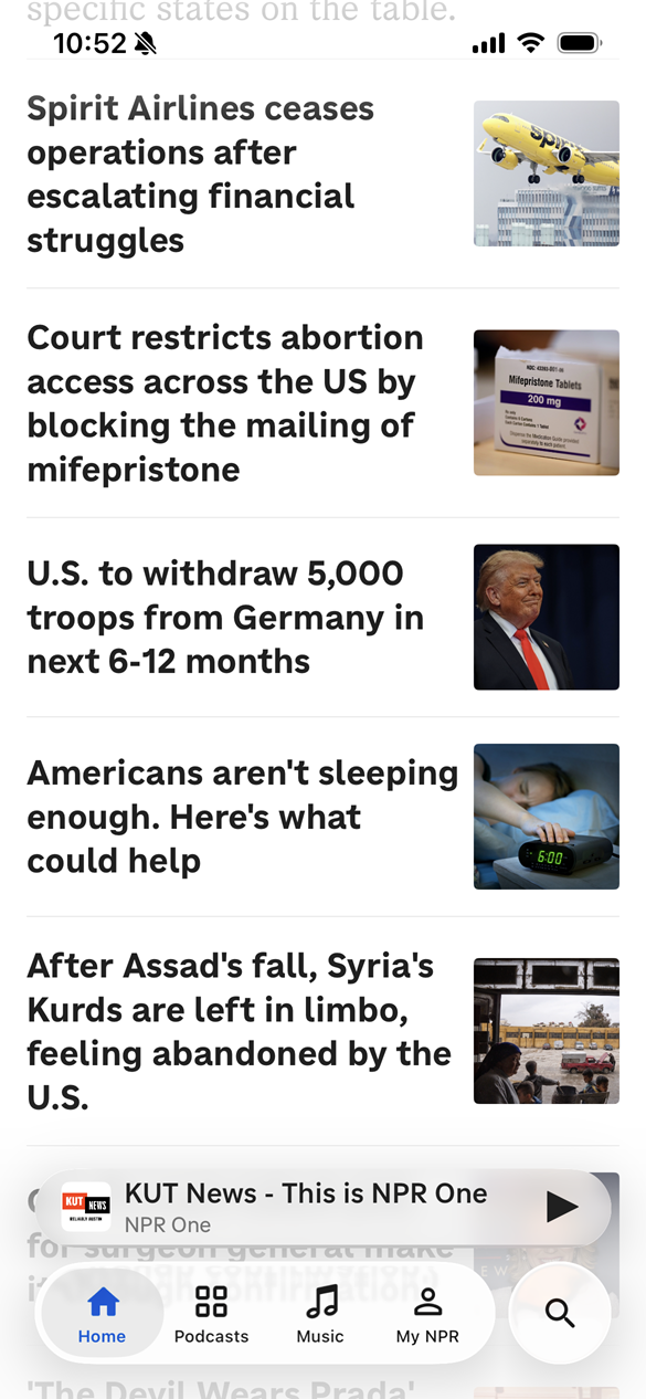
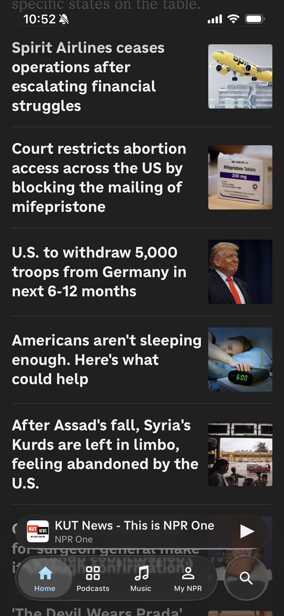
Dark mode example
Comparing light mode to dark mode in the NPR native mobile app:
Text scaling
Enabling Dynamic Type for the text in native mobile apps gives people a lot of control over their experience. A common customer complaint is that the font size in an app is too small to read. If the app doesn’t support Dynamic Type, it won’t respond to peoples’ iOS text settings to view the text larger.
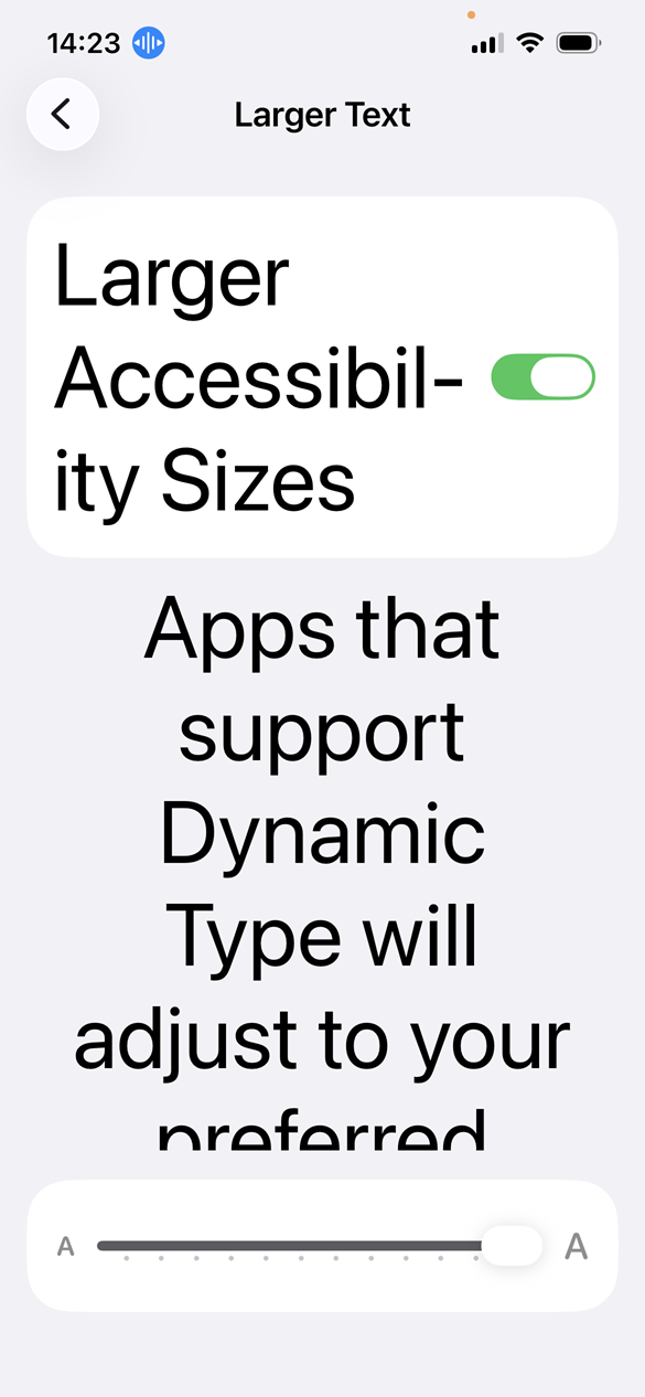
iOS provides two levels of text resizing. In Display settings, text size can be set up to 135% from the default 100%. In Accessibility settings, the text size scale can be increased to 310%. Yes, we should support every level of text resize though some text may not resize like labels in navigation.
Supporting text scaling means ensuring that all screens and content respond to iOS font settings while reflowing larger text and ensuring text is not truncated with ellipsis or cutoff by a container that doesn’t scroll.
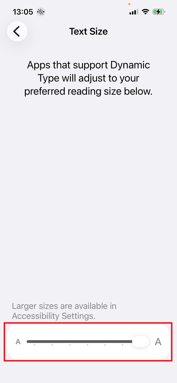
Setting text size in iOS
- Settings app > Display & Brightness > Text Size > Adjust slider up to 135%
- Settings app > Accessibility > Text Size > Larger Text > Switch Larger Accessibility Sizes on > Adjust slider up to 310%
We can also add a slider to the iOS Control Panel for scaling font size quickly. Access the control panel by pulling down from the top right of the screen. Tap the “+” icon and look for the text scale slider to add to the screen.
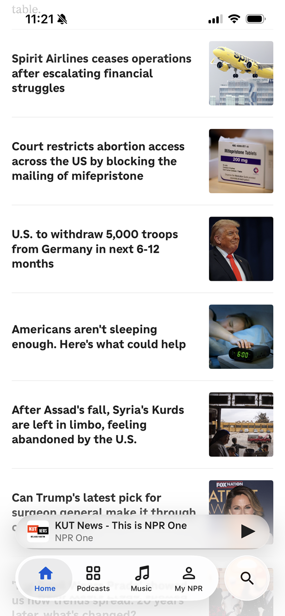
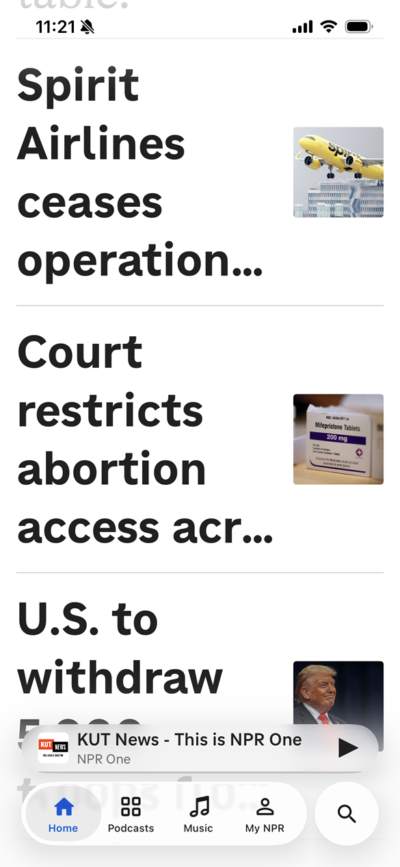
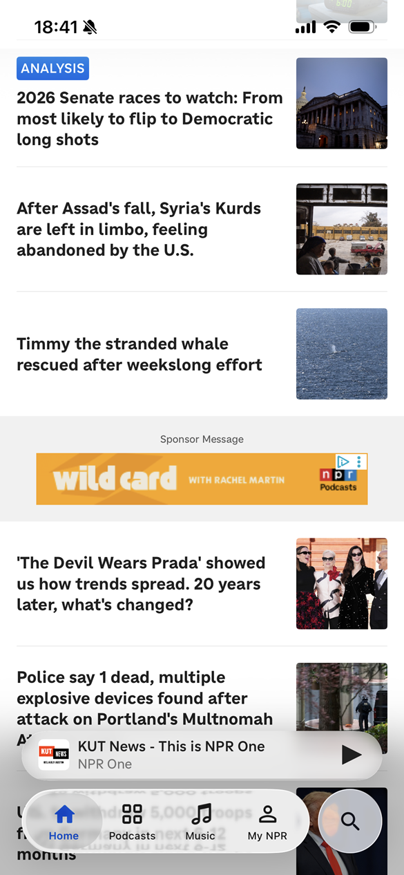
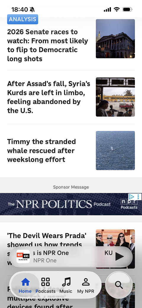
Text scaling example
Comparing 100% text size to an example of 310% text size with headlines truncated in the NPR native mobile app:
Display zoom
This is a setting that developers have no control over and it often gets enabled when people set up a new iPhone. During setup they are asked if they want to view “Larger Text” which is a display zoom setting. The result of enabling “Larger Text” is that everything on the screen gets larger—not just the text—whether or not text scaling is supported.
Supporting display zoom Larger Text includes allowing screens and overlays like bottom sheets to expand and scroll as the display size increases. People may combine Larger Text display zoom with accessibility font sizes.
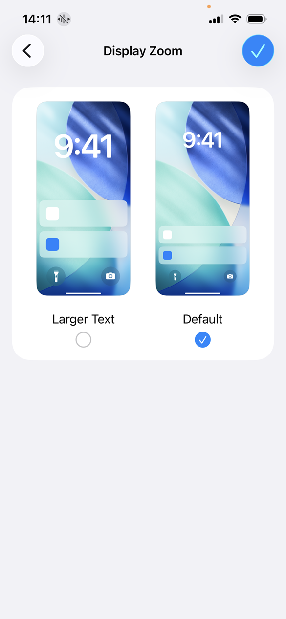
Setting display zoom in iOS
Settings app > Display & Brightness > Display Zoom > Select the Larger Text radio button
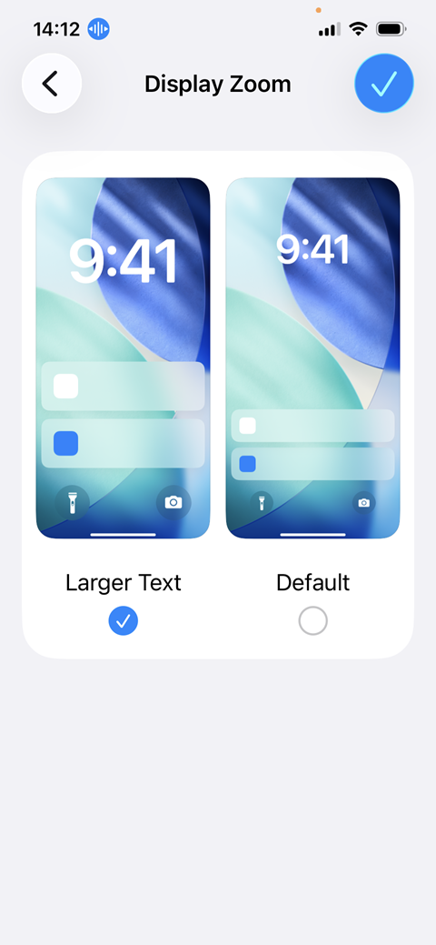
Display zoom example
Comparing Default display zoom to Larger Text display zoom in the NPR native mobile app at 100% text size:
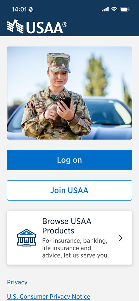
Orientation
Orientation isn’t an iOS user setting but it is a native mobile app developer setting. By default, iOS apps are intended to work in both portrait and landscape orientations. Landscape orientation has to be intentionally disabled. Preventing people from using an app in landscape orientation may prevent them from using it at all. Some people have their devices fixed in landscape orientation and have a difficult time using apps that don’t support all orientations.
Orientation example
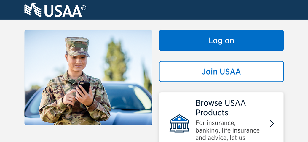
The NPR app doesn’t support landscape orientation. Comparing portrait orientation to landscape orientation in the USAA native mobile app:
Conclusion
This list isn’t exhaustive of all the possible display settings in iOS that people may use to interact with your native mobile app. The four settings we explored cover a range of user preferences and accessibility needs, but this is always evolving and changing. Our goal should be to make sure our iOS apps are adapting to users’ preferences where it can.
Related articles
- 4 iOS display settings to check your app with
- AT for iPhone: VoiceOver screen reader
- AT for iPhone: Voice Control speech input
- AT for iPhone: Full Keyboard Access
Screenshots and videos taken on an iPhone 16e running iOS 26.4.