Audio Descriptions on Netflix

For the first time last night, I stumbled across a Netflix movie offering audio description in addition to subtitles. According to The Audio Description Project

Audio Description involves the accessibility of the visual images of theater, television, movies, and other art forms for people who are blind, have low vision, or who are otherwise visually impaired.  It is a narration service (provided at no additional charge to the patron) that attempts to describe what the sighted person takes for granted—those images that a person who is blind or visually impaired formerly could only experience through the whispered asides from a sighted companion.

The movie in question is Hush, a thriller with a deaf woman as the protagonist. I use closed captions/subtitles all the time, even though I am hearing, because I find them useful for understanding quiet dialogue. When I went to turn captions on for this film, I was surprised to see an option for audio descriptions.

screenshot showing a list of language options for audio and subtitles
Screenshot: Netflix app audio and subtitles menu

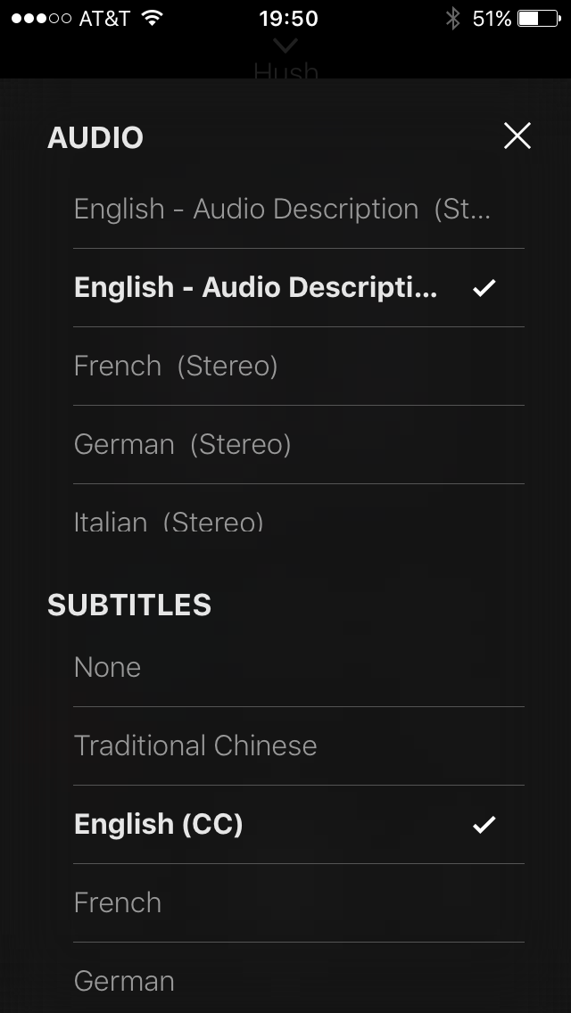
Excitedly, I chose “English – Audio Descriptions”. This film is a study in accessibility options! A couple of the characters use sign language and the descriptive audio provides spoken translation for the woman who does not speak when she signs. In a single scene we see sign language, hear audio descriptions and dialogue, both while reading subtitles.

The film has very little dialogue, providing ample time to experience the audio descriptions. I rather enjoyed them because this was a thriller and it felt less scary with someone describing the scene. It also provided a richer layer for enjoying the story since the audio interpretation at times highlighted actions and parts of the scene I might have missed as a sighted user.

It’s good to see Netflix taking accessibility more seriously and providing useful options for non-sighted customers. Netflix provides a list of content with audio description support after signing in to your account.

Registering a Product Shouldn’t be this Hard

When I bought a new dishwasher recently, I went online to register it with Frigidaire in case I needed to use the warranty. My immediate reaction was, is this something I have to print out and mail in?

screenshot of a web form on the Frigidaire website
Screenshot: Frigidaire product registration form

This form suffers from a lot of problems including

  • Unclear form fields because they aren’t boxes, just underlines; where do I click?
  • Unnecessary fields (email confirmation, first and last name instead of full name)
  • Small text with poor contrast
  • Required fields that aren’t marked (address, city, state, zip)

My focus for this post, though, is the next part of the form where the user is asked to enter product information.

screenshot of form requiring the user to click a box to show the form's fields
Screenshot: Add a product

The whole reason I’m filling out this form is to add product information, yet those fields are obfuscated by an unnecessary ‘add product information’ link. When clicked, fields for model number, serial number, date of purchase and location of purchase display, and the wonky ‘add production information’ link remains.

screenshot of a web form with four fields model number, serial number, date and location with a disabled submit button
Screenshot: Add product fields

If you click the ‘add’ button without filling out these fields, you get error messages for three of the fields as it turns out model number, serial number and purchase date are required.

screenshot of error messages when leaving the add a product fields blank
Screenshot: Add product form validation

Design Recommendations

  1. Don’t require the user to click the ‘add production information’ link to see the form fields and remove the unnecessary help text above the form: “Click below to add your product information”
  2. Clearly indicate required fields
  3. Make form fields look like form fields
  4. Provide form labels and keep formattitng instructions visible instead of using placeholder text
  5. Make it easier for users to understand what model number and serial number are and where to find them

I gave the form a streamlined, top-to-bottom flow with large text and obvious form fields. To the right is an example of a product tag that shows what the user is looking for to locate model and serial numbers; I also listed the links to the help pages that show the locations of these tags for each product type.

screenshot of the form with three fields model number, serial number, purchase date and links to find this information
Redesigned add product form

The form checks the field data as it is entered and alerts the user of errors inline. Once a field’s data validates, a check mark displays next to it. After the user enters his model number, an image of that product and the product’s name display below the field for visual verification.

screenshot of the redesigned add product form will the fields field out
Redesigned form filled out

Once all required fields are verified, the “Done” button becomes active. After clicking “Done”, the user can choose to add additional products—something the existing form handles well.

Hangouts, where’s my mute?

I mostly use Hangouts to communicate with friends and family. While at work on my laptop, I use the Chrome extension for Hangouts. The rest of the time I use the iPhone app. The user experience between these two versions is not the same though, because the navigation menu is so different.

I think the iPhone app has the superior layout and use of space.

screenshot of the Hangouts iPhone app with title at the top and a menu bar with options favorite, voice, invite, video, mute, details
Google Hangouts iPhone app

With one tap of the menu icon, you get access to most of the hangout features, the rest of which are available by tapping the “Details” icon.

Conversely, in the browser extension the same features are either missing or work differently.

screenshot of the extension menu bar with icons for video call, people, and options
Google Hangouts extension chat window

I am most annoyed that the ‘Mute’ function is missing because I use it frequently. It’s located under the ‘Options’ icon, labeled “Notifications”, and is turned on/off with a check box.

screenshot of the Hangouts extension 'Options' screen with edit name, notifications check box, history check box, archive, and leave
Google Hangouts extension ‘Options’ screen


After unchecking the “Notifications” box, you have to click ‘Save’ to return to the chat window. The total interaction requires three clicks, context switching, and a confirmation action. After turning off notifications, though, the menu bar displays an indication icon.

menu bar showing a mute icon for the chat
Hangouts extension notifications off

Clicking the ‘Mute’ icon now performs the same action as clicking the ‘Options’ icon and you have to check the “Notifications” checkbox to turn them back on.

Design Recommendations

  1. Add the ‘Mute’ icon and allow for single click to turn notifications on or off
  2. Use consistent labels—change “Notifications” to “Mute” and “Options” to “Details”

screenshot of extension menu bar design with mute icon added and options icon updated to match the app
Updated menu bar with mute icon

Favorites doesn’t seem to be supported in the extension and it never remembers my favorites in the app, so I don’t see this as missing on the desktop. Not including Voice is questionable, it could open up Google Voice, but using that on desktop is also not something I do. Video hangouts cover both.